While writing “macOS 27 Golden Gate Sharpens Tahoe’s Blurry Icons” (22 June 2026), I was chatting with Paul Kafasis of Rogue Amoeba about how it was good that macOS 27 Golden Gate’s app icons will be sharper and more distinct, but that it was a shame that Apple was still forcing all icons into the squircle shape that makes them more difficult to tell apart. Scroll through the TidBITS Member Benefits for a quick tour of some apps that haven’t changed their icons—I particularly like Acorn.
More specifically, we wondered, wouldn’t the similarity of squircle icons be especially problematic if the user had chosen either Clear or Tinted in System Settings > Appearance > Icon & widget style? (On the iPhone, touch and hold an empty spot on the Home Screen, tap Edit > Customize, and select Clear or Tinted.)
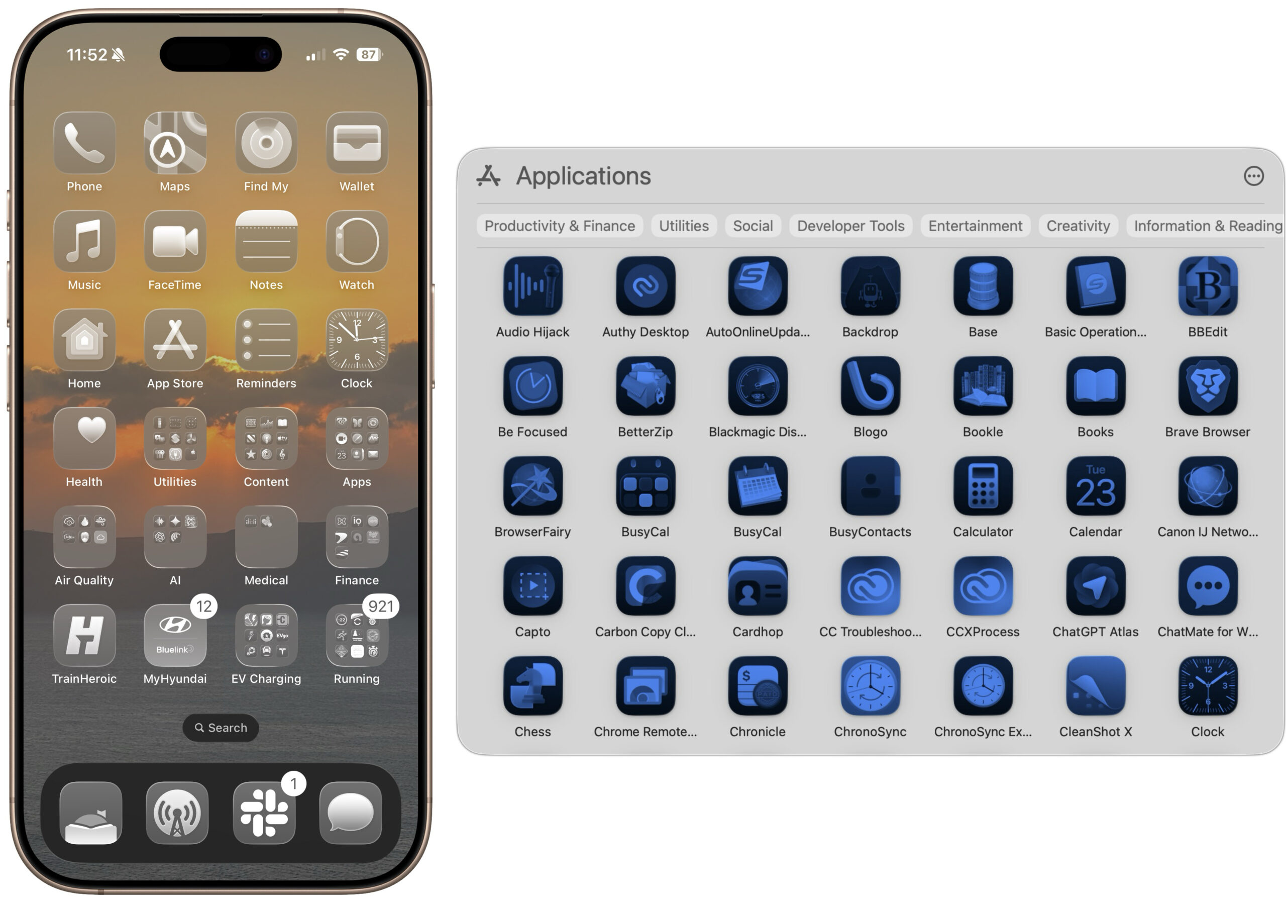
Answer: Yes, it’s nearly impossible to identify a particular app when they’re all clear or tinted squircles, as you can see below. My brain just shuts down when it sees them.
For comparison, here’s that iPhone Home Screen in Default, Dark, Clear, and Tinted.
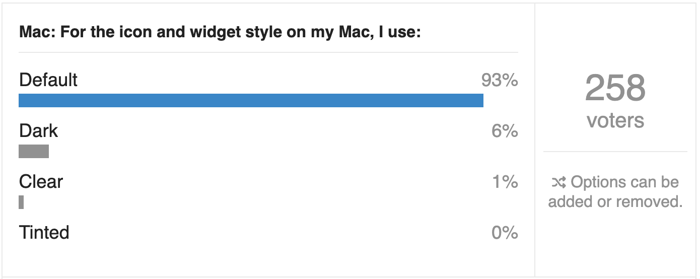
Seeing just how difficult it was to distinguish between clear or tinted icons led to our next question, and to this week’s Do You Use It? poll. What percentage of Mac or iPhone users—or at least TidBITS readers—prefer one of these Liquid Glass monochromatic looks for all their apps? Some users with color vision deficiencies might prefer them, but are they at all common otherwise? If you prefer to see your icons in clear or tinted, tell us why and share a Home Screen or Spotlight screenshot in the comments. Respond to these poll questions on the TidBITS Talk site.