Posted By Paul Kafasis on January 10th, 2026
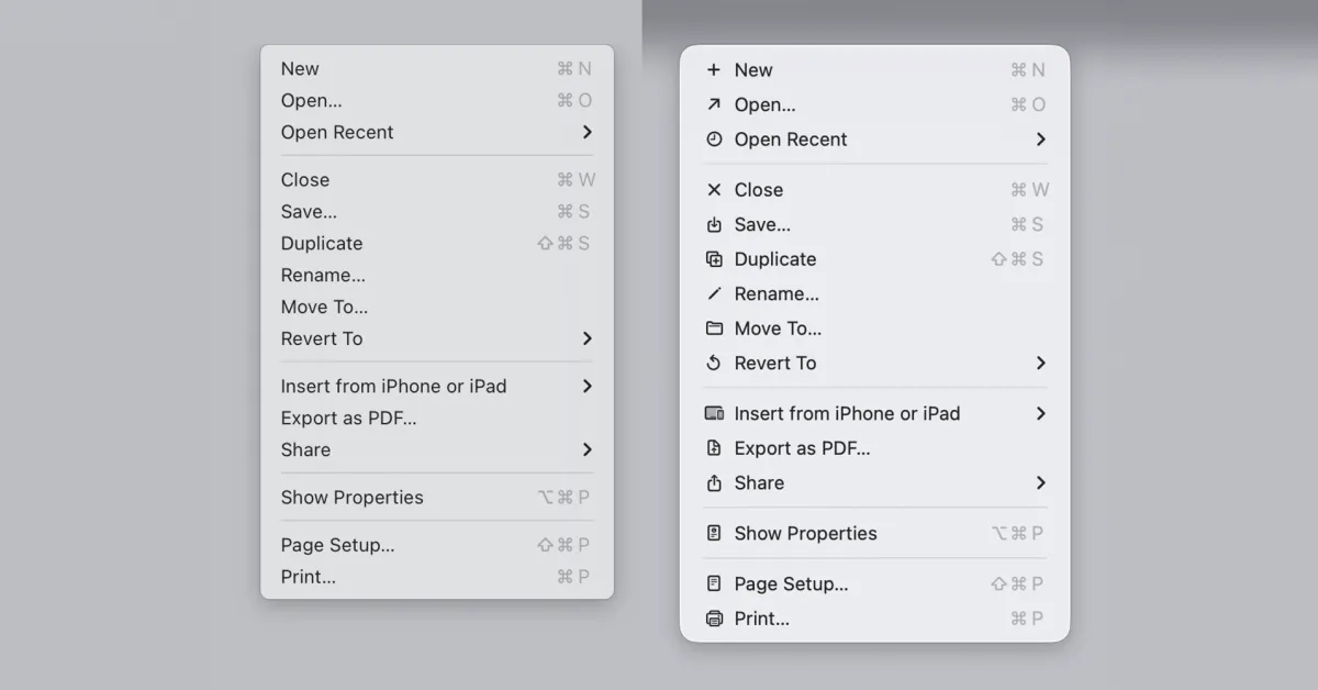
Recently, two widely discussed posts have decried the proliferation of icons in MacOS 26 (Tahoe) menus. First, Jim Nielsen wrote a post in December that referenced Apple’s old Human Interface Guidelines (HIG) advice against using confusing symbols in menus. Next, Nikita Prokopov provided example after infuriating example of just how poorly implemented these icons are on Tahoe.
A Bit of Nuance
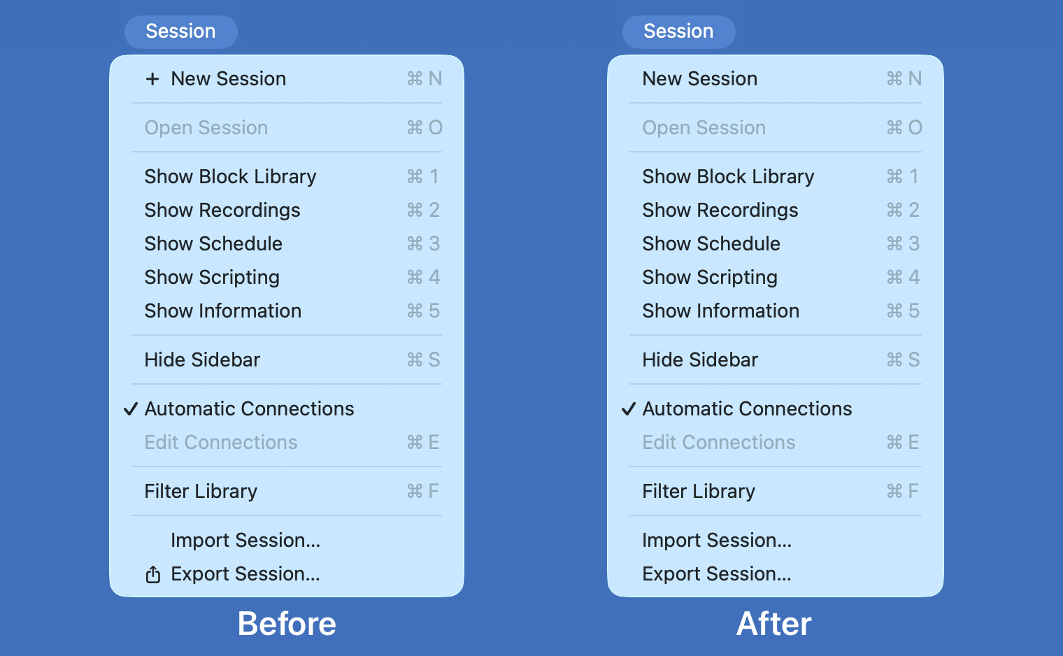
It’s not that icons in menus are inherently bad. Indeed, they can be helpful in small doses. We use them to good effect in select places throughout our own apps:
From left to right: Audio device icons in SoundSource; AirPlay device icons in Airfoil; Application icons in Audio Hijack.