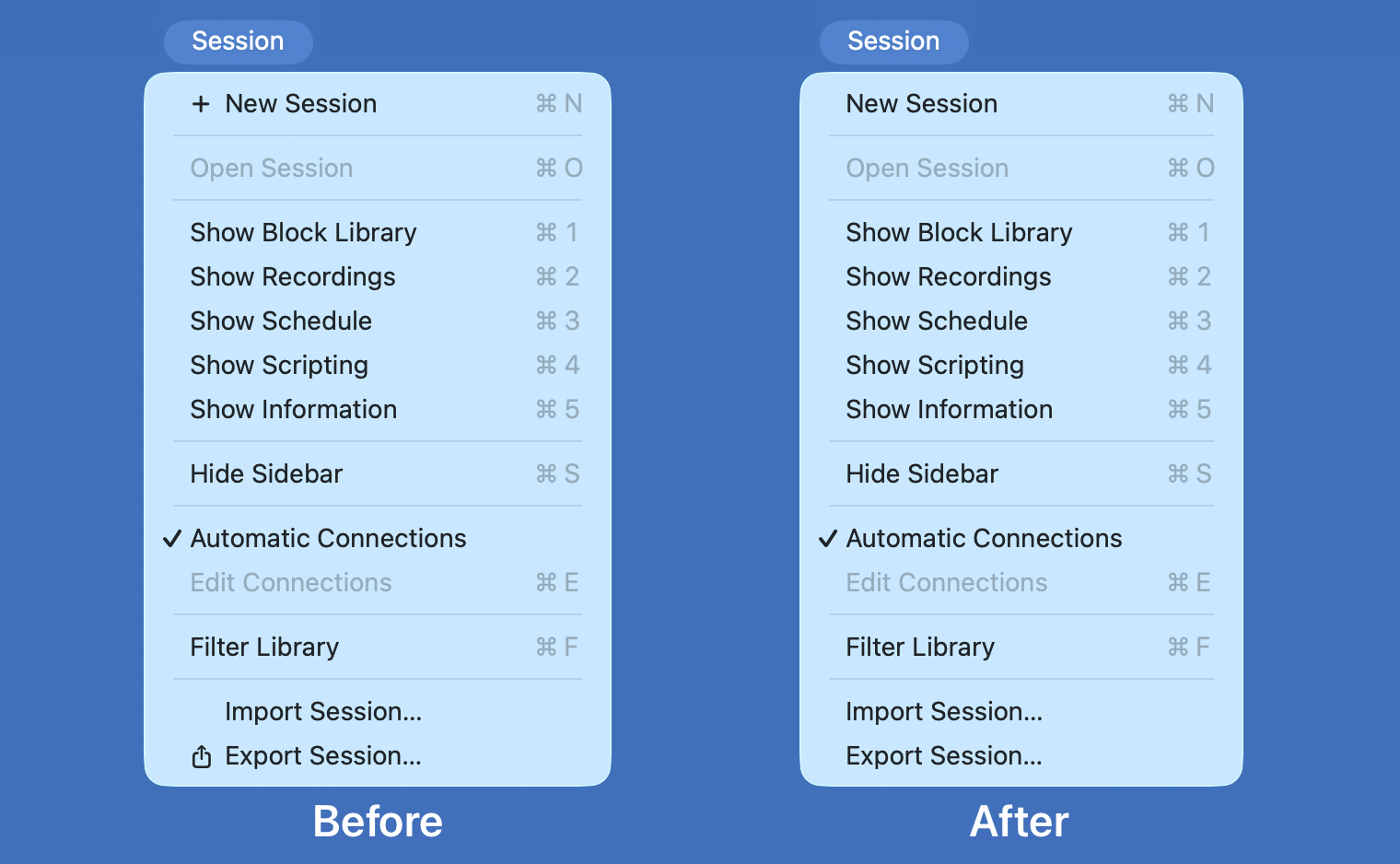
Perhaps the worst UI crime in MacOS 26 Tahoe was the inexplicable decision to add inscrutable, distracting icons next to every item in the menu bar. You will recall Jim Nielsen writing about it, rightly describing it as exactly the sort of thing that Mac users look down upon in platforms like Google Docs and Windows. You will also recall Nikita “Tonsky” Prokopov writing about it, illustrating that the bad idea wasn’t even implemented well, with different Apple apps using entirely different icons for the same menu items. You will also recall my linking to Nielsen (“I can tolerate being angry about UI changes Apple makes to the Mac. But I can’t tolerate being heartbroken.”) and to Prokopov (“The fact that Tahoe’s menu item icons are glaringly inconsistent and often utterly inscrutable is the fudge icing on a shit cake, but the real embarrassment is that the idea ever got past the proposal stage. No real UI or icon designers think this is a good idea. None.”)
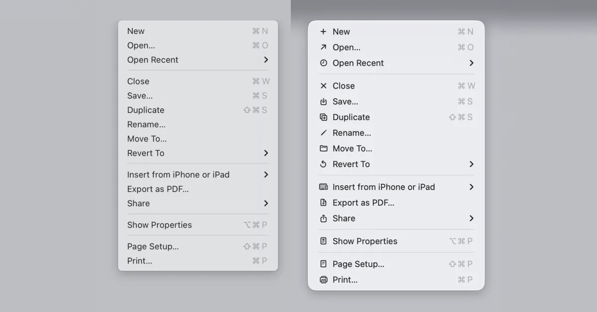
Wonderful news in MacOS 27 Golden Gate: the icons are gone. It’s like Tahoe’s menu item icons never happened. Prokopov noted it on Mastodon with before and after screenshots, and mentions that Apple has updated the Human Interface Guidelines accordingly: