
Tahoe’s Terrible Icons
Paul Kafasis, writing at One Foot Tsunami:
While Apple had previously urged developers to use squircle icons
on our apps, they’ve now taken things much further to ensure
compliance. It’s a shame.
Link to: https://onefoottsunami.com/2025/11/05/tahoes-terrible-icons/
Tahoe’s Terrible Icons
Paul Kafasis, writing at One Foot Tsunami:
While Apple had previously urged developers to use squircle icons
on our apps, they’ve now taken things much further to ensure
compliance. It’s a shame.

Link to: https://tonsky.me/blog/tahoe-icons/
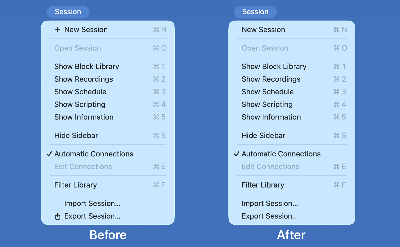
We can avoid Apple’s heavy-handed implementation of a questionable idea.
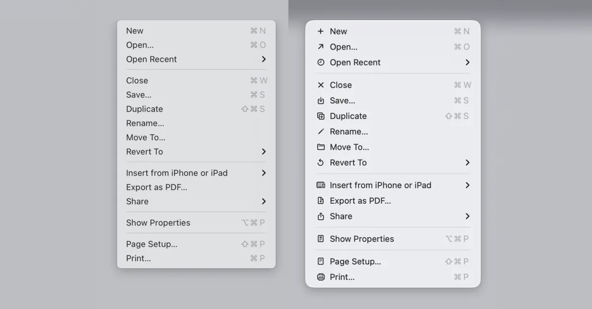
The menu icons in macOS 26 Tahoe were roundly criticized for being both ugly and making Macs harder to use....
Basic Apple Guy has a rundown of the new icons in Golden Gate compared to their Tahoe predecessors: The colours are much bolder,…
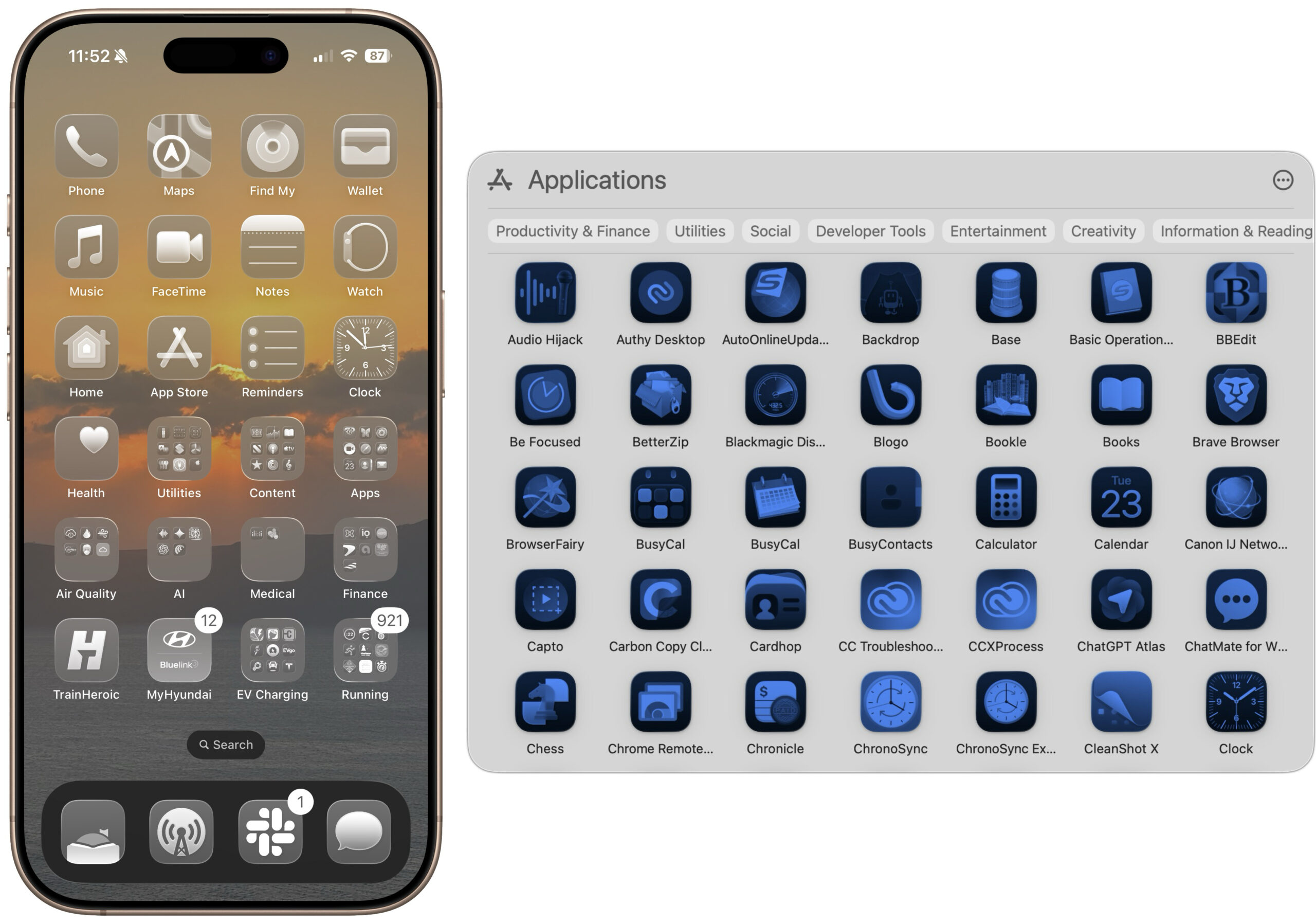
The Clear and Tinted icon options in macOS 26 and iOS 26 might look stylish, but they make identifying individual apps nearly…

Shape was often the most iconic thing about an icon. Now it’s no part at all.