WARPTECHNEWS · LAB
HomeAIBusinessTechArchive
WARPTECH LAB NEWS

Warptech Lab News aggrega le notizie più rilevanti da oltre 700 fonti internazionali, con classificazione AI, TL;DR sintetici e timeline cluster su singole storie.

Navigazione

  • Home
  • Archivio
  • Editor's Brief
  • Cerca
  • Il tuo account
  • Newsletter tech/AI

Informazioni legali

  • Privacy Policy
  • Termini di servizio
  • Cookie Policy

© 2026 Sparktech S.R.L. — Tutti i diritti riservati. Sito gestito e manutenuto da Sparktech S.R.L.

Sede legale: Corso Libertà 55, 13100 Vercelli (VC), Italia · P.IVA / C.F. 02835910023 · Contatti: admin@warptechlab.com

Home
Storia in 3 fonti

Do You Use It? Clear and Tinted Icons - TidBITS

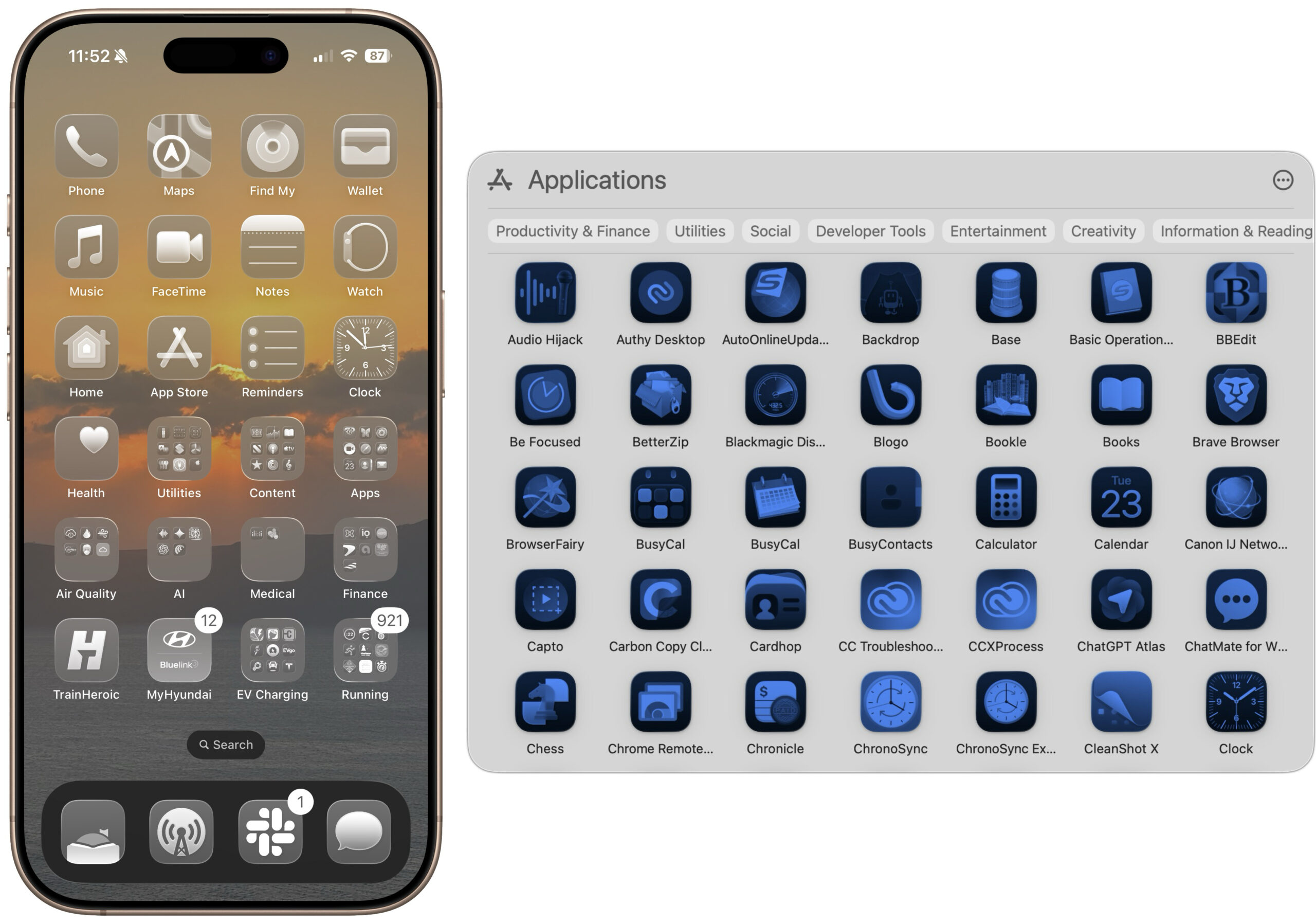
The Clear and Tinted icon options in macOS 26 and iOS 26 might look stylish, but they make identifying individual apps nearly impossible. Do you actually use these monochromatic modes? If so, we’d love to hear why.

Raccontata dadaringfireball.netsixcolors.comtidbits.com

Confronto fonti

3 prospettive sulla stessa storia
AI · summaries
tidbits.comStai leggendo14 g fa

Do You Use It? Clear and Tinted Icons - TidBITS

The Clear and Tinted icon options in macOS 26 and iOS 26 might look stylish, but they make identifying individual apps nearly impossible. Do you actually use these monochromatic modes? If so, we’d love to hear why.

originale
sixcolors.com15 g fa

Apple’s updated icons in Golden Gate

Basic Apple Guy has a rundown of the new icons in Golden Gate compared to their Tahoe predecessors: The colours are much bolder, several icons have been adjusted, and the refraction in the Liquid G…

Leggi questa versione → originale
daringfireball.net16 g fa

Before and After: MacOS 27 Golden Gate Beta 1’s App Icons

macOS Golden Gate beta redesigns app icons with bolder colors and sharper Liquid Glass, advancing Apple's visual modernization strategy. Enterprise teams updating macOS/iOS applications must adapt visual assets to the new design language for platform consistency.

Leggi questa versione → originale

Timeline cronologica

  1. domenica 21 giugno 2026·daringfireball.net

    Before and After: MacOS 27 Golden Gate Beta 1’s App Icons

    Link to: https://basicappleguy.com/basicappleblog/macos-golden-gate-icon-comparison

  2. lunedì 22 giugno 2026·sixcolors.com

    Apple’s updated icons in Golden Gate

    Basic Apple Guy has a rundown of the new icons in Golden Gate compared to their Tahoe predecessors: The colours are much bolder, several icons have been adjusted, and the…
  3. martedì 23 giugno 2026·tidbits.com

    Do You Use It? Clear and Tinted Icons - TidBITS

    The Clear and Tinted icon options in macOS 26 and iOS 26 might look stylish, but they make identifying individual apps nearly impossible. Do you actually use these monochromatic…