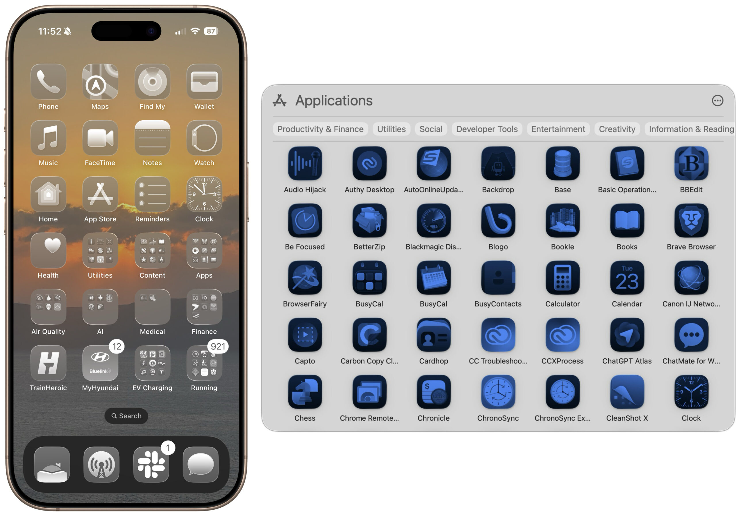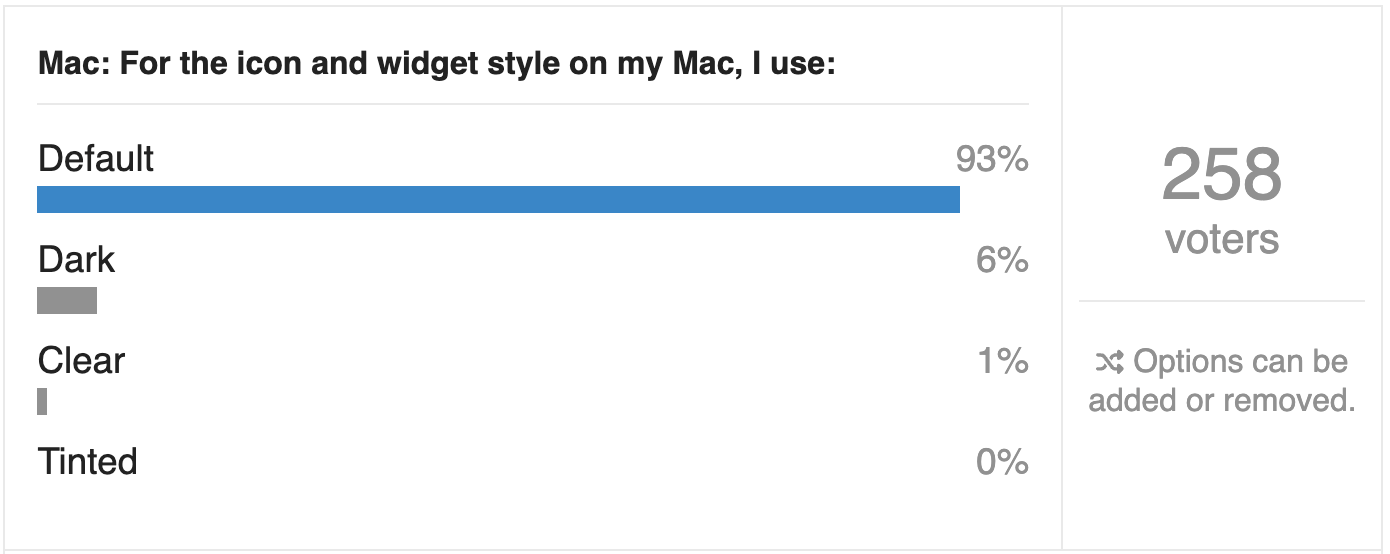
I’m always interested to see the results of our Do You Use It? polls, but some surprise me more than others. Our latest poll, “Do You Use It? Clear and Tinted Icons” (23 June 2026), was not one of them. It asked if you use Apple’s new clear or tinted style for your icons (and widgets) on the Mac or iPhone, and unsurprisingly, almost no one does.
Of the TidBITS readers who chose to respond to the poll, only 1% said they use clear icons on the Mac, and no one admitted to using tinted icons. On the iPhone, clear icons were twice as popular—a whopping 2%—and just 1% of respondents said they use tinted icons. Dark icons, which retain color, were slightly more popular, but still couldn’t exceed single digits, with 6% on the Mac and 9% on the iPhone.
TidBITS readers are perhaps the least likely demographic to switch to clear or tinted icons, because we have had many years to become accustomed to distinguishing icons by color. I even know people who organize their apps by color. Color is good!
The entire point of icons on the Mac and iPhone is to serve as the visual identities of apps, so you know which app you’re launching. Anything that makes it harder to distinguish between apps loses usability points.