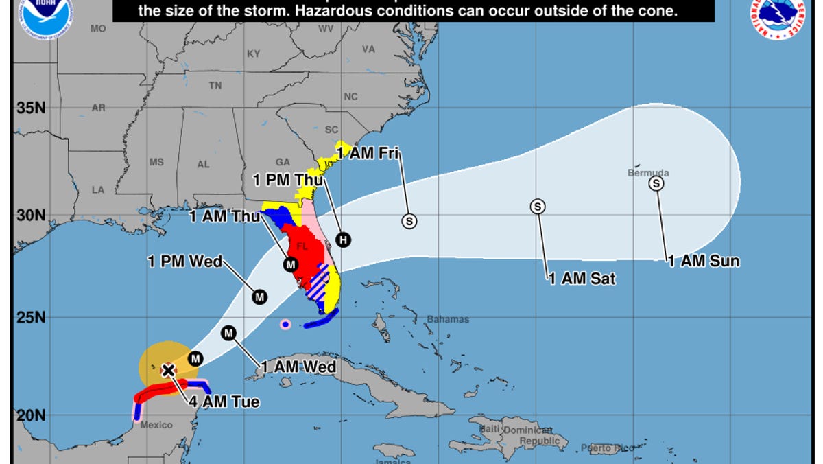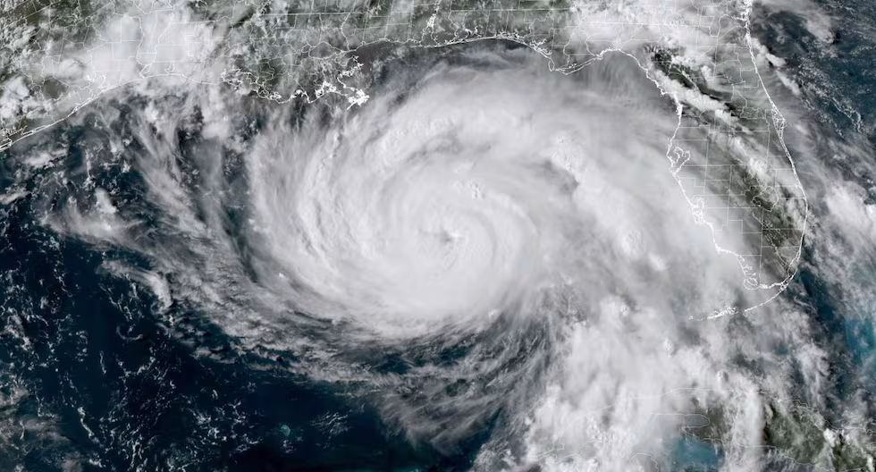
It might have seemed exotic when it first appeared, but the forecast “cone of uncertainty” used by the NOAA/NWS National Hurricane Center (NHC) is now a familiar part of tropical cyclone readiness in U.S. states and territories. For 2026, NHC has made a couple of key tweaks to its standard cone product. It’s also testing an expanded version of the cone – one made feasible by a new way of understanding how and where forecast errors arise.
Since its debut in 2002, the cone has become what a University of Miami writer called “arguably [the center’s] most iconic graphic,” a mainstay of TV coverage and weather apps. Prior to the cone, hurricane maps simply showed a line depicting the official multi-day forecast for the storm center, as issued every six hours by NHC. Experts urged the public not to “focus on the skinny line,” keeping in mind that a hurricane’s path can easily deviate from the forecast track and that impacts will typically extend far beyond that center.
When you see a cone graphic, that ‘skinny line’ may or may not appear (NHC provides both versions), but the cone itself has gone a long way to fix the skinny-line problem.
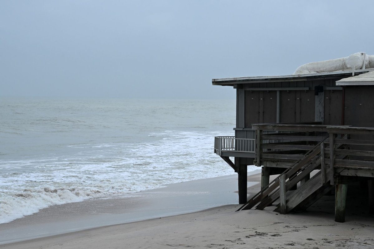
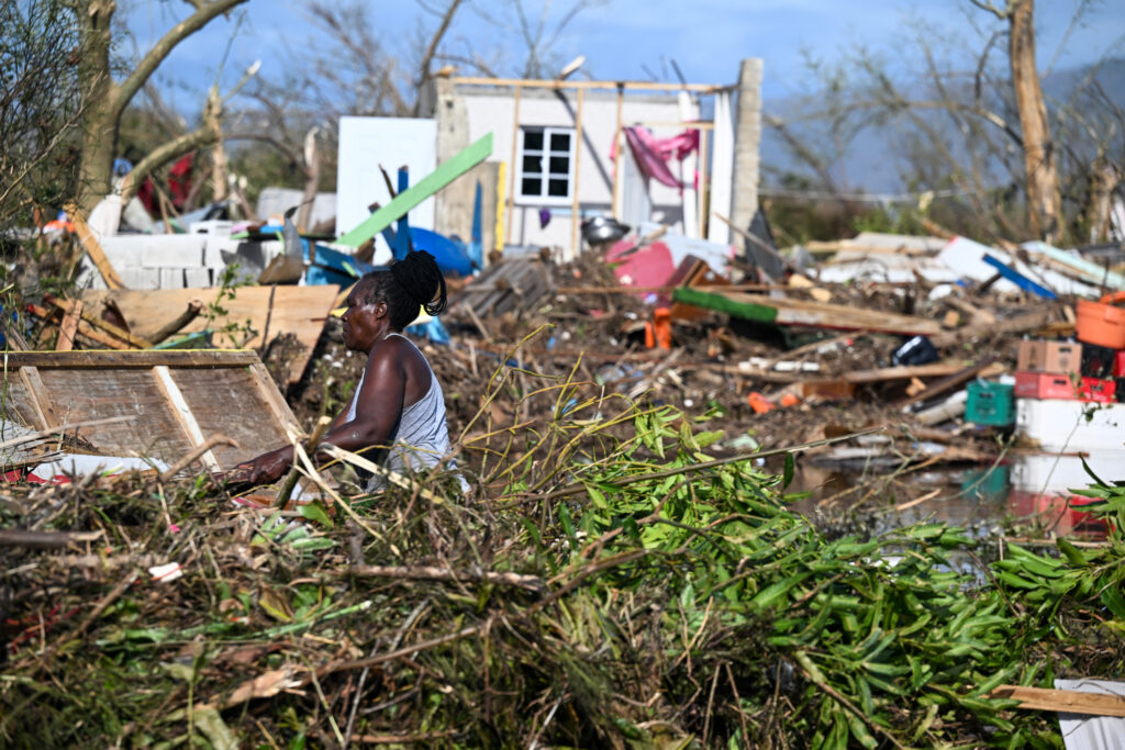
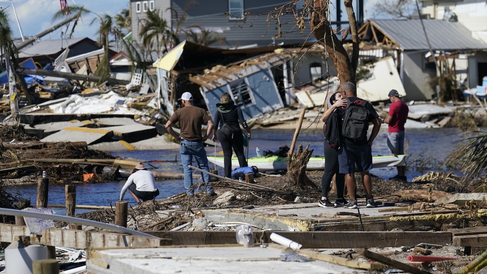
However, just as a hurricane’s impacts do not just lie along a narrow line, a hurricane’s damage doesn’t stop when it comes ashore. Some of the worst U.S. hurricane disasters in recent years have occurred well inland, including billions of dollars in wind-driven destruction across Georgia in 2018’s Michael, and the catastrophic, deadly flooding from 2024’s Helene, which killed more than 100 people in and around western North Carolina.