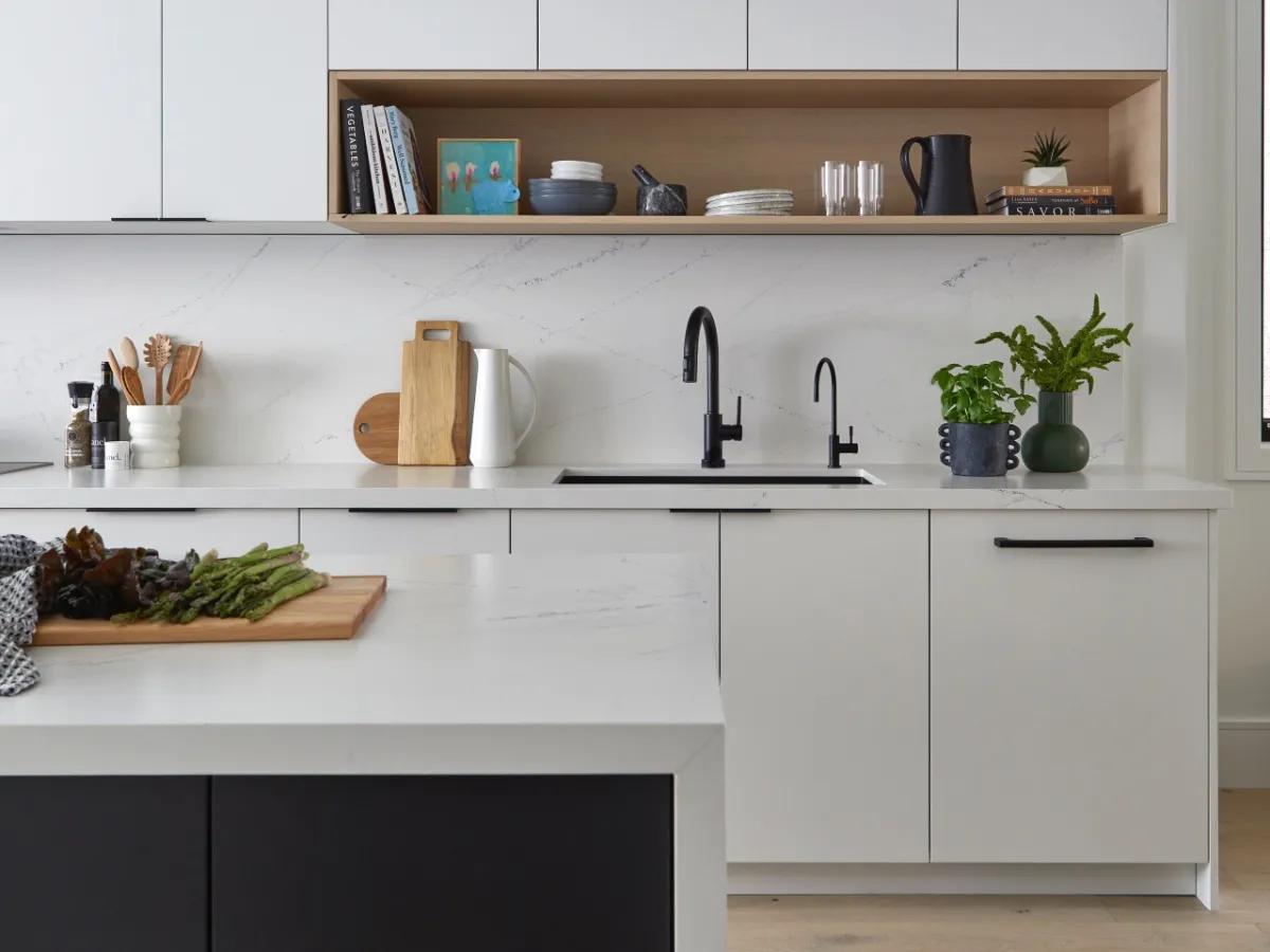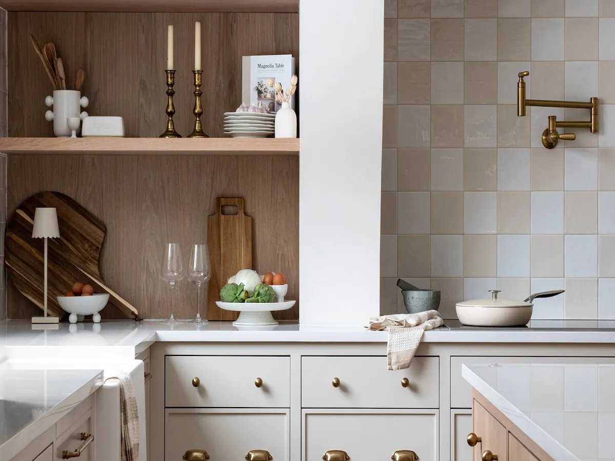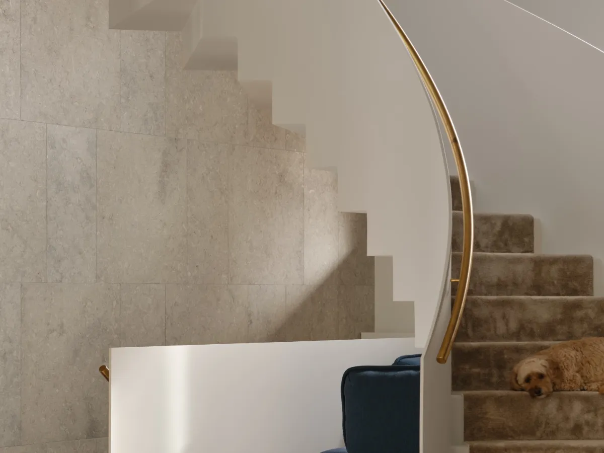
Skip to Content Subscribe Our Offers My Account Manage My Subscriptions FAQ Newsletters Canada Canadian True Crime Canadian Politics Health World Israel & Middle East Financial Post NP Comment Longreads Puzzmo Diversions Comics NP News Quiz New York Times Crossword Horoscopes Life Eating & Drinking Style Sponsored Play for Ontario Travel Travel Canada Travel USA Travel International Cruises Travel Essentials Culture Books Celebrity Movies Music Theatre Television Business Essentials Advice Lives Told Tails Told Shopping Buy Canadian Home Living Outdoor Living Kitchen & Dining Tech Style & Beauty Personal Care Entertainment & Hobbies Gift Guide Travel Guide Amazon Prime Day Deals Savings National Post Store More Sports Hockey Baseball Basketball Football Soccer Golf Tennis Driving Vehicle Research Reviews News Gear Guide Obituaries Place an Obituary Place an In Memoriam Classifieds Place an Ad Celebrations Working Business Ads Archives Healthing Epaper Manage Print Subscription Profile Settings My Subscriptions Saved Articles My Offers Newsletters Customer Service FAQ Newsletters Canada World Financial Post NP Comment Longreads Puzzmo Diversions Life Shopping Epaper Manage Print Subscription HomeHomesInterior design: “Texture, simplicity and warmth” This renovation took a Kitchener family home from peak ’90s to modern minimalism that is just cozy enoughLast updated 26 minutes ago You can save this article by registering for free here. Or sign-in if you have an account.The modern steel steps of the staircase are counterbalanced by a soft, deep-pile carpet runner. Photo by Doublespace PhotographyWe independently select everything we recommend. Buying through us may earn us a commission, which supports our work.A professional couple with two teens had their family home built in Kitchener 10 years ago. It was attractive for its time but, as the years passed, they found themselves feeling ready to “turn over a new leaf.” Enjoy the latest local, national and international news.Exclusive articles by Conrad Black, Barbara Kay and others. Plus, special edition NP Platformed and First Reading newsletters and virtual events.Unlimited online access to National Post.National Post ePaper, an electronic replica of the print edition to view on any device, share and comment on.Daily puzzles including the New York Times Crossword.Support local journalism.Enjoy the latest local, national and international news.Exclusive articles by Conrad Black, Barbara Kay and others. Plus, special edition NP Platformed and First Reading newsletters and virtual events.Unlimited online access to National Post.National Post ePaper, an electronic replica of the print edition to view on any device, share and comment on.Daily puzzles including the New York Times Crossword.Support local journalism.Create an account or sign in to continue with your reading experience.Access articles from across Canada with one account.Share your thoughts and join the conversation in the comments.Enjoy additional articles per month.Get email updates from your favourite authors.Create an account or sign in to continue with your reading experience.Access articles from across Canada with one accountShare your thoughts and join the conversation in the commentsEnjoy additional articles per monthGet email updates from your favourite authorsSign In or Create an Accountor“When it was first built, they hadn’t had a clear sense of their own design voice or what they really wanted,” says Merike Bauer, co-principal of Reigo & Bauer, the firm they hired to guide their renovation. “In terms of design and function, the house no longer aligned with their lives.” This time, they wanted a contemporary design that was quietly elegant but not so fancy that they wouldn’t feel comfortable putting their feet up on the furniture or welcoming in friends and family for informal gatherings. Italian limestone clads the fireplace surround. Photo by Doublespace PhotographyThe first time Reigo & Bauer visited, what stood out most was a series of pillars in the living room clad in facing stone. In the context of the original house, with its dark stained wood and bland off-white drywall, the pillars gave off a heavy 1990s feeling. But they could sense the pillars’ potential, given the right context, and the owners were fond of them and wanted to retain them if possible. The trick was to find a way to bring out what made them work. “Normally that kind of split-stone cladding isn’t something we would choose,” says Bauer. “But the idea was to balance the rough, tonal textures of the pillars with soft, neutral and minimalist surfaces and materials, then make everything else crisp and clean.” Creatively designed steps connect the sunken living room and the family room. Photo by Doublespace PhotographyThroughout the home, the key to the redesign is the recurring use of contrasts: rough and smooth, curved and rectilinear, dark and light, soft and crisp. Whether you notice it or merely sense it, it creates an air of artistic, unstuffy comfort; it’s elegant without being intimidating. It begins in the front foyer, where a curved staircase winds to the upper level. Previously, this had been one of those slightly awkward, double-height spaces ubiquitous in foyers a decade or so ago. “Usually, all you can do in a space like this is to put a table in and maybe top it with a vase of flowers,” says Bauer, whose firm handled the interior design as well. “We wanted to do something more interesting.” Hard lines in the renovated kitchen and living room are balanced by furnishings that are soft and curved; in the family room, an oversized ottoman does triple duty as seating, coffee table and a place to put feet up. Photo by Doublespace PhotographyNow the architecture of the foyer “holds the centre” of the home: the jagged line formed by the steel stair treads is sculptural, twisting upwards towards the second floor, contrasting subtly with a soft brown, deep-pile carpet runner. The kitchen, says Bauer, combines warmth and functionality just as smoothly. At one end, fully concealed appliances and striking stainless-steel countertops are pure minimalism. A backsplash made from three slabs of natural quartzite clads the back wall, forming a backdrop for a plaster-finished range hood. A three-sided fireplace at the other end, near the breakfast table, is similarly finished and forms a link with the sitting area just beyond. In the minimalist kitchen, pure white cabinetry, concealed appliances and a swath of quartzite covering the wall behind the cooktop create a serene mood. Photo by Doublespace PhotographyThe main lounging area consists of two joined spaces: a laid-back family room and a more formal living room three steps down from the rest of the house. Formerly, the division between the two rooms had felt awkward; the object became to connect them without losing the distinct character of each room. “The upper-level seating area was where you hung out before dinner, chatted with the cook and basically relaxed,” Bauer says. Soft, informal furnishings designed to stand up to frequent use were chosen, including a stylish Moroso swivel armchair upholstered in a charcoal quilted fabric, and an oversized tan ottoman that does extra duty as a coffee table and extra seating. The living room is more dressed-up but just as inviting. The pillars and a handsome formal fireplace with a mantel consisting of a single carved piece of contrasting limestone are the prominent elements here. Formerly a ’90s timepiece, pillars clad in facing stone take on a Frank Lloyd Wright-style beauty in their new context. Photo by Doublespace PhotographyThe architects left the pillars more or less alone; they cleaned them up a bit, augmenting them with additional facing stone where needed to balance the room. Some windows were extended to the floor, then limestone cladding was installed on walls and flooring. In this lighter, brighter setting, the pillars take on a clean, rustic look that is slightly reminiscent of Frank Lloyd Wright. Given the strong, linear composition of the room, the addition of soft, nubbly furnishings — overstuffed sofas and even a curvy coffee table — creates coziness. Overhead, a bubbly chandelier made of blown-glass globes by Giopato and Coombes look like upside-down balloons, adding a touch of whimsy. “People think that minimalism is cold, but it’s all about texture, simplicity and warmth; that’s what gives it its humanity,” says Bauer. “I love the material palette, and the way the old and the new bring it all together. It celebrates the existing, but alters it, through the introduction of the right colours and textures, for a beautiful overall effect.” Join the Conversation This website uses cookies to personalize your content (including ads), and allows us to analyze our traffic. Read more about cookies here. By continuing to use our site, you agree to our Terms of Use and Privacy Policy.
Interior design: “Texture, simplicity and warmth”
This renovation took a Kitchener family home from peak ’90s to modern minimalism that is just cozy enough
1,404 words~6 min read