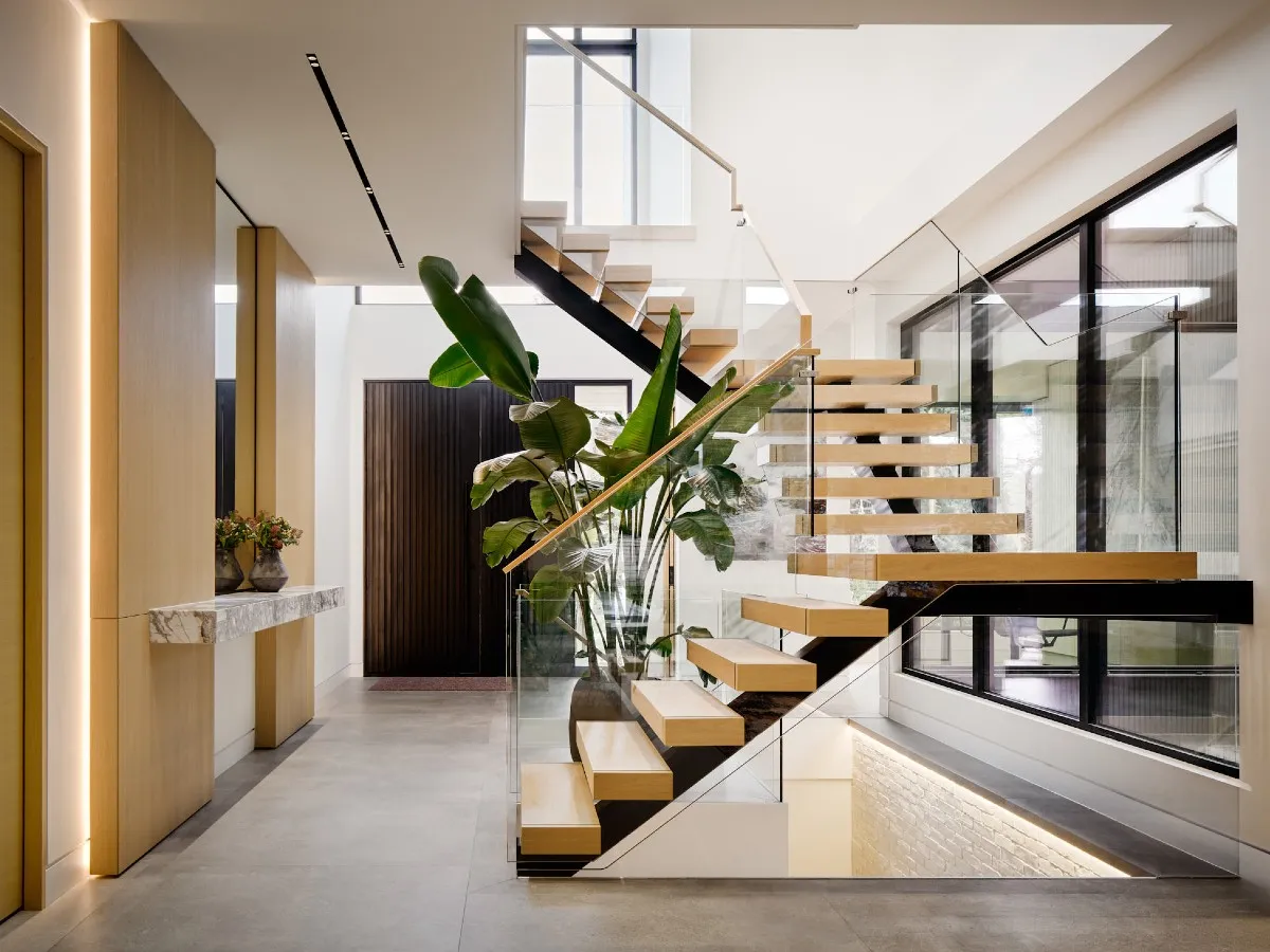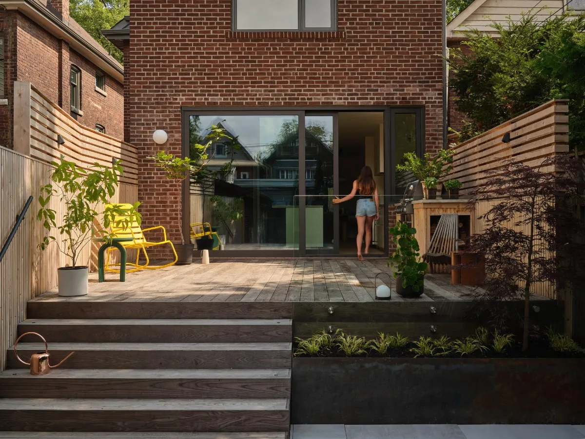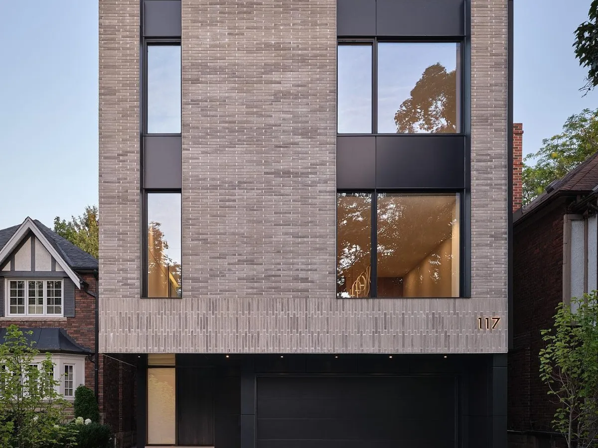
Skip to Content Subscribe Our Offers My Account Manage My Subscriptions FAQ Newsletters Canada Canadian True Crime Canadian Politics Health World Israel & Middle East Financial Post NP Comment Longreads Puzzmo Diversions Comics NP News Quiz New York Times Crossword Horoscopes Life Eating & Drinking Style Sponsored Play for Ontario Travel Travel Canada Travel USA Travel International Cruises Travel Essentials Culture Books Celebrity Movies Music Theatre Television Business Essentials Advice Lives Told Tails Told Shopping Buy Canadian Home Living Outdoor Living Tech Style & Beauty Kitchen & Dining Personal Care Entertainment & Hobbies Gift Guide Travel Guide Deals Savings National Post Store More Sports Hockey Baseball Basketball Football Soccer Golf Tennis Driving Vehicle Research Reviews News Gear Guide Obituaries Place an Obituary Place an In Memoriam Classifieds Place an Ad Celebrations Working Business Ads Archives Healthing Epaper Manage Print Subscription Profile Settings My Subscriptions Saved Articles My Offers Newsletters Customer Service FAQ Newsletters Canada World Financial Post NP Comment Longreads Puzzmo Diversions Life Shopping Epaper Manage Print Subscription HomeHomesModern design: “Very much a family home” A house design influenced by the Japanese architect Tadao Ando uncovers the warmer, livable side of minimalismLast updated 10 hours ago You can save this article by registering for free here. Or sign-in if you have an account.Concrete, smooth brick and black metal dominate the home’s minimalist palette, while an open-topped window wells lighten the visual weight of the brick. Photo by Younes Bounhar, DoubleSpace PhotographyReviews and recommendations are unbiased and products are independently selected. Postmedia may earn an affiliate commission from purchases made through links on this page.This serene Modernist home by Izen Architecture may appear simple in form, but sometimes simplicity can be deceptive. Enjoy the latest local, national and international news.Exclusive articles by Conrad Black, Barbara Kay and others. Plus, special edition NP Platformed and First Reading newsletters and virtual events.Unlimited online access to National Post.National Post ePaper, an electronic replica of the print edition to view on any device, share and comment on.Daily puzzles including the New York Times Crossword.Support local journalism.Enjoy the latest local, national and international news.Exclusive articles by Conrad Black, Barbara Kay and others. Plus, special edition NP Platformed and First Reading newsletters and virtual events.Unlimited online access to National Post.National Post ePaper, an electronic replica of the print edition to view on any device, share and comment on.Daily puzzles including the New York Times Crossword.Support local journalism.Create an account or sign in to continue with your reading experience.Access articles from across Canada with one account.Share your thoughts and join the conversation in the comments.Enjoy additional articles per month.Get email updates from your favourite authors.Create an account or sign in to continue with your reading experience.Access articles from across Canada with one accountShare your thoughts and join the conversation in the commentsEnjoy additional articles per monthGet email updates from your favourite authorsSign In or Create an AccountorThe design is the result of a collaboration between principal architect Brenda Izen and the homeowner, an interior designer and friend, Danielle Sucher of DS Interiors. “Danielle and I had worked on several other projects together over the years,” Izen recalls. “We became friends, and she said she knew that if she ever built a house, she wanted to do it with me.” Her family had lived on the lot for the past seven years, with the intention of rebuilding later. When the time came, they decided they wanted a better relationship with the backyard and the abundant greenery surrounding the house, and a design that worked better for the couple and their three kids. In the intricately engineered staircase, white oak risers, clean white walls and black-stained wood guards interact with natural light throughout the day. Photo by Younes Bounhar, DoubleSpace PhotographyThe two professionals also shared an interest in the work of the Japanese architect Tadao Ando, renowned for his way of carving and shaping natural light; his use of a limited palette and clean, refined materials such as concrete; and for buildings that are Zenlike in their spareness. (Though based in Osaka, Ando designed the multimillion-dollar Malibu mansion of Beyoncé and Jay-Z.) The simple but arresting geometry of the front elevation starts with textured-grey bricks that are longer than standard, giving them a tactile, almost woven appearance. The bottom three courses are set vertically, creating a border or a base, making the house appear to almost float on its recessed ground floor. An asymmetrical pair of window wells, set deeply into the brick in the front of the house and lined with black metal, are open at the top, creating a W shape, allowing more light in, particularly on the upper floor. The overall design follows a standard elevated floor plan, to accommodate a two-car garage on the ground floor and full-width living spaces one flight up. It’s an efficient use of a narrow city lot, but it also increases light in the interior and creates a gracious entrance, recessed under the cantilevered dining room above. The house is filled with playful details that manipulate light, such as the narrow reveals on the inside edges of the upper staircase. Photo by Younes Bounhar, DoubleSpace PhotographyThe dramatic foyer is reached through an oversize door, half black metal, half pebbled glass. Taking up a good part of the front and side section of the house and filled with light and air, the entryway also features a ceiling that soars a good 20 feet high. Like most of the house, the foyer is stripped of unnecessary details of any kind: the generous closet doors have recessed, integrated finger pulls; trimless pot lights are recessed into the ceiling and floor. Even the front door handles are black metal on a black door, which makes them disappear. Just beyond, the graphic black-and-white-oak staircase is lit by a huge skylight hidden from view at the top of the house. The shape of the stair is a riff on Ando, with its alternating flights of open and closed risers, concealing and revealing the light. In the top flight, a narrow reveal close to the wall sends slivers of light down through the space as the sun moves throughout the day, while exterior windows on the outer walls of the foyer and interior windows transmit light and views. As you turn at the top of the first flight, a white-oak-clad wall ahead directs the way to the main living area. The white oak wall turns out to be a pantry, joining dining room to the right and kitchen on the left, where the limited palette of white oak, black metal or stained wood, and white walls rises to grand effect. The white-oak pantry has pocket doors, while the black stained wood cabinetry is matte-finished. Sleek floor-to-ceiling black stained cabinetry features a minimum of hardware; even the faucets and sink disappear. Photo by Younes Bounhar, DoubleSpace PhotographyBut this is also the home of an active family. In the centre, a sintered stone island with a textured marble pattern, repeated in a side cabinet by the window, adds a familiar, human touch. It’s a place where kids can do their homework or hang out. The living room combines the same stripped-down materials in a supremely relaxed and comfortable setting. Floor-to-ceiling windows overlook mature trees in the backyard, while a three-sided fireplace with a chimney clad in reeded black oak takes up one end of a low black credenza. As Izen observes, the softness of upholstered items like the living room sofa, provides a warm counterpoint to the crisp lines of the architecture, playing up a homey feeling. Large windows framing leafy views, and the soft textures of sheers curtains and an invitingly overstuffed sofa, make the living room both cozy and expansive. Photo by Younes Bounhar, DoubleSpace PhotographyPowder rooms are always a place to show off, design-wise, even in a house where simplicity rules the day. In this one, gently textured micro-cement walls in a warm grey add a gentle contrast to the white that clads most of the interior. The vanity consists of a sintered stone in a darker, more dramatic pattern than the one chosen for the kitchen island. Even here, the lighting is only flamboyant by comparison: a trio of elegantly tailored spherical lights look like buttons on a sleeve. The ensuite required a bit of wizardry on the part of the builders, Izen recalls. The objective, she explained, was to get the light to fall from an overhead skylight into the shower despite the room’s complicated geometry. The reward, she says, is that during the day, the only light you need in the shower is natural light. The use of hard, refined materials and a monochromatic palette could make a house like this seem a little cold in its beauty, and yet it’s not; it’s warm and full of life. In a way, that’s the complexity that the simple design conceals. The ceilings are high, but the rooms are scaled to human beings; large windows frame views of trees and neighbourhood life. “The architecture may be hard and minimalist, but the furnishings, the curtains, how they live in the home, is comfortable and relaxed,” Izen says. “It’s very much a family home.” Join the Conversation This website uses cookies to personalize your content (including ads), and allows us to analyze our traffic. Read more about cookies here. By continuing to use our site, you agree to our Terms of Use and Privacy Policy.
Modern design: “Very much a family home”
A house design influenced by the Japanese architect Tadao Ando uncovers the warmer, livable side of minimalism
1,567 words~7 min read