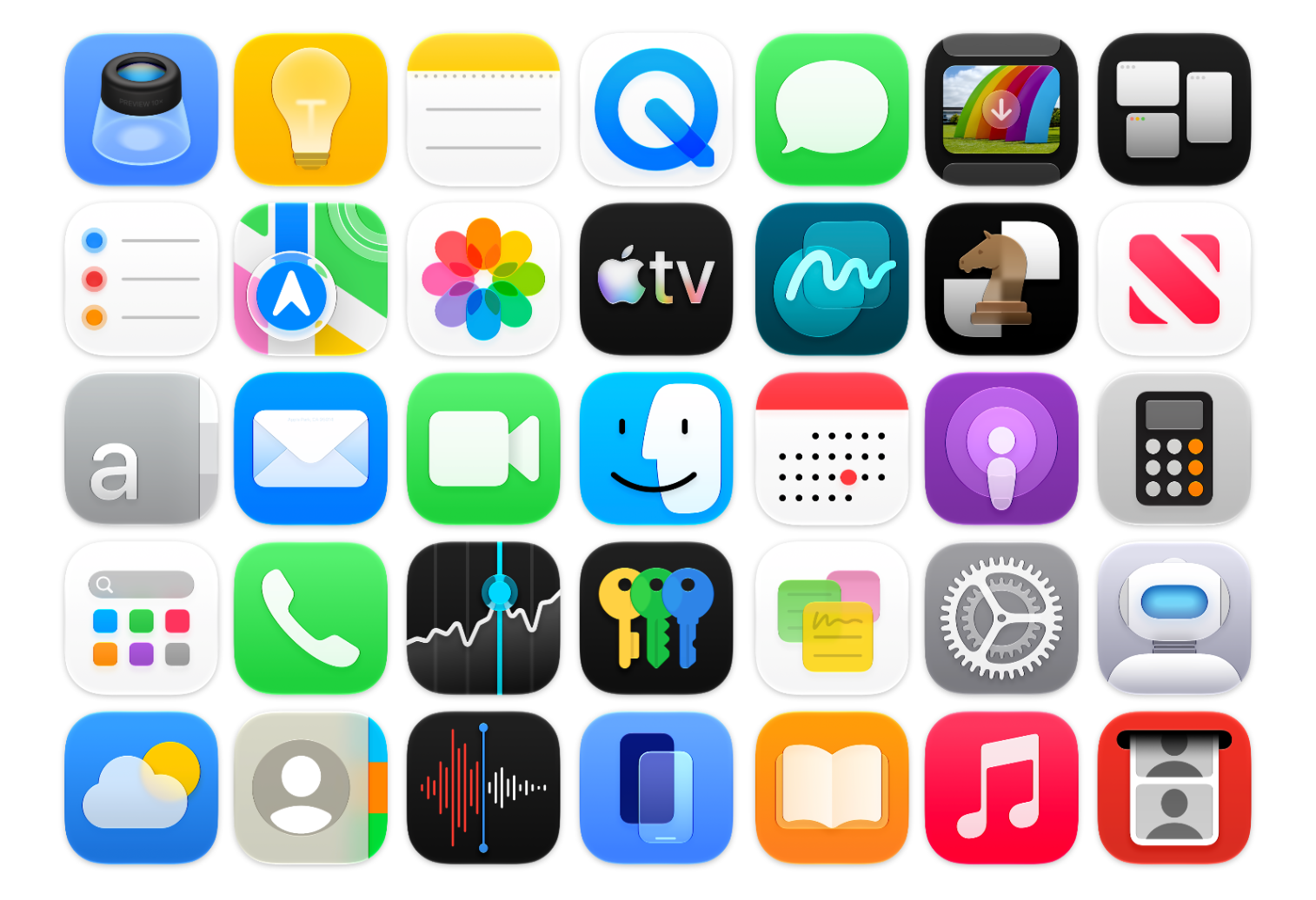
WWDC always brings a torrent of new content, details, and platform-wide changes. One of the first things I noticed after installing the macOS Golden Gate beta was the updated icon design. The colours are much bolder, several icons have been adjusted, and the refraction in the Liquid Glass effect has changed significantly, especially in icons like Journal.There’s also a noticeable sharpness to the icons, along with a flattening of the Liquid Glass effect. I’m not sure yet whether this is simply an early-beta artifact or the intended final look. For example, while I really like the redesigned Finder icon, the sharp black edges around the nose currently feel a little unrefined.Here are a list of many of the icons across macOS Golden Gate (beta 1) compared to their liquid glass Tahoe counterpart. Enjoy!
macOS Golden Gate Icon Comparison — Basic Apple Guy
Comparing the new system applications of macOS Golden Gate (Beta 1) icons to those of macOS Tahoe
TL;DRAI
Apple redesigned macOS Golden Gate's icons with bolder colors, refined Liquid Glass effect, and sharper lines compared to Tahoe. The visual update appears unfinished; rough edges suggest design is still WIP—no material impact on enterprise deployments.
133 words~1 min read