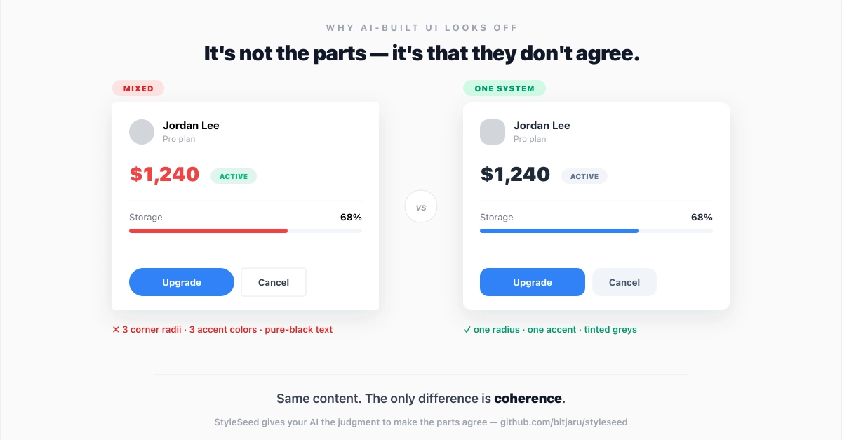
You shipped the feature. The code works. But something feels off.
You squint at the screen, toggle between breakpoints, and that… yeah. The button doesn't quite pop. The text feels muddy against the background. The dark mode version looks like someone just inverted everything and called it a day.
You're not imagining it. And you're not alone — this is one of the most common threads on r/webdev and in design-focused Discord servers. The gap between "technically valid CSS colors" and "colors that actually look right" is wider than most developers realize.
The good news? You don't need a design degree to close it. You need to understand three things: contrast, color space, and systematic palette building.
Contrast: The Problem Most Developers Underestimate