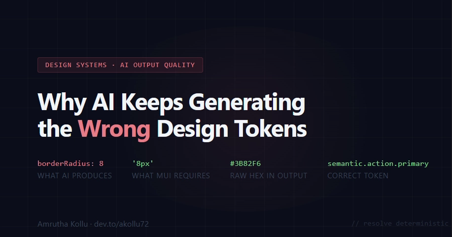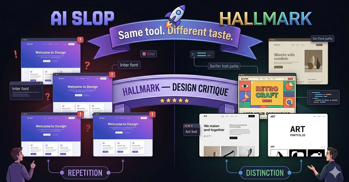
You've seen it. You ask an AI to build a dashboard, and it returns something that's… fine? Every component is individually competent. The button is a button. The card is a card. And yet the whole thing reads as generated — like a stock photo of a UI.
For a long time I assumed the fix was "better components" or "more taste in the prompt." It isn't. After digging through the actual design literature — Refactoring UI, Material Design 3, Apple's HIG, IBM Carbon, WCAG, the Financial Times' visual vocabulary — the real culprit has a name:
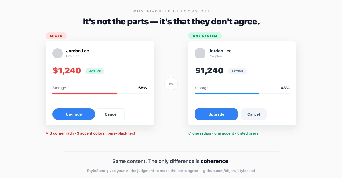
Incoherence.
The parts don't agree with each other. And once you can see it, you can't unsee it.
I've written before about why your vibe-coded app looks ugly and what I did about it. This post goes underneath that — the actual mechanism behind the "off" feeling, and the one principle that fixes it.