Open Lovable, v0, or Bolt. Describe an app. Hit generate.
In thirty seconds you have a working UI — cards with rounded corners, a sidebar with icons, a dashboard with soft shadows, a color palette that feels vaguely familiar. It works. It's clean. It's perfectly... fine.
And that's exactly the problem.
The "fine" problem
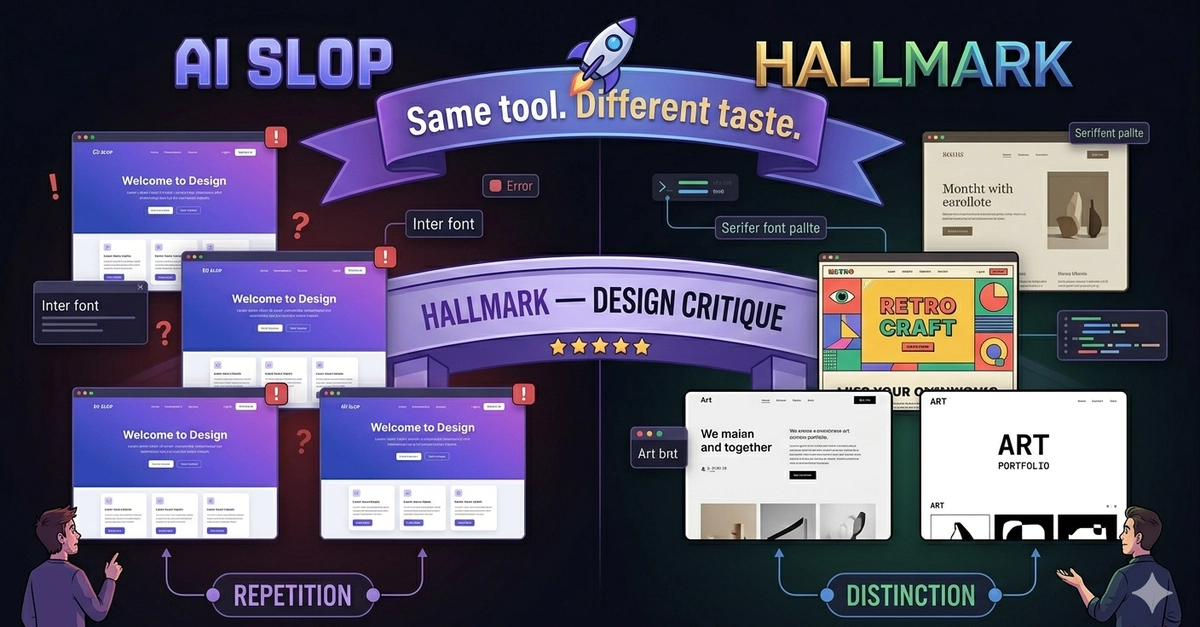
There's a specific aesthetic that AI-generated UIs tend to converge on. Tailwind defaults. shadcn/ui components. A blue or purple primary color. A hero section with a headline, a subheadline, and a CTA button. A features grid with icons and three-word labels.