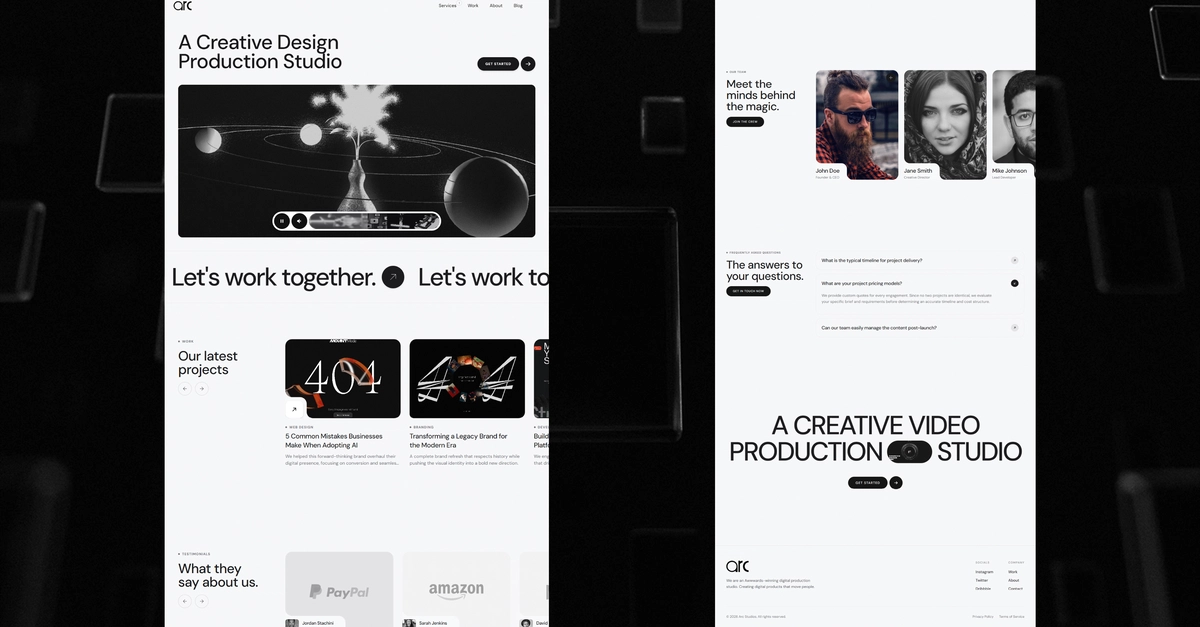
If you’ve been building with Claude or Cursor for the last year, you’ve noticed a pattern. The code comes out clean. The logic is sound. But the interfaces? They look like 2015-era Bootstrap clones. Everything has the same rounded corners, arbitrary shadows that don't communicate depth, and linear animations that feel robotic rather than organic.
AI agents are incredible at generating functional HTML and CSS, but they lack a fundamental concept: design intent. They can write the code to make a button blue, but they struggle to understand why that button needs a specific spring-based scale effect when pressed, or how its elevation should change relative to the background surface.
They produce 'zombie' interfaces—functional, but lifeless and fundamentally broken for high-end production use. This isn't just an aesthetic problem; it’s a technical one involving accessibility, usability, and user agency.
I recently started using something called the UI/UX Excellence Prover via Vinkius to close this gap. It doesn't generate code—that's not its job. Instead, it acts as a design unit test for your agentic pipeline. You aren't asking it to 'make it look better'; you are asking it to validate that the generated component meets 2026-era standards across six specific pillars.