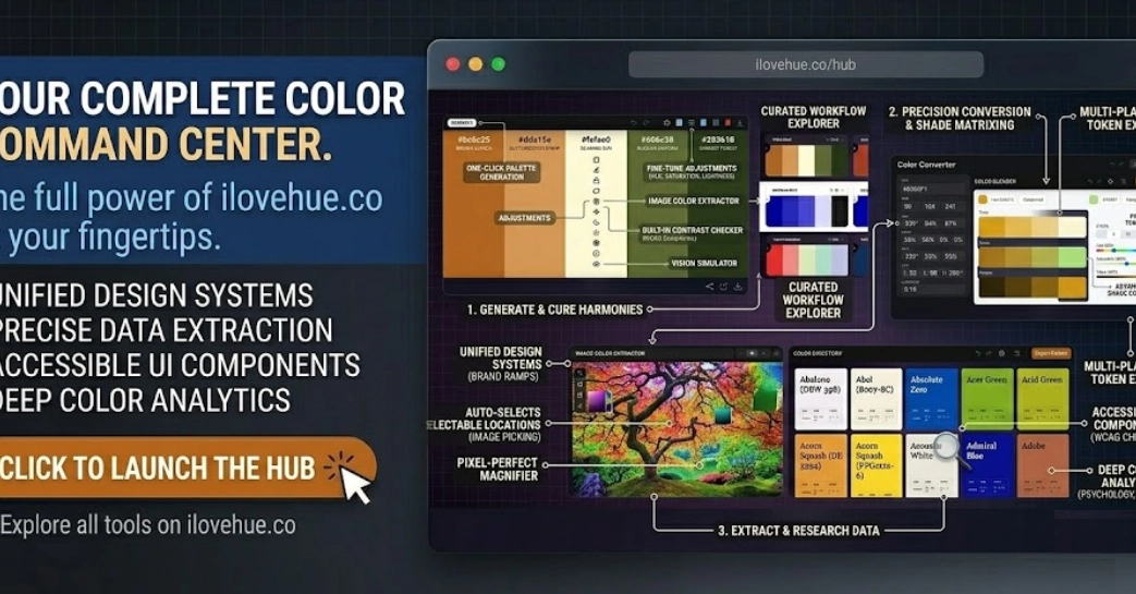
Every developer building UI eventually hits the same problem: you're constantly switching tabs for color tools—contrast checkers, palette generators, Tailwind scales, image pickers.
It should take 30 seconds. It takes 15 minutes.
Color work is one of those tasks that should take thirty seconds but ends up consuming fifteen minutes of context-switching. This guide covers the color tools that are actually worth bookmarking — what they're good for, where they fall short, and how to structure a workflow that keeps you in flow.
The Core Problem With How Most Developers Handle Color
Color tools are abundant. The problem is they're fragmented. Most tools do one thing well: a contrast checker that only checks contrast, a palette generator that only generates palettes, a converter that only converts. So developers end up building a collection of five or six different bookmarks, each for a separate micro-task.