Originally published on danholloran.me
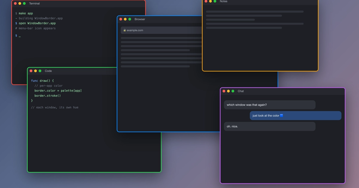
A typical day moves through a lot of windows. Editor, terminal, a git client, a notes app, and lately an agentic coding tool or two. Each one ships its own default theme, and even when you pick a "good" one in each, the seams show: the blue that means keyword in your editor means directory in your shell and link in your notes. Your eyes re-learn the color language every time you switch context. It is a small tax, but you pay it hundreds of times a day.
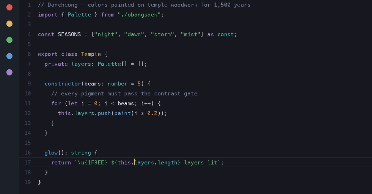
Grimicorn started as a fix for that tax. It is a calm, low-fatigue color theme — the name is grim reaper × unicorn, dead serious but secretly colorful — built on a muted blue-gray base with soft pastel syntax. The real work, though, was not picking the colors. It was making one palette behave identically across fourteen different tools.
Color by role, not by name
The mistake most themes make is thinking in colors instead of roles. "I'll use teal here because it looks nice" is how you end up with a teal that means three unrelated things in three places.