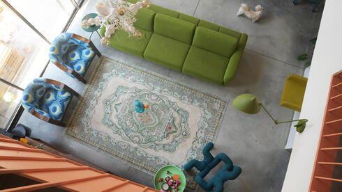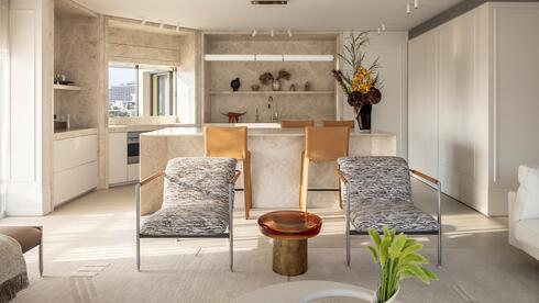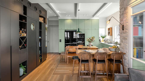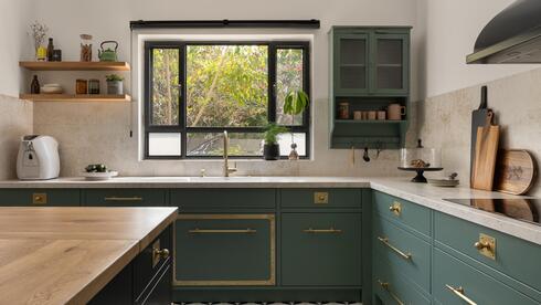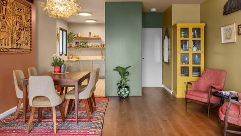
A generic living space has been upgraded with extensive use of color and a re-division of rooms; The homeowner, who moved from a moshav to the big city, didn't hesitate to introduce burgundy, coffee, yellow, green and orange, so that there are no white wallsNoam Ron|When the tenant, a 60-year-old retiree and gifted mosaic artist, decided to leave the moshav for life in the big city, she knew she was not looking for a standard contractor apartment but an authentic, personal home.She turned to interior designer Maya Birger, who took a generic four-room apartment in north Tel Aviv and translated the vision into a distinctive material and color language. During a complete renovation, the apartment was converted into a spacious three-room home where old and new blend into a private gallery full of character and color.15 View gallery A space built around the resident's unique personality(Photo: Shiran Carmel)“It was clear to us that this would not be a ‘regular’ home,” Birger says. “This is a space built around the tenant’s special personality, a place where there is not a single white wall and her lifestyle is reflected in every corner.”The renovation included a full demolition and replacement of all infrastructure, with contractor Shahar Planning and Construction, alongside a change in layout. The central move was breaking walls and eliminating one room to open up the corridor.“On one side there was a guest bathroom, and on the other a room,” Birger says. “We opened the room and broke up the corridor. The space created now serves both as a reading corner and as a work and creative area, which were important to the homeowner. I canceled the guest bathroom and connected that area to the master bedroom to enlarge its bathroom and make it spacious and comfortable.”15 View gallery The kitchen and dining area. Started with marble furniture and progressed (Photo: Shiran Carmel)15 View gallery The living room. The sofa was moved from thr moshav and reupholstered (Photo: Shiran Carmel)15 View gallery There is no white wall, sometimes there are even contrasting shades next to each other (Photo: Shiran Carmel)According to the designer, work on the apartment began with what already existed, and then moved to filling in what was missing. They started by mapping and evaluating the existing items, artworks and objects. Then they moved on to choosing the color palette and redesigning the division of spaces.“We hardly bought anything new,” Birger says. “We worked with the existing things. Her furniture, her art, her rugs.”Much of the furniture moved with the tenant from her previous home in the moshav. Old Villa Maroc sofas were reupholstered, the bedroom furniture remained and was upgraded with contemporary textiles, and some of the lighting fixtures also made the move. The new purchases — such as the dining area, bathroom vanities and TV cabinet — were chosen so they would not look new, but would blend harmoniously with the apartment’s chosen language and style. The art, especially the tenant’s mosaic works, became an integral part of the planning.15 View gallery A baroque-style mirror found in a store that imports items from castles in France(Photo: Shiran Carmel)15 View gallery Art integrated into the apartment (Photo: Shiran Carmel)15 View gallery The dining area is set on a carpet. Colorful of course(Photo: Shiran Carmel)“There is not a single white wall in the house. Even for the light-colored walls, we chose a delicate café au lait shade, not white,” Birger says.“The palette is based on deep tones — burgundy, mustard, earth colors — that appear in the homeowner’s artworks. The colors served as a tool for dividing the space or ‘tying’ different spaces together in the same language. In the dining area, for example, the wall color continues onto the ceiling and frames it, while in the living room we added burgundy that continues into the reading corner, the hallway and the room doors, creating a sense of one space. We chose a Benjamin Moore color palette with subtle levels of sheen. That meant the walls themselves had to be perfectly leveled and flawless. It was painstaking work.”15 View gallery The kitchen is functional with many work surfaces (Photo: Shiran Carmel)15 View gallery The kitchen's soft mint shade balances the bright tones in the home (Photo: Shiran Carmel)15 View gallery The coffee corner created thanks to the angle in the wall (Photo: Shiran Carmel)The kitchen was redesigned to be functional and spacious, despite the modest starting conditions of the space. One area was used for an inviting coffee corner, while the service area, where the washing machine is located, was covered in the same tiles as the kitchen to maintain visual continuity.“It was important to us that the laundry area also feel like part of the home, so we left it without a door and with plenty of storage,” Birger says.In the entrance foyer, the depth behind the refrigerator was used for a hidden cabinet for bags and shoes. Another striking item is a Baroque-style mirror found in a store that imports items from French castles, adding character from the first step inside.The master bedroom underwent a major change: The guest bathroom and original shower were combined into a pampering, accessible bathroom. The wall between the bedroom and bathroom was opened, and a sliding glass door was installed in its place to bring in more light and create a sense of space and openness.15 View gallery The ceiling is also colorfully painted(Photo: Shiran Carmel)15 View gallery The bedroom is calming and is used for yoga practice (Photo: Shiran Carmel)15 View gallery Art and color in the bathroom too(Photo: Shiran Carmel)15 View gallery Sliding glass doors make the bathroom more accessible and more spacious-looking (Photo: Shiran Carmel)The bedroom furniture, as noted, was already owned by the tenant, and was refreshed with light textiles and wallpaper that soften the feel and atmosphere.“The spacious bedroom was deliberately kept clean and airy. The tenant, who practices yoga, asked to leave the space open for practice, so it was decided not to place a wardrobe there. The adjacent reinforced safe room was converted into a walk-in closet, fully custom-built, including a seating bench with storage that allows several people to sit comfortably if a prolonged stay is needed,” Birger explains.She notes that the home’s carpentry was done by La Casa Kitchens; the lighting was chosen at Kamchi Lighting and BaBoo; the textiles are from Keren-Or BaBayit; and the ceramics and bathroom fixtures ware were purchased from A.A. Ceramics.According to the designer, the home’s uniqueness lies in the small, unexpected details scattered throughout. A mosaic mirror created by the tenant was hung in the bathroom; a unique feathered light fixture completes the composition on the cabinet in the reading corner; and the chandelier designed by Yehuda Ozen above the dining area was upgraded with a decorative rosette.15 View gallery A touch of vintage(Photo: Shiran Carmel)Birger was also not afraid to incorporate humorous elements, such as a small monkey figure in the kitchen that brings a smile.“I am proud of the home that was created here. It is a home that truly reflects the person who lives in it,” Birger concludes. “The most moving moment was when her son entered the apartment for the first time and said, ‘Mom, this is simply you.’ For me, as a designer, that is the greatest success. I was privileged to work with a brave client who allowed me to step outside the routine and create something authentic and unique together with her.”
Even the ceiling is colorful: Designing a Tel Aviv apartment for a retired artist from the moshav
A generic living space has been upgraded with extensive use of color and a re-division of rooms; The homeowner, who moved from a moshav to the big city, didn't hesitate to introduce burgundy, coffee, yellow, green and orange, so that there are no white walls
1,243 words~6 min read