An Arabic type preview becomes more useful when it helps a designer classify intent. “Which one looks best?” is too vague. The better question is whether the phrase needs readability, geometry, ceremony, ornament, handwriting energy, or poetic flow.
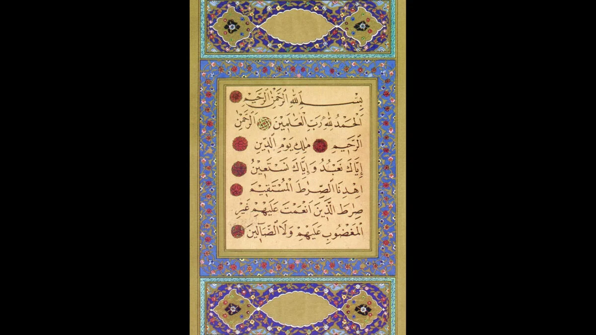
Six familiar script directions make that distinction visible: Naskh, Kufic, Thuluth, Diwani, Ruq'ah, and Nastaliq. They should not be treated as interchangeable decorations. Each changes the apparent density, rhythm, and purpose of the same phrase.
Define the intent before rendering
A preview UI can ask for a short design intent alongside the text:
type PreviewIntent =