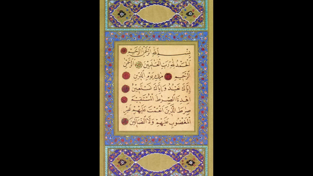
How do you justify Arabic text? It’s a simple question, but—as cataloged in a lengthy interactive post on the blog La Vita Nouva—it has a remarkably deep and fascinating answer. The story begins with a single support ticket complaining that “a block of mixed-content Arabic prose on the customer-facing dashboard was rendering with a ragged left edge (the rag falls on the left in Arabic, since the lines set out from the right margin; the ticket said ‘ragged right’) when the design team had explicitly specified justified text.” Before we dive into this, just so we’re clear—and so I don’t have to keep using phrases like “justifying Arabic”, which unfortunately sounds somewhat awkward in the current political climate—”justification” in this context means stretching the text so that it sits flush with both margins. OK? Good. So: how do you justify a block of text? If you’re dealing with the Latin alphabet we use for English, the answer is relatively simple—you simply increase the space between words. If you’re a little more sophisticated about it, you can also hyphenate words and perhaps increase the space between letters, although you can only go so far with the latter approach before the words themselves start to decohere and read as individual letters.
Typographers Have Spent a Thousand Years Trying—and Failing—to Render Arabic Properly
How a millennium of kludges and workarounds led to one man's "will not fix."
830 words~4 min read