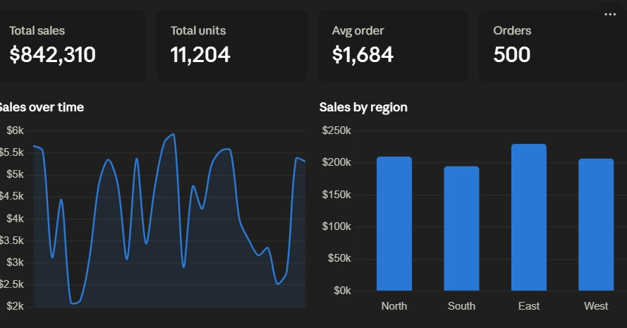
In this tutorial, we explore the advanced visualization capabilities of the XY Python library by building interactive, scalable, and extensible charts. We begin with XY’s composition model, where we combine multiple marks, dual axes, annotations, tooltips, legends, themes, and interactive controls within a single chart declaration. We then work with Pandas DataFrames, faceted layouts, linked viewports, and million-point datasets that automatically switch to density-based rendering for efficient exploration. We also connect browser interactions back to Python through selections and callbacks, update charts dynamically through streaming, customize visual components with DOM slots and CSS, and extend the library with a reusable custom trendline mark. Also, we use the Matplotlib-compatible interface and export our visualizations as standalone HTML, SVG, and PNG files.
import subprocess, sys, os
subprocess.run([sys.executable, "-m", "pip", "install", "-q", "xy"], check=True)
WIDGETS_OK = True
try: