Every team eventually opens a competitor's website, takes one look at the colors, and asks the wrong question: "Can we get the exact hex values?" The better question — the one that actually moves product work forward — is "What constraints produced that palette, and which of those constraints do we want to inherit?" A palette is the surface; the system behind it is the asset. This article walks through how to read a competitor's color system, decide which pieces are worth borrowing, and ship a new one that holds up under accessibility review, brand review, and the inevitable "make it pop" meeting.
What You're Actually Looking At When You Look At a Palette
A website usually exposes two to seven "brand" colors and a much larger set of neutrals, surface tints, and semantic tokens (success, warning, danger, focus). The brand hexes are the easy part. The interesting work is in the gradients, the subtle border tones, and the way the neutral text scales from 12px to 32px without changing contrast. Those details encode decisions about contrast targets, theme count, and how the design system treats elevation.
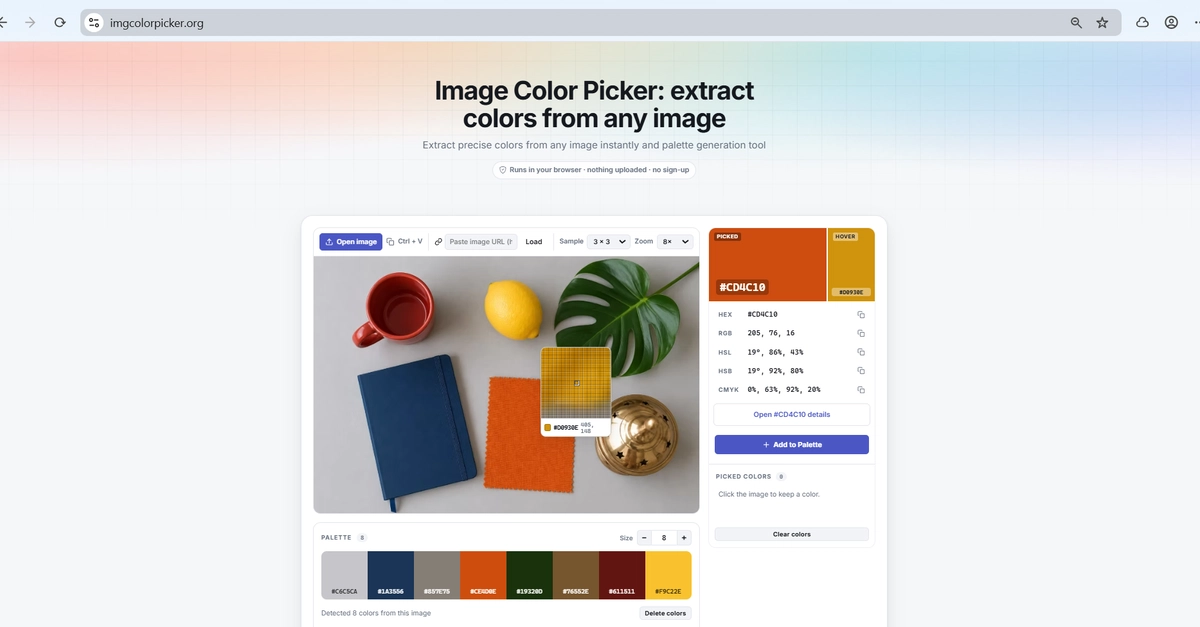
The most useful first move is to sample more than the hero. Pull the body text color, the muted secondary text, the disabled control color, the focus ring, the link color, and the surface beneath a modal. Five to eight swatches across these surfaces will tell you more about the system's intent than any single logo.