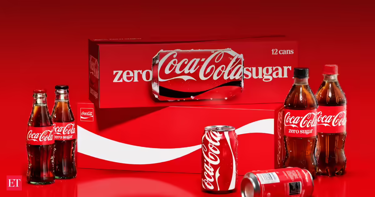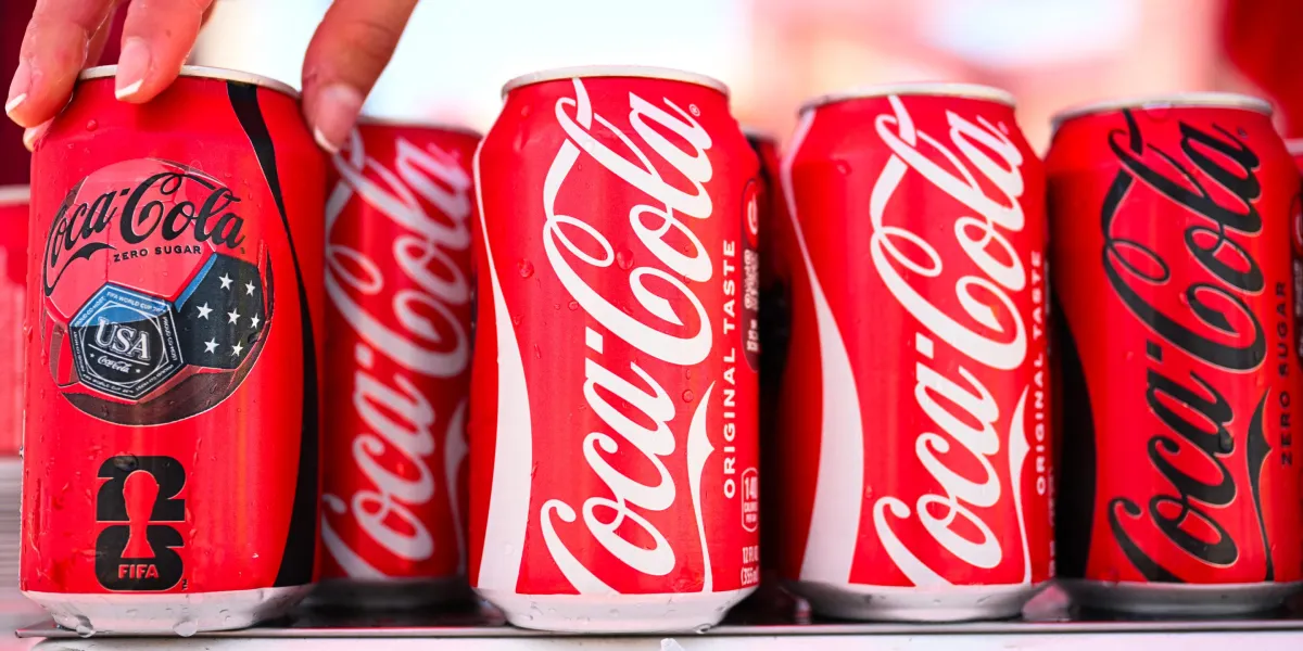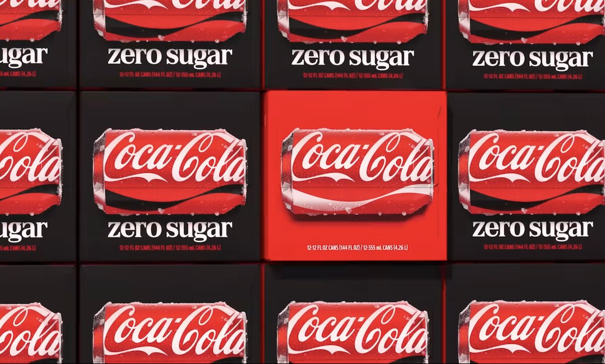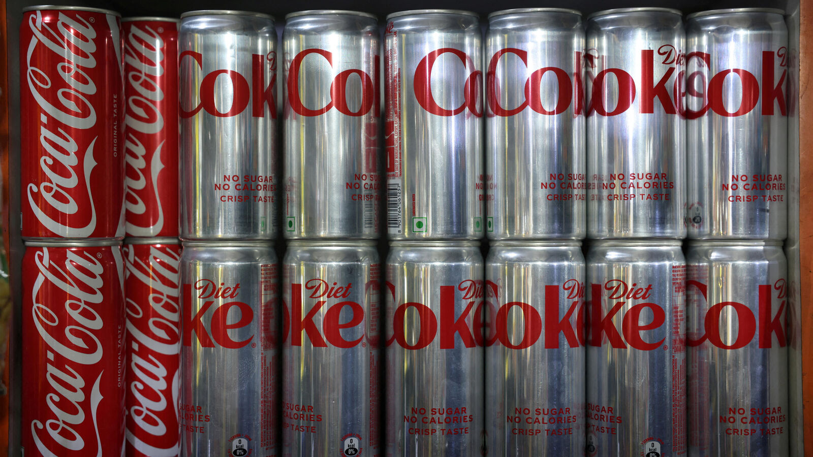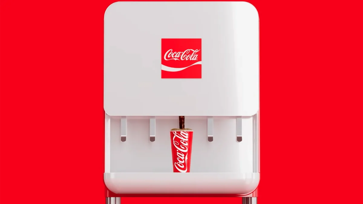
Coca-Cola announced a subtle tweak to its brand design on Monday. The iconic beverage company dubbed it a “visual refresh,” and there’s a new 90-second video to announce the changes. But social media users have spotted something weird. What was your first thought after watching that video? If you were craving a cigarette, you’re not alone. “The typeface looks very similar to Marlboro,” one user wrote in a common response. Another user wrote, “Love that they just leaned into the fact that soda is the new cigarettes by just straight up doing the Marlboro font.” Love that they just leaned into the fact that soda is the new cigarettes by just straight up doing the Marlboro font pic.twitter.com/NTO3VGFdcL — DriftedTekk (@driftedtekk) July 20, 2026 Designer Andreas Storm notes that it’s technically a different typeface, but there’s no denying the similarities.
It's not the Marlboro font pic.twitter.com/kV1YERJexU — Andreas Storm (@avstorm) July 20, 2026 Marlboro is the most popular cigarette brand in the world and has been for decades. That’s where things can get a bit tricky from a branding perspective. Sugary sodas aren’t healthy by any stretch of the imagination. By the early 21st century, tobacco became the one consumer product with which you definitely didn’t want your own brand associated. Whenever people identify a new public health threat, it’s inevitably compared to tobacco.