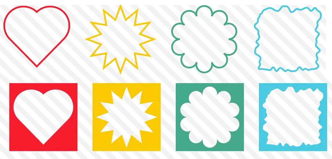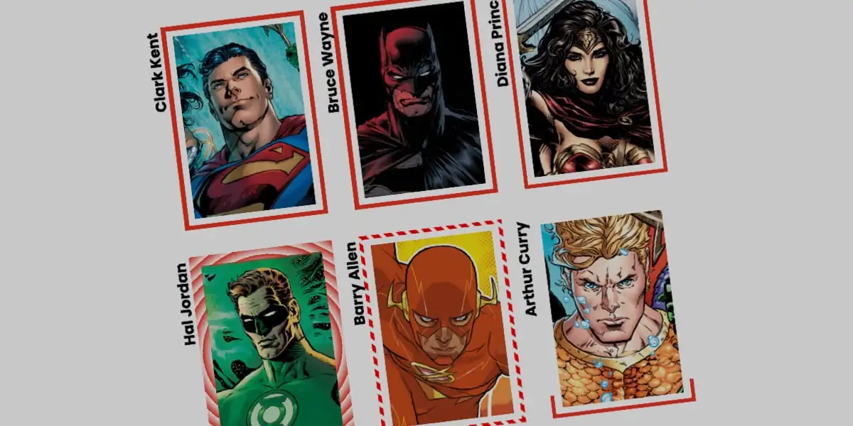
Every time you slapped a clip-path on a card and then added a border, you watched the border evaporate. Same with box-shadow. Same with outline. The element got cut into a nice shape, and every piece of decoration you had painted around it got cut off with it. That was fine, because we didn't have a choice. It's not fine anymore.
CSS-Tricks has an explainer by Temani Afif on the incoming border-shape property, and the pitch is the one thing you actually want: shape the box, keep the border. Verdict up front — this is the property clip-path should have shipped with, and I'm honestly relieved it exists.
Why clip-path was never the answer
Here's the mechanism. clip-path (and mask) clip the whole element after painting, decorations included. Your 8px red border? Painted, then clipped along the same path as everything else. The article is uncompromising on this: put a border on a clipped element and, as it says, borders are "a big NO." Same physics for box-shadow, same for outline. Anything living outside the box or riding its edge gets guillotined at the clip.
border-shape swaps the model. It doesn't clip. It shapes. The border, the box-shadow and the outline follow the new outline instead of the rectangle underneath. That is the whole trick, and it is a big one.