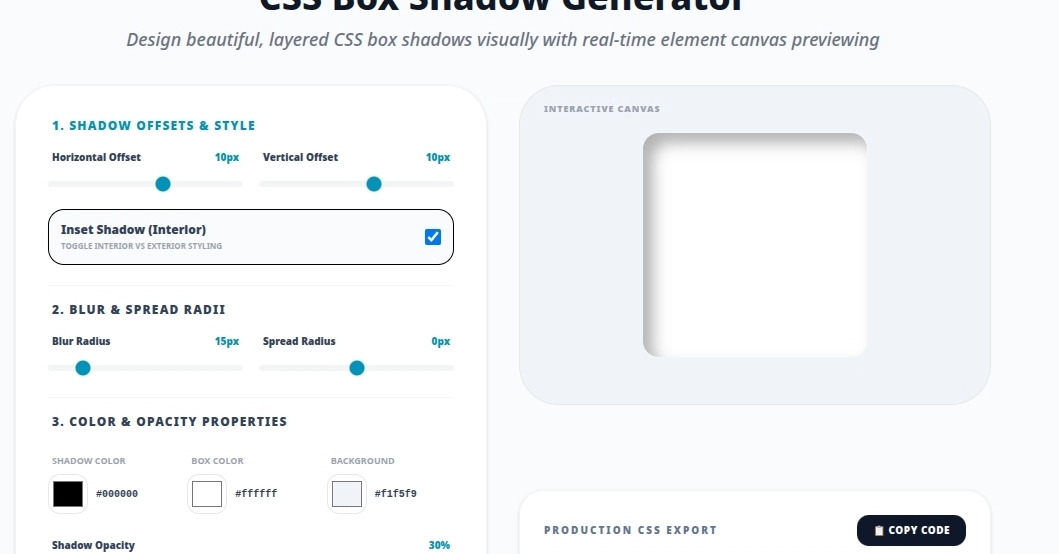
The box-shadow property is one of the most powerful CSS properties for making UI elements feel real. A well-placed shadow turns a flat button into something you want to click. A subtle card shadow separates content from the background without a hard border. But getting it right from memory is genuinely hard — the syntax has five parameters, and composing multiple shadows mentally is nearly impossible.
This guide covers everything you need to know about CSS box shadows, from the syntax to layered shadows, common presets, and performance tips.
The Syntax
box-shadow: [inset] offset-x offset-y [blur-radius] [spread-radius] color;
Enter fullscreen mode