I came across Kitty Giraudel’s folded corners technique. It leverages CSS clip-path, and I thought that that was such a cool way to do it. clip-path has been trending lately, most likely because web browsers support the shape() function now.
However, I’ve been on a bit of a corner-shape kick lately (have a look at my introduction to corner-shape as well as these scroll-driven corner-shape animations), so I figured that corner-shape could be used to create folded corners as well, and this is what I came up with:
So open Chrome, which supports corner-shape, and let’s dig in (if you’re looking at this in other browsers, it basically falls back to a rounded corner).
Step 1: Set some CSS variables
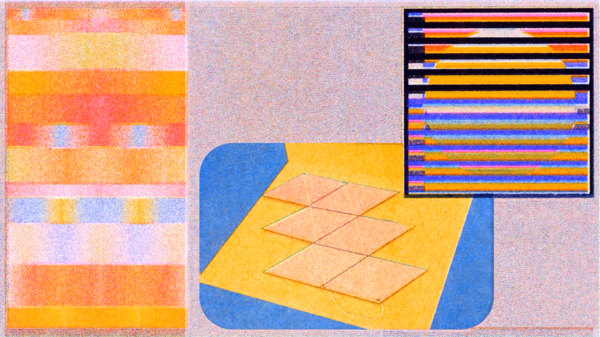
Elements have four corners, but when we use border-radius, each corner is split into two coordinates. The x-axis coordinate moves along the x-axis, away from its associated corner, while the y-axis coordinate does the same thing along the y-axis. It’s from these coordinates that border-radius draws the curvature of the rounded corners.