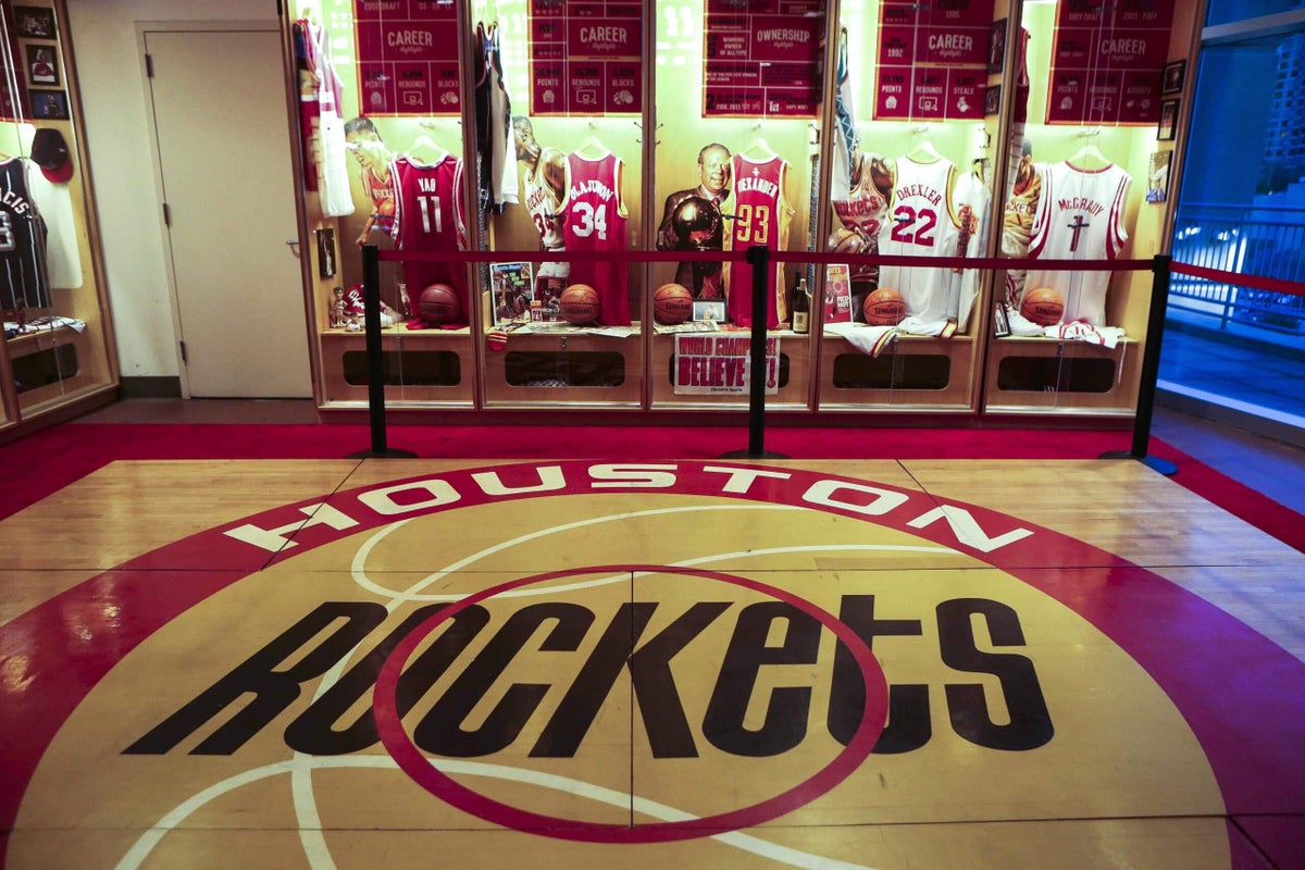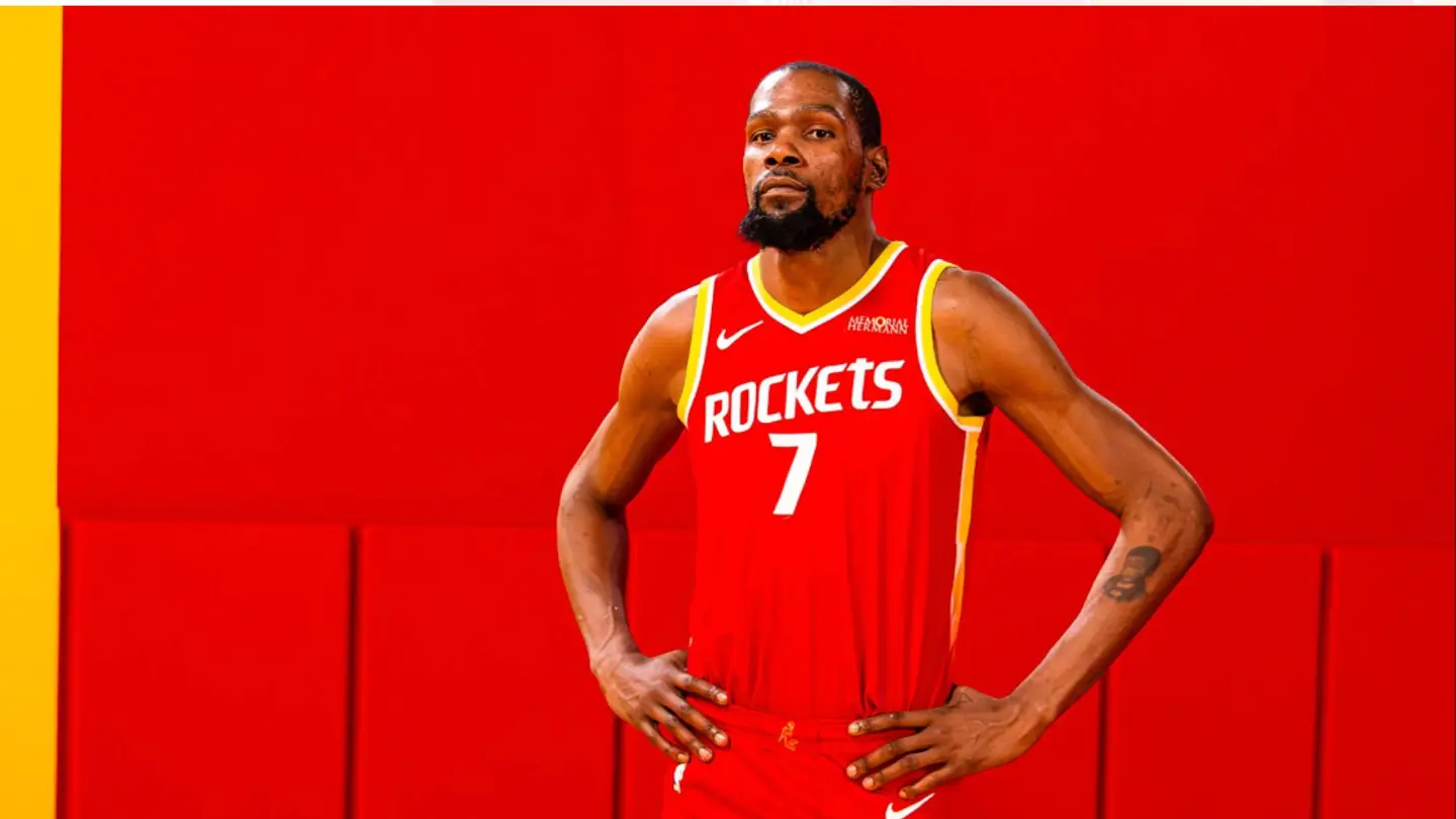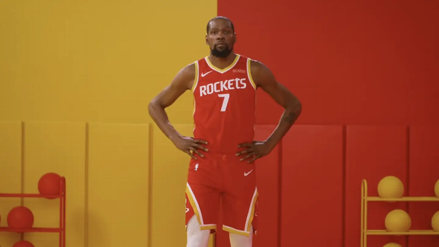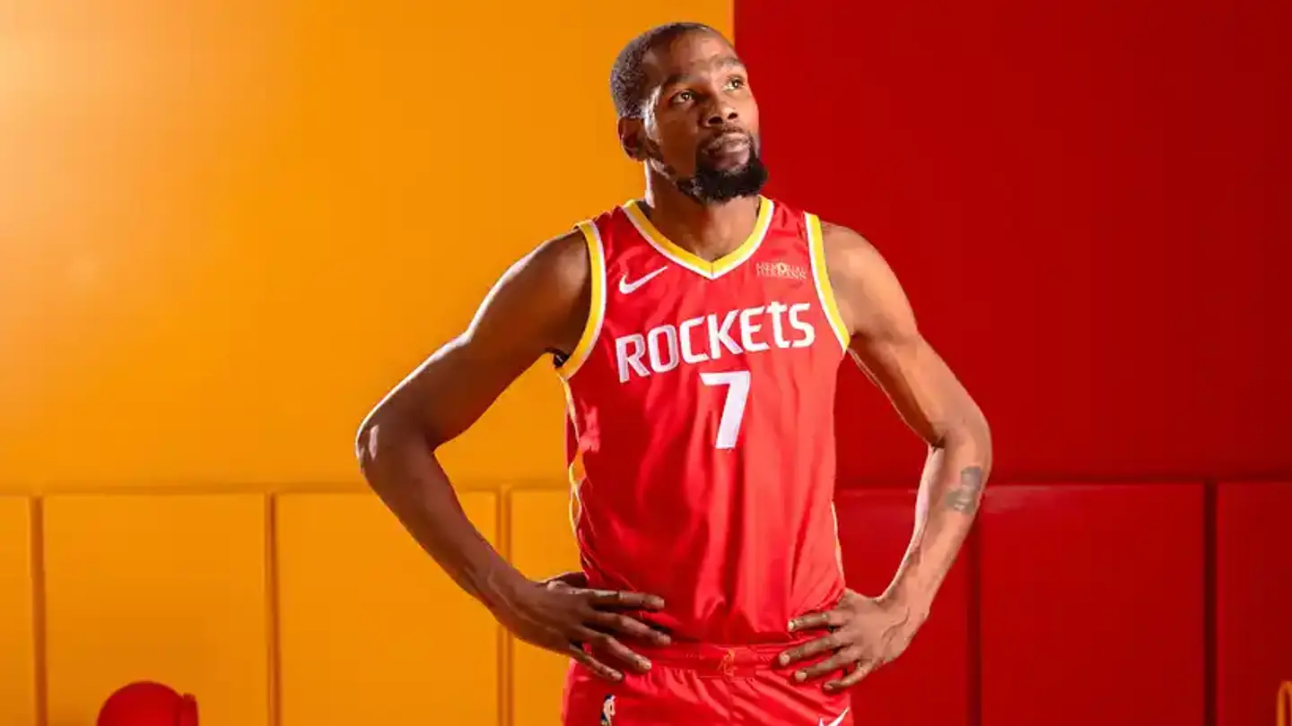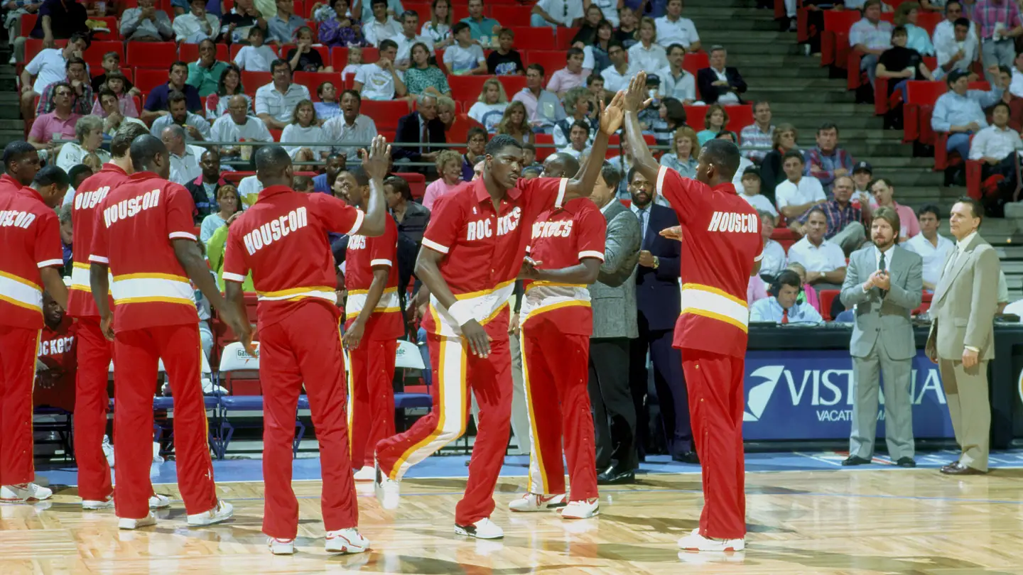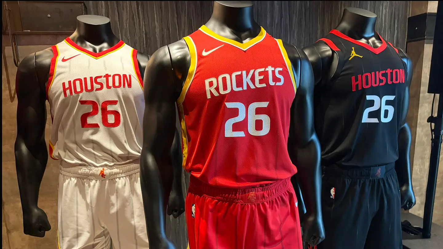
The legendary ketchup and mustard uniforms are officially back in Houston. On June 4, the Houston Rockets announced an official rebrand of the franchise from the logo to all three of the main uniforms that will be worn starting next season. This move back to the classic colors and uniform design has been requested by Rockets fans for quite some time now, as it brings back the nostalgia of the back-to-back championships from 1994 and 1995. The original red and yellow was introduced in 1972 and worn until the 1995 season. That style has now returned. The white and red with a slight yellow outline are the away uniforms and the black is the alternate. The Rockets released a video for the design as well as multiple posts on social media showcasing the look. One giant leap for new threads. pic.twitter.com/Aj0OmxTsnw— Houston Rockets (@HoustonRockets) June 4, 2026Besides that, the new Rockets primary logo was introduced as well as the secondary dunkstronaut logo that has now become one of the main pieces of the collection. A Closer Look at the Logo and Uniformspic.twitter.com/oaGsGwYkrL— Houston Rockets (@HoustonRockets) June 4, 2026First, let's dive into the logo. Besides adding the yellow accent around the Rockets "R", the primary logo is encompassed with two triangle shapes inspired by the space mission patches. The interior one is yellow and two quasars are on either side of the "Houston", symbolizing the journey from San Diego to Houston. Rooted in history. Built for tomorrow. 🚀 pic.twitter.com/yn63IaN1GB— Houston Rockets (@HoustonRockets) June 4, 2026The signature lowercase "t" also returns to the logo from the original look, and the uniforms and wordmarks match that. The Rockets also used the dunkstronaut as the secondary logo with a yellow accent as well. The font is supposed to honor the past while redefining the future. pic.twitter.com/tPIyfANxK9— Houston Rockets (@HoustonRockets) June 4, 2026The Rockets are calling it "championship yellow" that has returned as the trim. It's much more prominent in the home red design. The "R" logo is on the bottom corner of the shorts enclosed by a white and yellow nose cone. There are also very light axis stripes on the red jersey in the shape of a rocket launching. The white jerseys have the pinstripe design as well. One of the changes was the red jerseys saying "Rockets" instead of "Houston" and vice versa for the white. Now we get to the black uniforms. pic.twitter.com/WnWX1lU7Xo— Houston Rockets (@HoustonRockets) June 4, 2026This looks to be the dark alternate and the Rockets changed the letters to red instead of it being plain white in the previous black jerseys. The Air Jordan logo is yellow. The hypersonic speed pattern is throughout the uniform, which is a nice touch. There is a new addition on the back of a commander stripe under the number which is inspired by a spacesuit. Besides that, the ketchup and mustard "R" logo is also on the bottom side of the shorts. pic.twitter.com/BR8BfDTPs0— Houston Rockets (@HoustonRockets) June 4, 2026The dunkstronaut logo is visible on all three jerseys right in the middle of the waistband and it matches in color scheme as well. A homage to "Clutch City" is also on the bottom right of the red jersey.Paying homage to the classics 🤝 pic.twitter.com/N0vKGLuDMg— Houston Rockets (@HoustonRockets) June 4, 2026These uniforms got plenty of attention and it looks like they hit the mark. Rockets fans will have something exciting to look forward to besides the product on the court. Add us as a preferred source on GoogleFollow
More Details on the Design of the Rockets' New Uniforms and Logo
The legendary ketchup and mustard uniforms are officially back in Houston. On June 4, the Houston Rockets announced an official rebrand of the franchise from th
584 words~3 min read