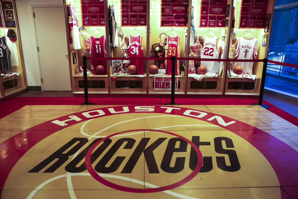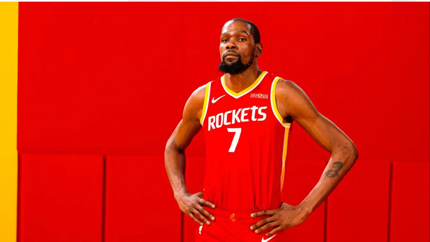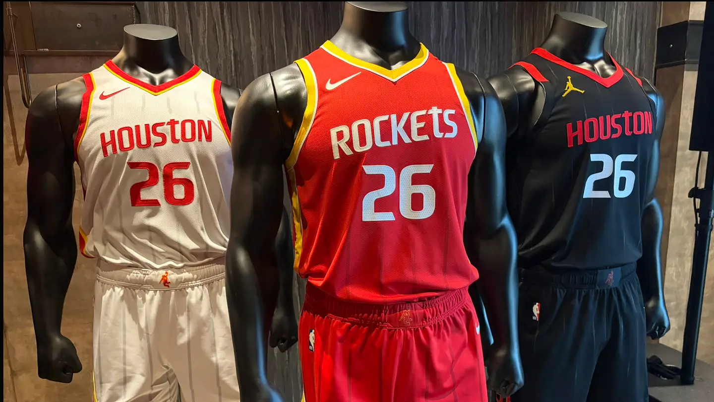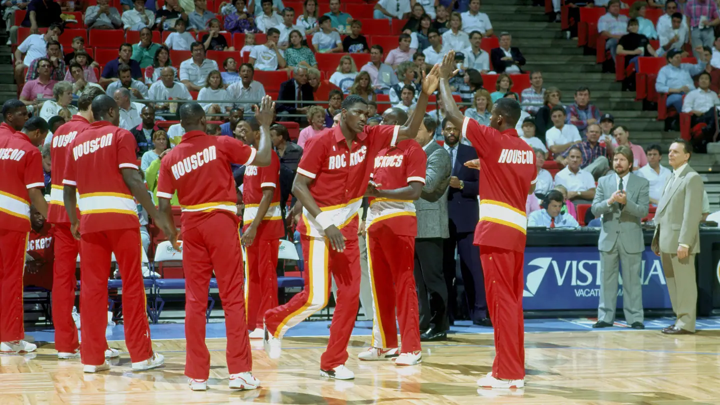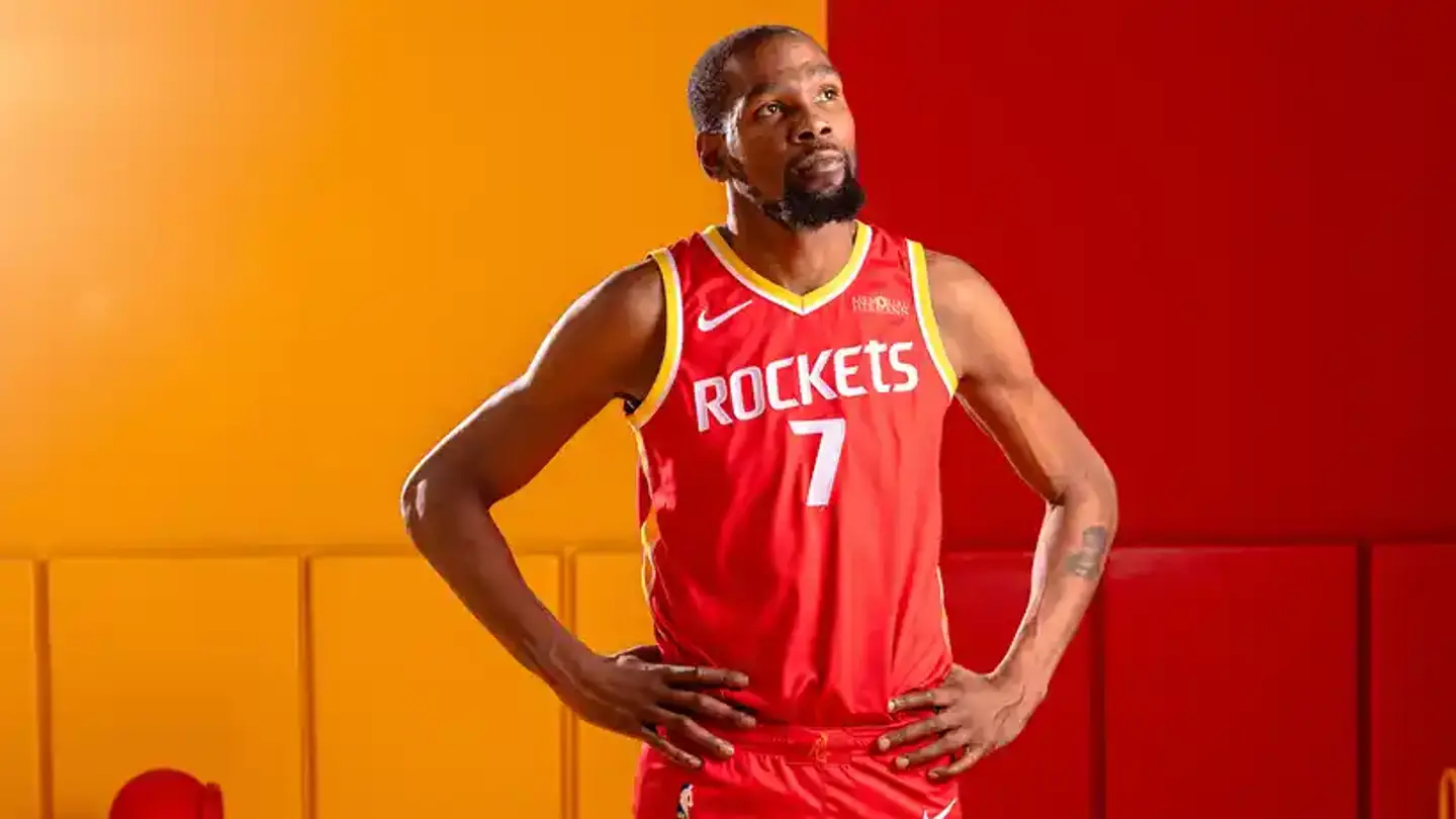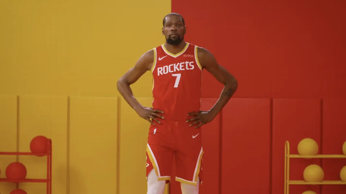
The Houston Rockets unveiled their new uniforms on Thursday, and the splashy announcement did not disappoint. Their social media team had teased the upcoming unveiling for weeks with videos set inside a restaurant, hinting at the return of their iconic "ketchup and mustard" color combination.There is plenty to unpack, and it's all good. The "Modern Classic" uniform trend continues to sweep across the NBA and NFL. Teams are taking elements from different eras in their uniform history and combining them into a beautiful masterpiece. The Rockets primary uniforms include: white (Association), red (Icon), and black (statement). This year's City Edition has not yet been unveiled. However, Nike and the Rockets went above and beyond with their attention to detail. Below are five key design elements you may have missed at first glance.The Houston Rockets updated their typography. / Houston RocketsThe updated Houston Rockets wordmark across the chest blends modern typography with elements inspired by classic team branding (notice the lowercase 't'). According to the Rockets, the new wordmark modernizes the championship era typography with a futuristic edge. The return of the signature lowercase 't' honors the past while redefining the future of Rockets basketball.The jagged two-tone stripes down the lateral sides of the white (Icon) and red (Association) uniforms are supposed to look like that. It mimics a rocket's natural rotation shortly after launch to align with its specific target orbit.The Houston Rockets official logos. / Houston RocketsWhen you have multiple iconic logos, you should not have to choose just one. Fans will immediately notice the iconic Rockets "R" on the shorts. The Primary Icon symbolizes two rockets launching through a Saturn-inspired basketball hoop. However, it is the return of the fan-favorite Dunkstronaut that we love. The secondary logo appears on the waistband of each pair of shorts. The updated interpretation of the logo honors the Rockets' history while evolving for the future. Lastly, the Global Logo draws inspiration from space mission patches. Two quasars symbolize the team's journey from San Diego to Houston.The Houston Rockets Icon Edition uniform. / Houston RocketsIf you think you're seeing pinstripes, you're not wrong. The quasar-inspired pinstripe reflects the speed, force, and intensity of Rockets basketball. This design element is present across all three uniform sets.The Commander Stripe on the Statement Edition jerseys. / Houston RocketsOn the back middle portion of the Statement Edition jersey, a red Commander’s Stripe draws inspiration from NASA mission leadership identifiers with EVA suit-inspired red trim elements. The Commander Stripe only appears on the Statement Edition jerseys.The Houston Rockets color palette. / Houston RocketsIt's not a hidden detail, but the color choices are notable. The official color palette is a return to the team's championship era from the 1990s, with a spacy look to the future. Rockets Red, Championship Yellow, Black, and White are the official team colors.Stay locked into Sports Illustrated's Jerseys On SI for all your uniform news from the sports world and beyond.
5 Hidden Details in the Houston Rockets New Uniforms
Nike included incredible details in the Houston Rockets' new uniforms.
487 words~2 min read