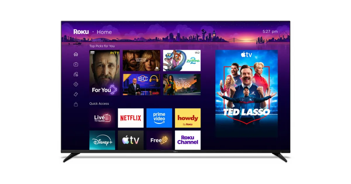
Roku has just unveiled its biggest home screen redesign in years with a new “Top Picks” row on top, and AI to organize your apps, among other updates.
Announced today, Roku is redesigning its home screen in what is both a pretty big change, and something that’s still familiar to long-time users.
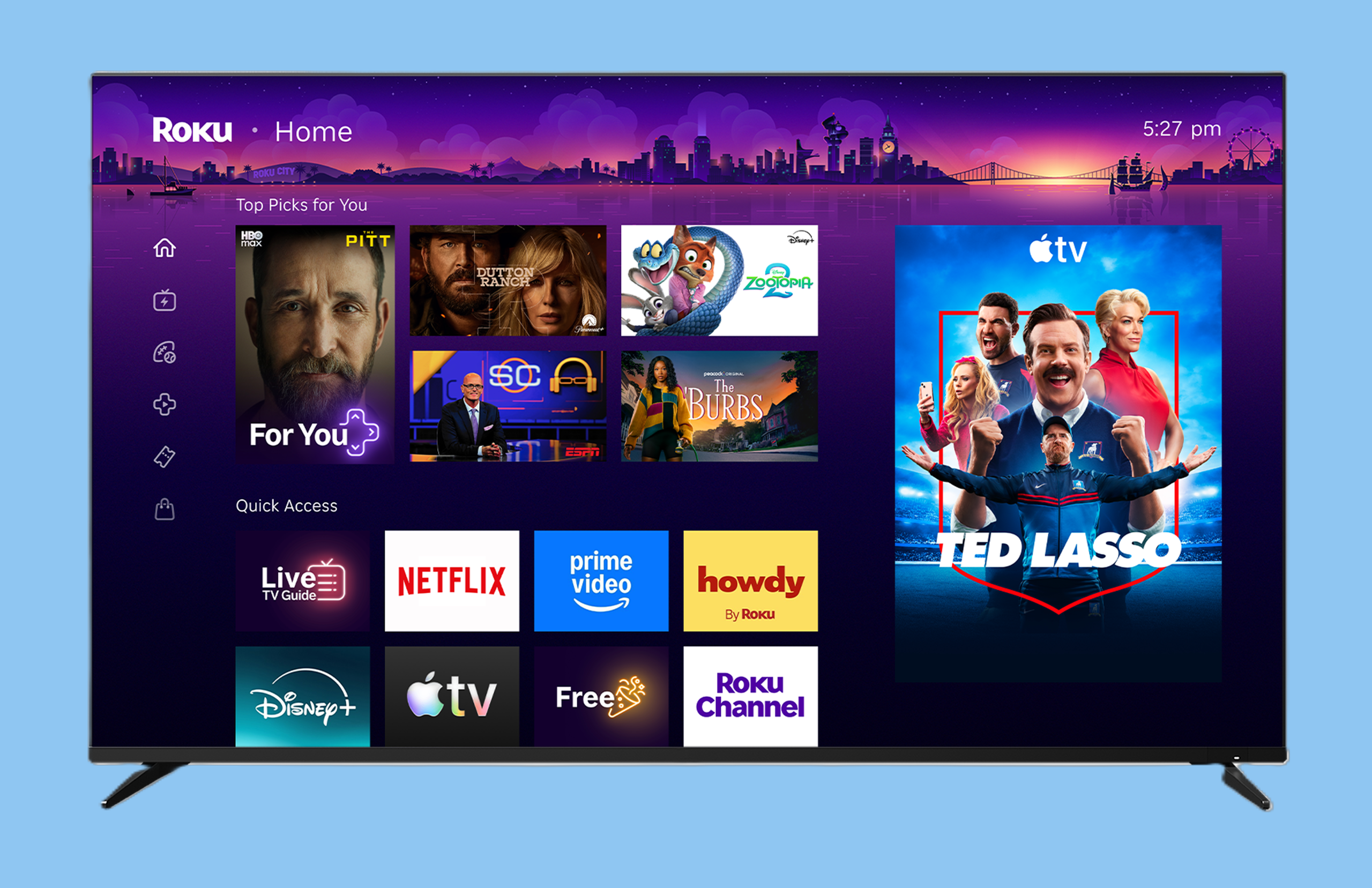
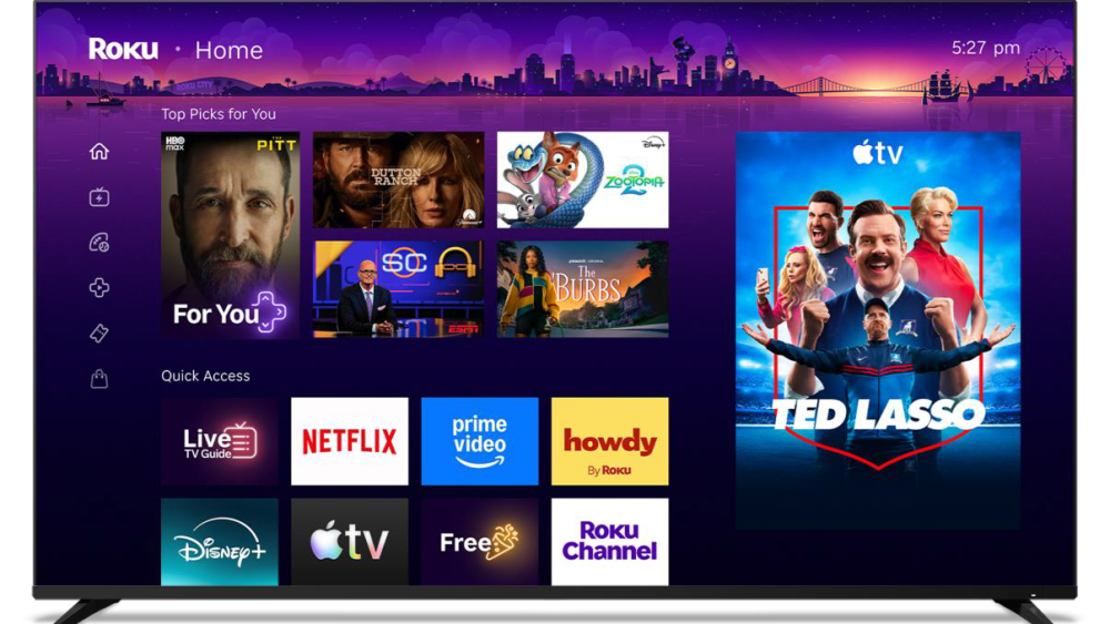
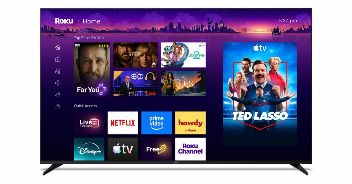
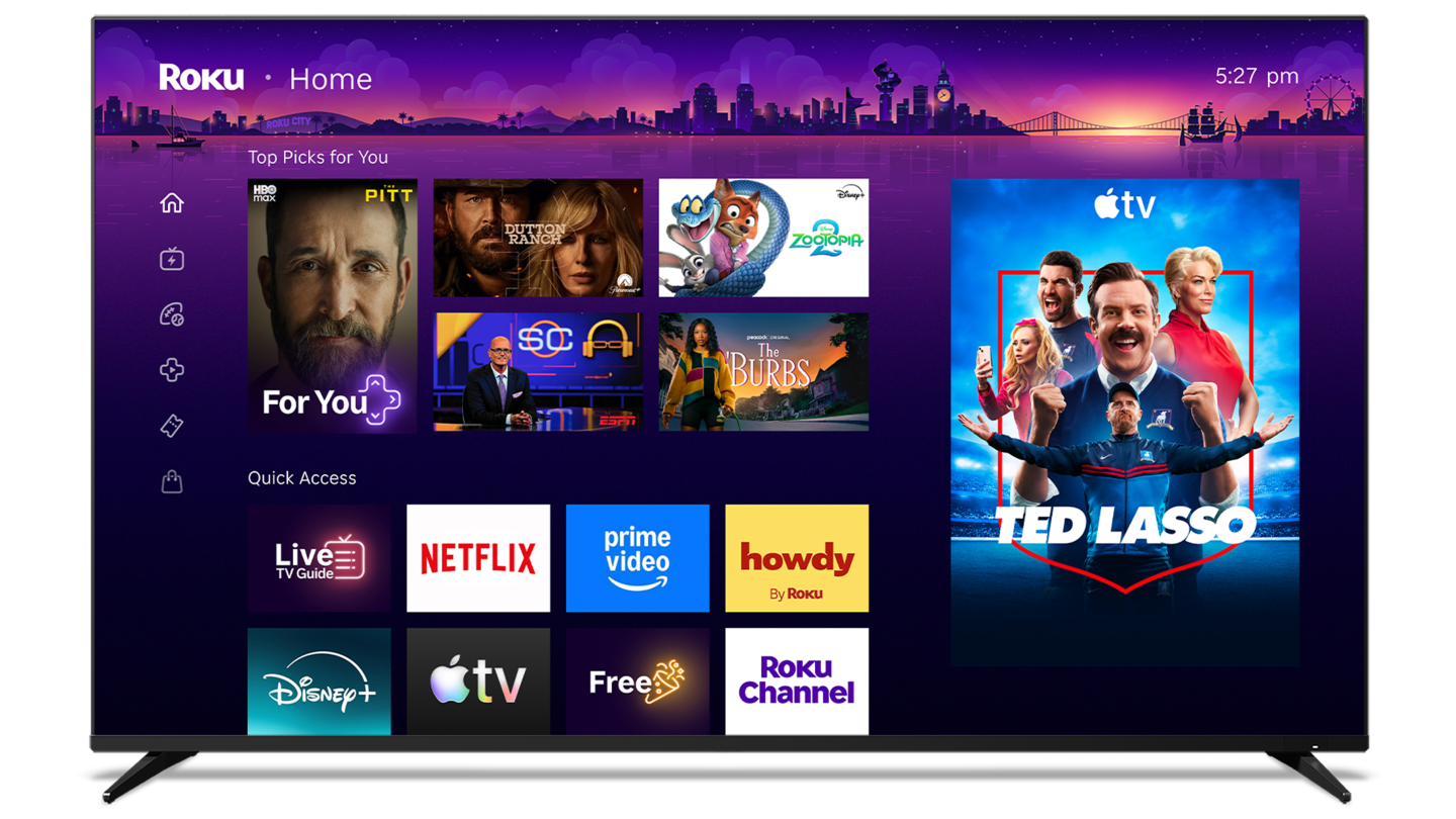
The updated home screen (in testing for the past year) retains the three-column design, with navigation off to the far left, apps in the center, and ads off to the right side just like in the old layout. The navigation column is a bit more condensed now, ditching the full names in exchange for simpler icons that take up much less space.
The center is where you’ll find the biggest updates. Your apps are no longer at the very top, with a new “Top Picks for You” section that highlights content from various streaming apps. It’s not quite as overbearing as Google TV, but it’s a shift in the home screen’s priority. Below that is “Quick Access,” a list of your most-used apps which Roku says is organized by AI. Roku is “confident” in this setup, but says you can still manually add or remove apps as you wish.
Powered by AI, Quick Access continually adapts to your routine and helps you get to your favorites faster. We’re confident it’ll pick up on the apps you use most, but if you’d rather take control, you can add or remove any app you’d like. And when you’re looking for the rest of your apps, they’re still right where you left them, just a few clicks away.