In a February earnings call, Roku CEO Anthony Wood said that he thinks the new home screen, which was in testing at the time, would “increase monetization over time, whether that’s getting viewers to sign up for subscriptions or watch more ad-supported content.”
Other changes
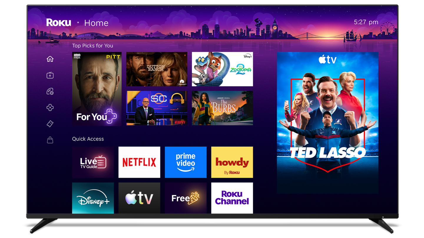
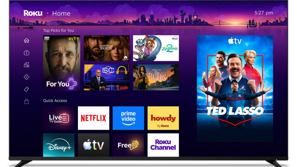
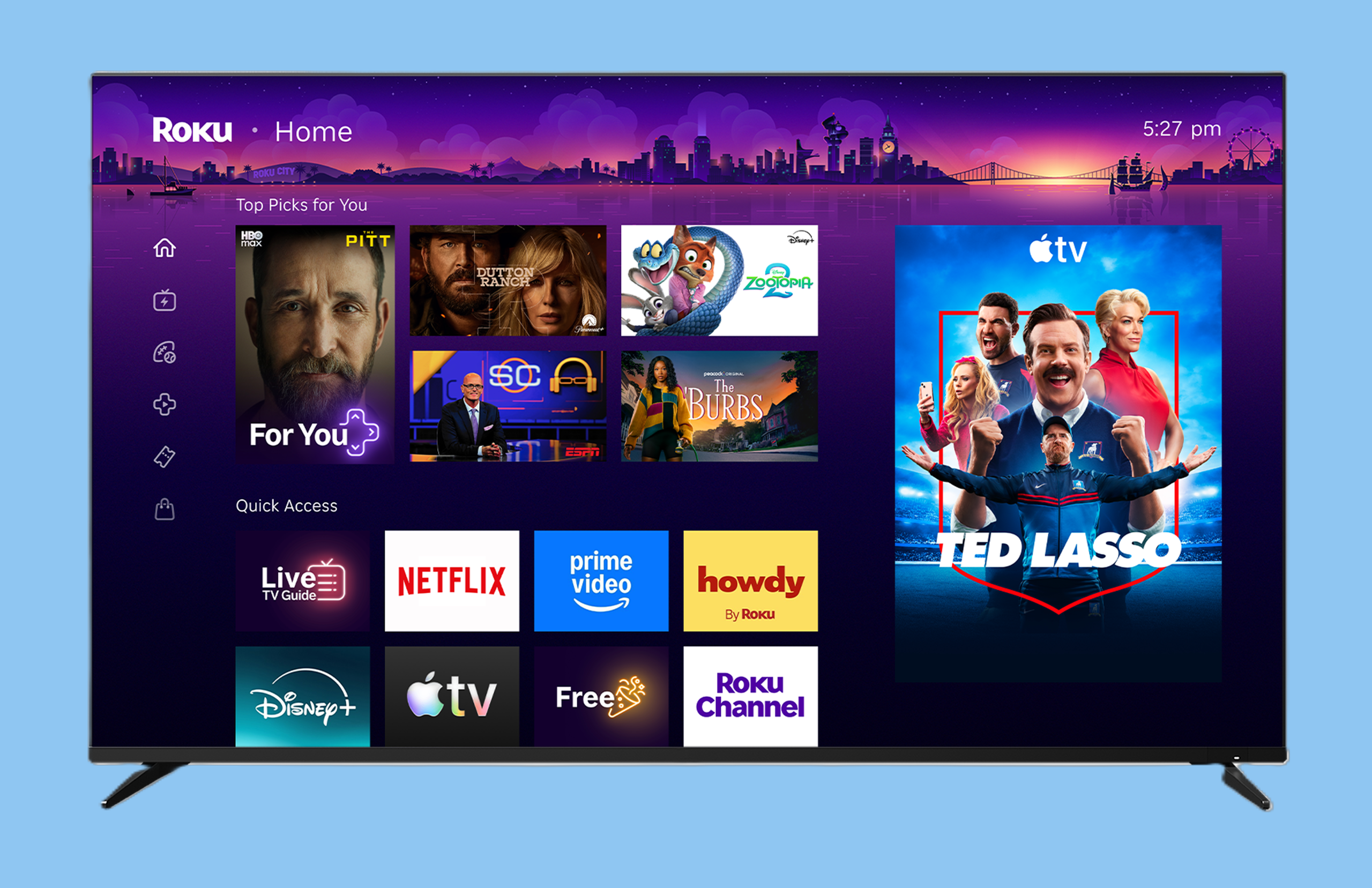
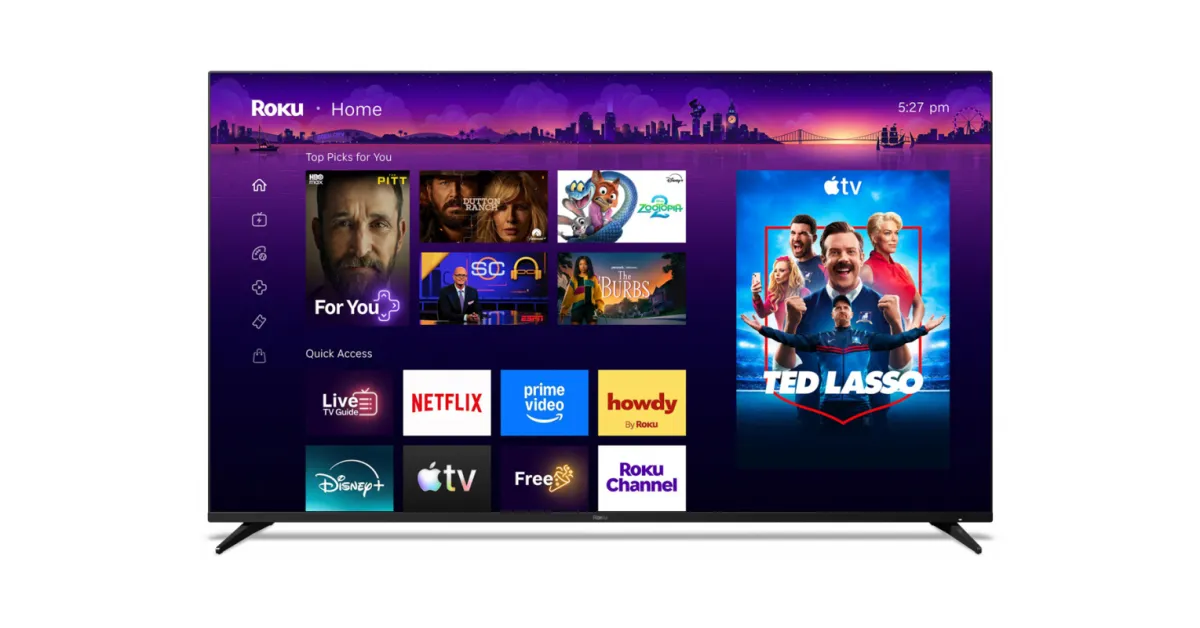
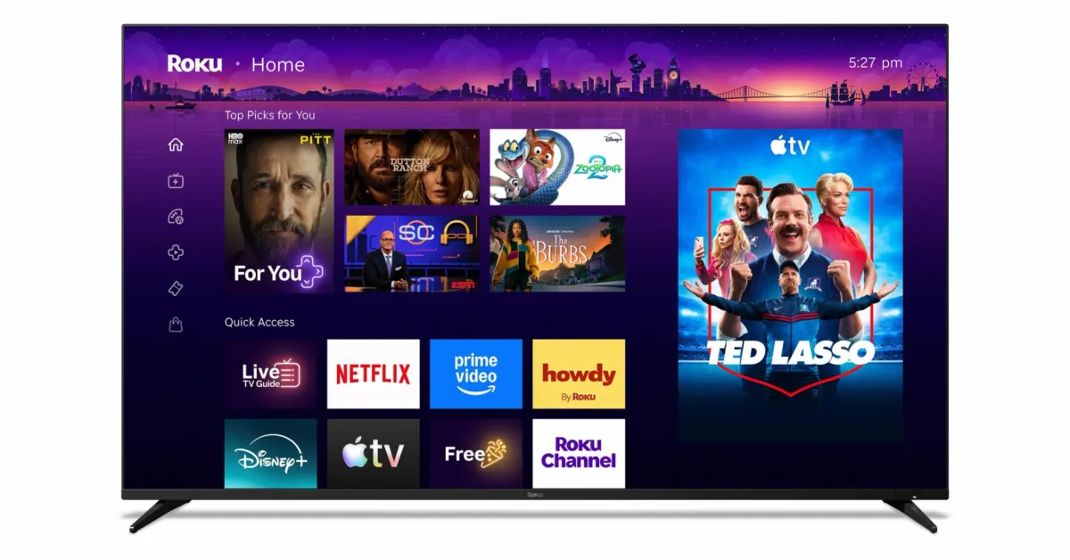
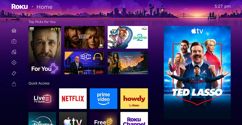
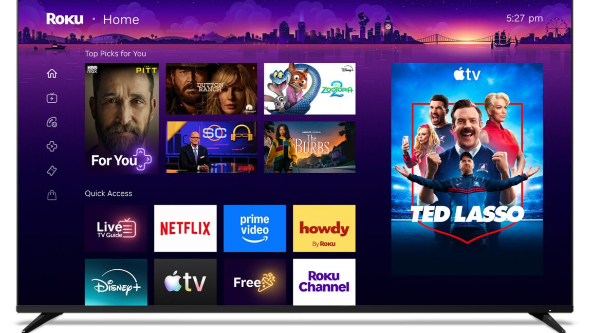
The new Roku OS home screen also has a slimmer left sidebar menu with images replacing text. In the center are tiles for “Top Picks for You” above rows of tiles for “Quick Access.” The former, per Roku’s announcement, is a “personalized row that makes recommendations and highlights trending and relevant content based on your interest,” where “no two people will see the same mix.” Quick Access, meanwhile, uses AI to show users’ “most-used apps and shortcuts.”
“One of the things we found is that not very many people actually customized those app screens,” Smalley told Fast Company. “They’d end up scrolling all the way to the bottom of this long list. So, what we wanted to do was actually pull that all together in a way that made sense for you.”
Other changes include the addition of a section called Destinations, which Roku said are “curated hubs [that] span genres and moods,” such as comedies, sports, and movies, with content across different streaming services.