I complained about this on the socials, but I didn’t get it all out of my system. So now I write a blog post.
I’ve never liked the philosophy of “put an icon in every menu item by default”.
Google Sheets, for example, does this. Go to “File” or “Edit” or “View” and you’ll see a menu with a list of options, every single one having an icon (same thing with the right-click context menu).
It’s extra noise to me. It’s not that I think menu items should never have icons. I think they can be incredibly useful (more on that below). It’s more that I don’t like the idea of “give each menu item an icon” being the default approach.
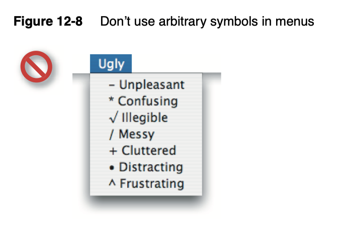
This posture lends itself to a practice where designers have an attitude of “I need an icon to fill up this space” instead of an attitude of “Does the addition of a icon here, and the cognitive load of parsing and understanding it, help or hurt how someone would use this menu system?”