in Design, Maps | May 7th, 2026 1 Comment
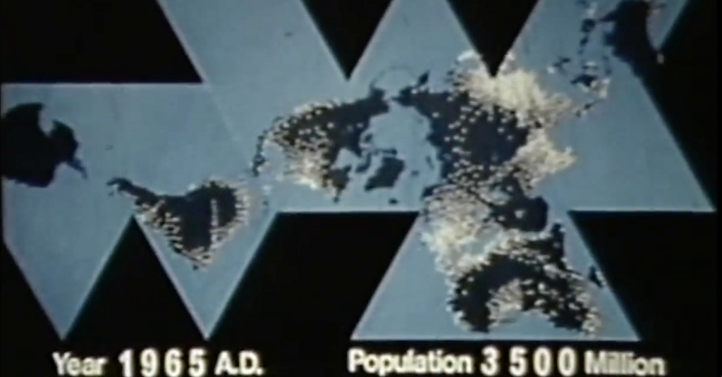
Sit back, relax, put on some music (I’ve found Chopin’s Nocturne in B major well-suited), and watch the video above, a silent data visualization by visionary architect and systems theorist Buckminster Fuller, “the James Brown of industrial design.” The short film from 1965 combines two of Fuller’s leading concerns: the exponential spread of the human population over finite masses of land and the need to revise our global perspective via the “Dymaxion map,” in order “to visualize the whole planet with greater accuracy,” as the Buckminster Fuller Institute writes, so that “we humans will be better equipped to address challenges as we face our common future aboard Spaceship Earth.”
Though you may know it best as the name of a geodesic sphere at Disney’s Epcot Center, the term Spaceship Earth originally came from Fuller, who used it to remind us of our interconnectedness and interdependence as we share resources on the only vehicle we know of that can sustain us in the cosmos.
“We are all astronauts,” he wrote in his 1969 Operating Manual for Spaceship Earth, and yet we refuse to see the long-term consequences of our actions on our specialized craft: “One of the reasons why we are struggling inadequately today,” Fuller argued in his introduction, “is that we reckon our costs on too shortsighted a basis and are later overwhelmed with the unexpected costs brought about by our shortsightedness.”