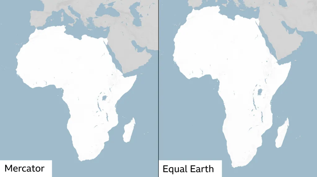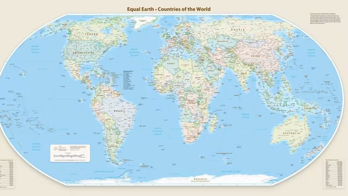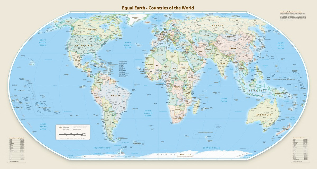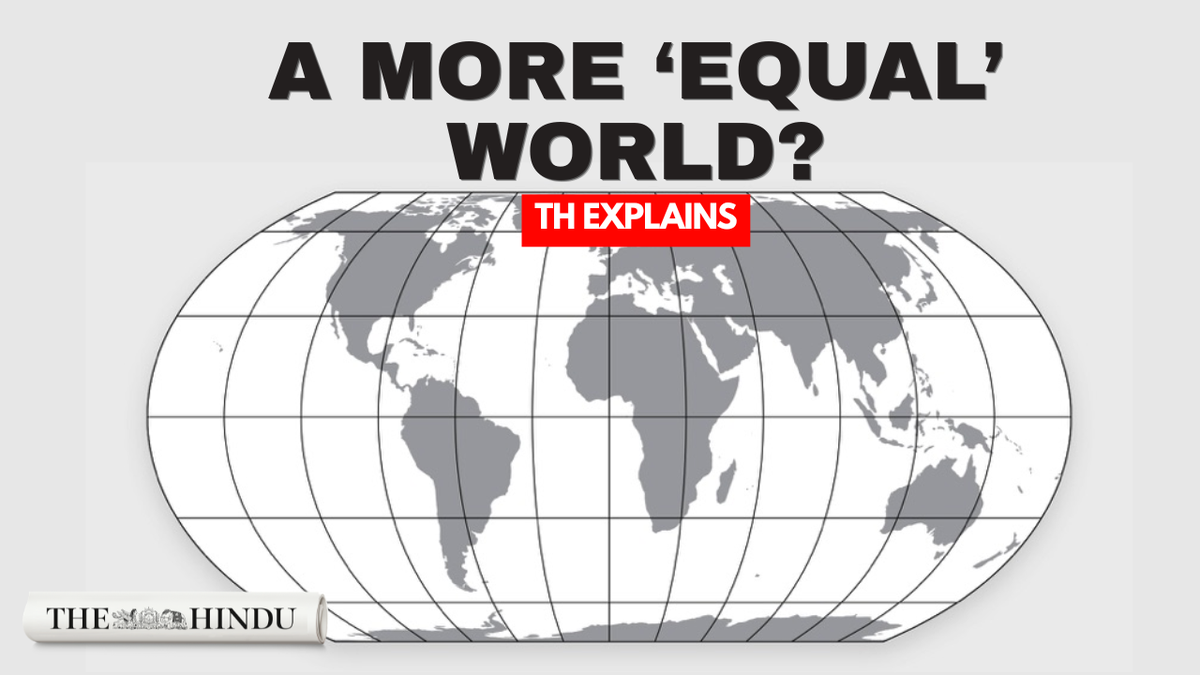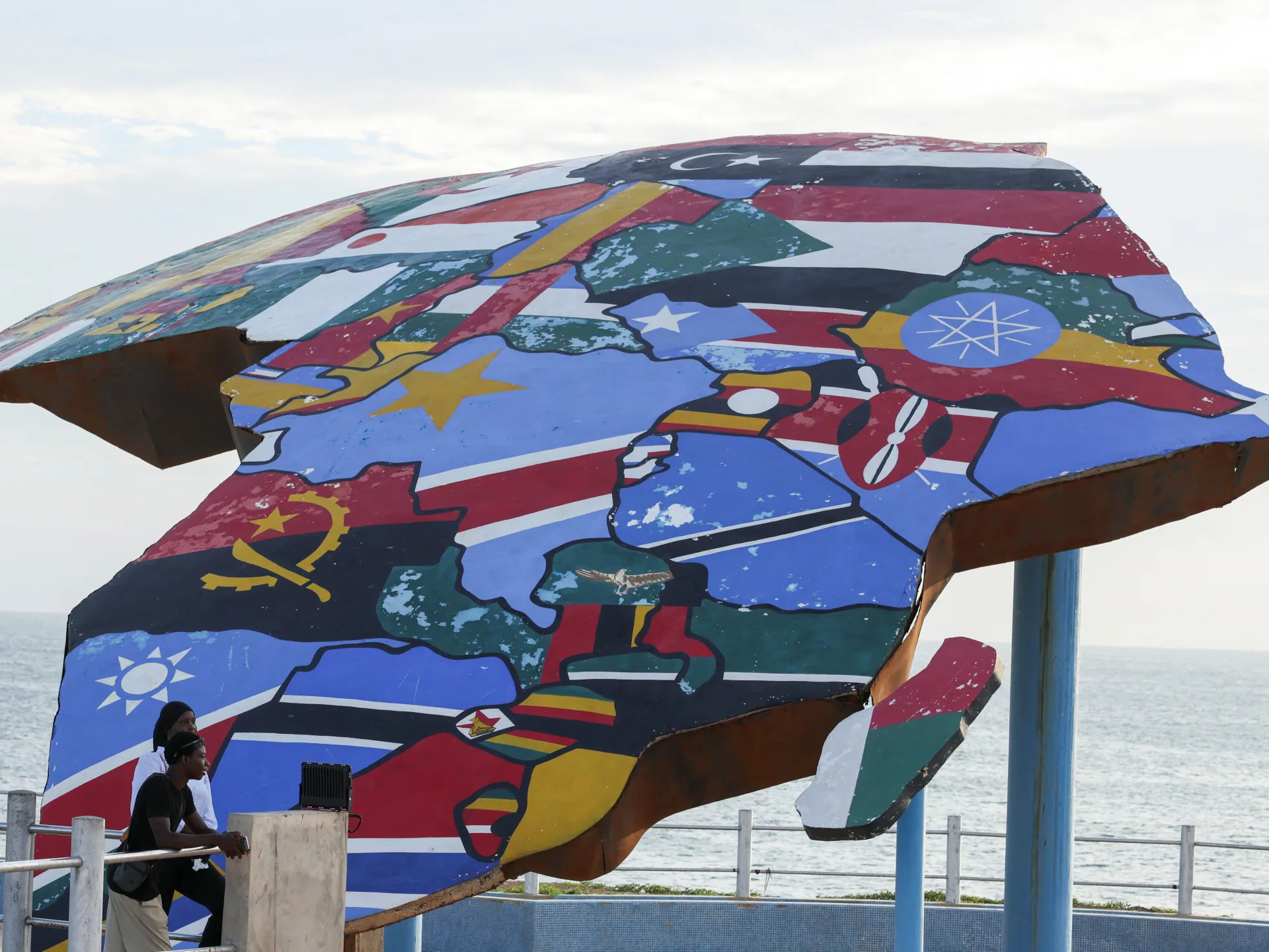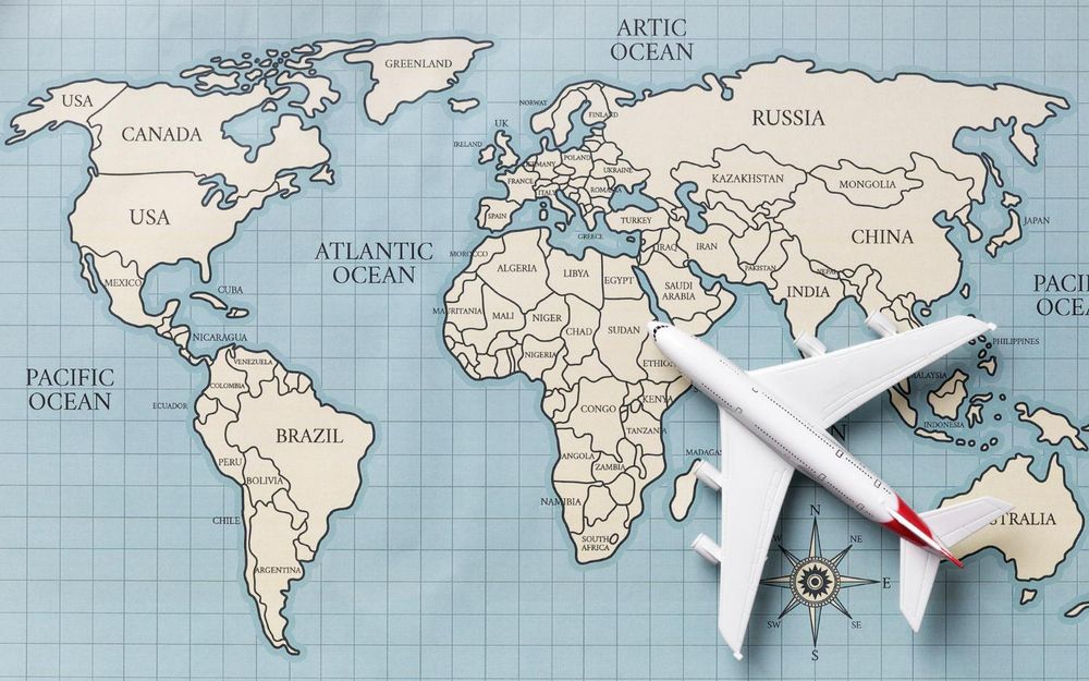
The World map as we know it will be changed to show a more accurate size of Africa.
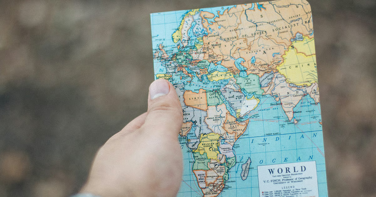
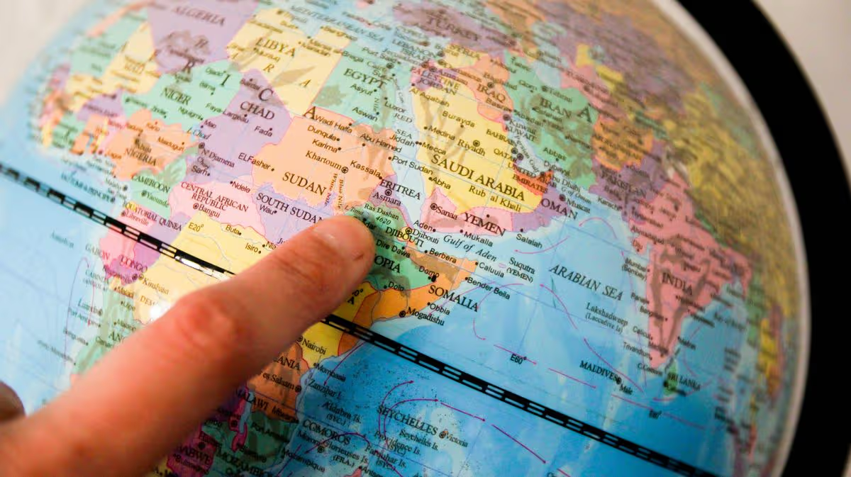
Think back to your school geography classroom and the world map that hung on the wall. For generations, that familiar image has shaped how we picture the size and position of countries and continents.
But the map many of us grew up with does not give an accurate impression of the size of every landmass.
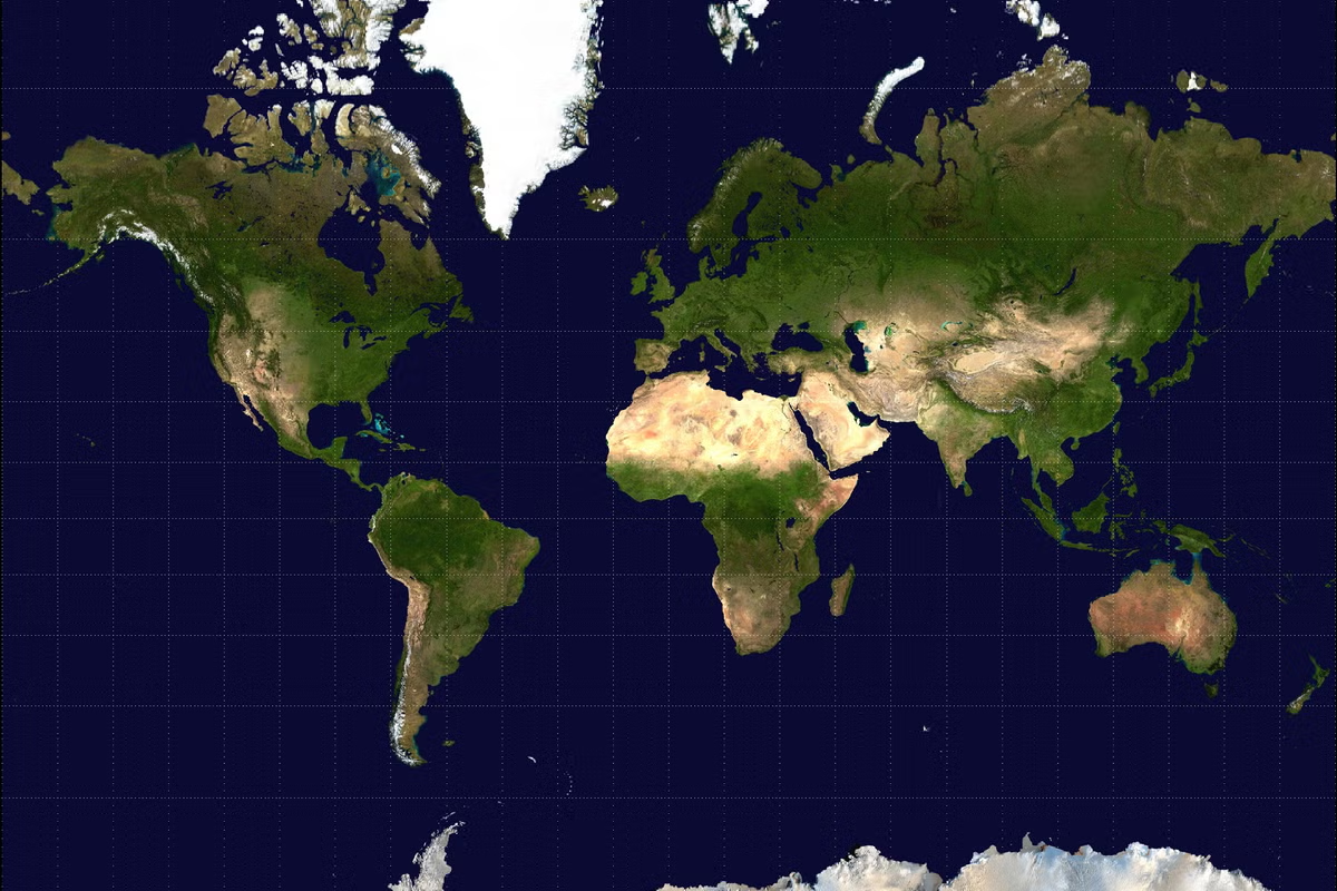
The widely used Mercator projection significantly distorts the size of countries and continents, particularly those further from the equator. Africa is one of the clearest examples.
The continent covers about 30.3 million square kilometres and is roughly 14 times the size of Greenland, despite the two appearing surprisingly similar in size on a Mercator map.