When you build an interface, icons are the part you check with your eyes and then stop thinking about. You drop an <svg> into a button, it looks great, and you move on. A screen reader user gets a different experience: either nothing where a label belonged, or an announcement of "graphic" on an icon that should have stayed quiet.
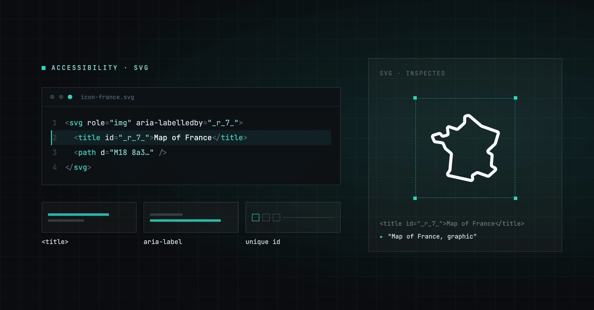
Labeling every icon is the wrong fix, because half of them sit next to text that already says the same thing. For each icon you need to decide whether it carries meaning on its own, and then mark it accordingly. That decision has two correct outcomes and one common mistake, and once you name an icon you inherit a second problem: the <title> element needs an id, and ids must be unique on the page.
In this article we'll walk through both outcomes with real markup, see what an id collision does to a screen reader, and use GeoIcons, a premium library of geographic map-shape icons, to get both behaviors from a single prop.
Key takeaways
An icon is either decorative (aria-hidden="true", skipped by screen readers) or meaningful (role="img" plus an accessible name). Every icon should land in one of those two states.