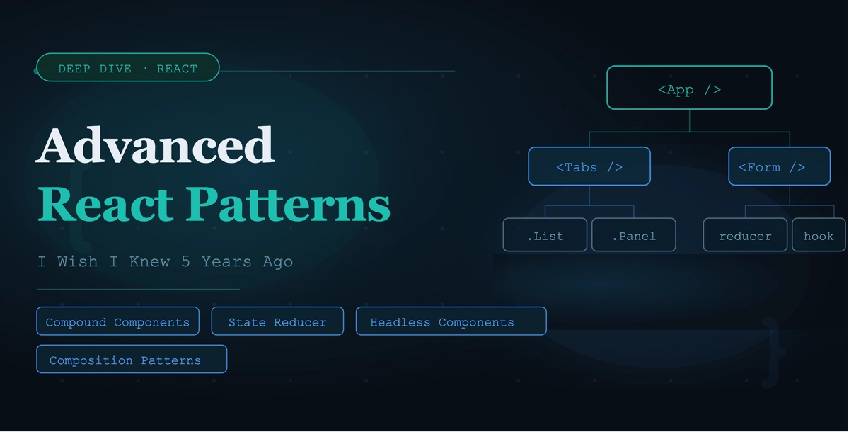
Ever stared at a component library you built just three weeks ago, only to realize it's already suffocating under a mountain of boolean props like hasBadge, isCompact, and withIcon?
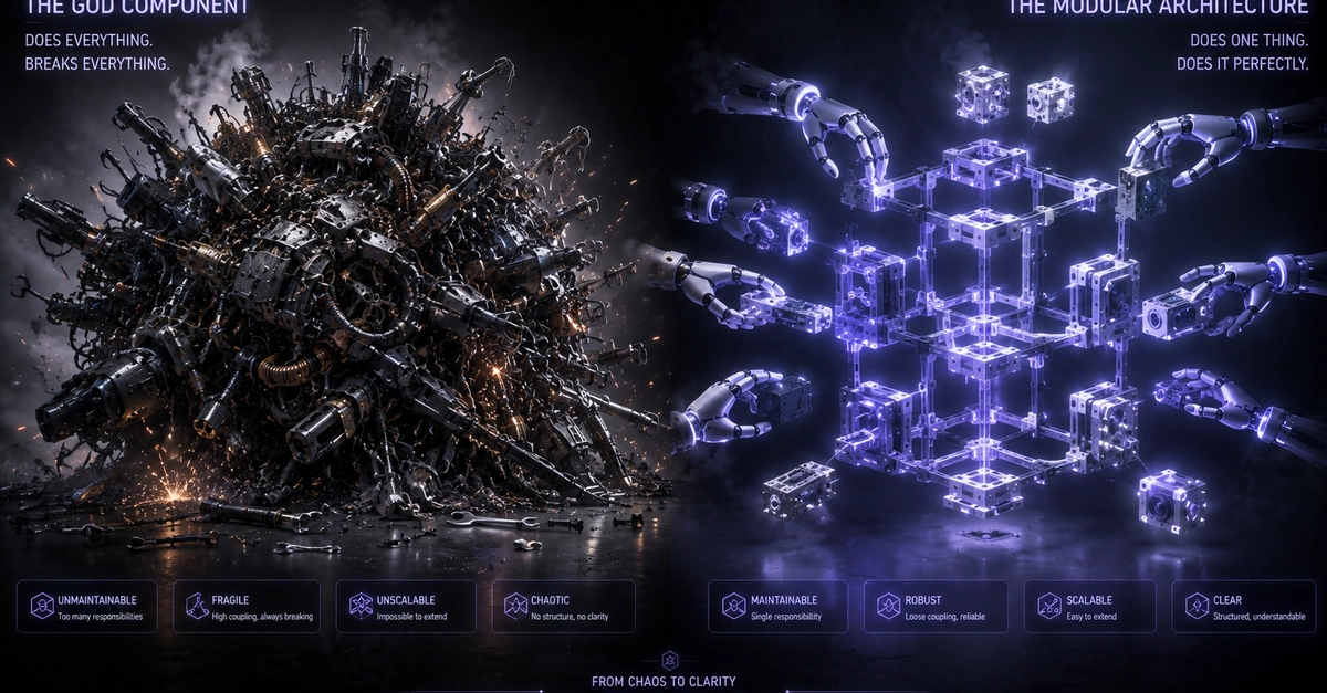
I ran into this exact wall recently while refactoring a set of modular landing page cards for a mixed-media client project. What started as a clean, reusable UI module quickly devolved into a brittle spaghetti monster the moment a new layout requirement dropped. Every time a client needed a tiny structural tweak—like shifting an image from top to side, or adding a secondary action tag—I found myself cracking open the core component file and risking regressions across the entire layout.
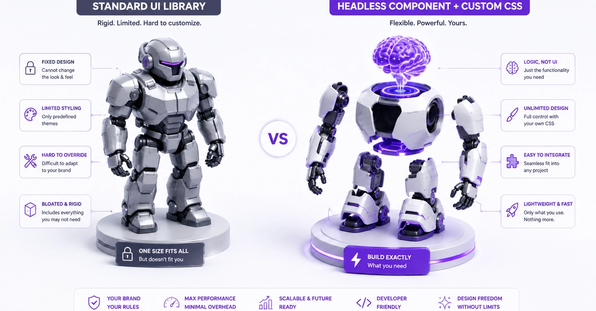
The underlying problem isn't just poor planning; it's treating components like rigid black boxes instead of flexible composition primitives.
Here is what that trap looks like in code:
// The Trap: A monolithic component buckling under conditional props