SHOP: Forget the Cotswolds – this summer it's all about Devon Girl interiors. Here’s 7 easy ways to get the coastal look that's replacing country interiorsREAD MORE: Smart kitchen upgrades that will make your life easier AND look chic - from the first non-ugly air fryer to a blissfully quiet coffee machineSee more Daily Mail on Google - save us as a Preferred SourceBy NICOLE GRAY - INTERIORS EDITOR Updated: 07:00 BST, 8 August 2026
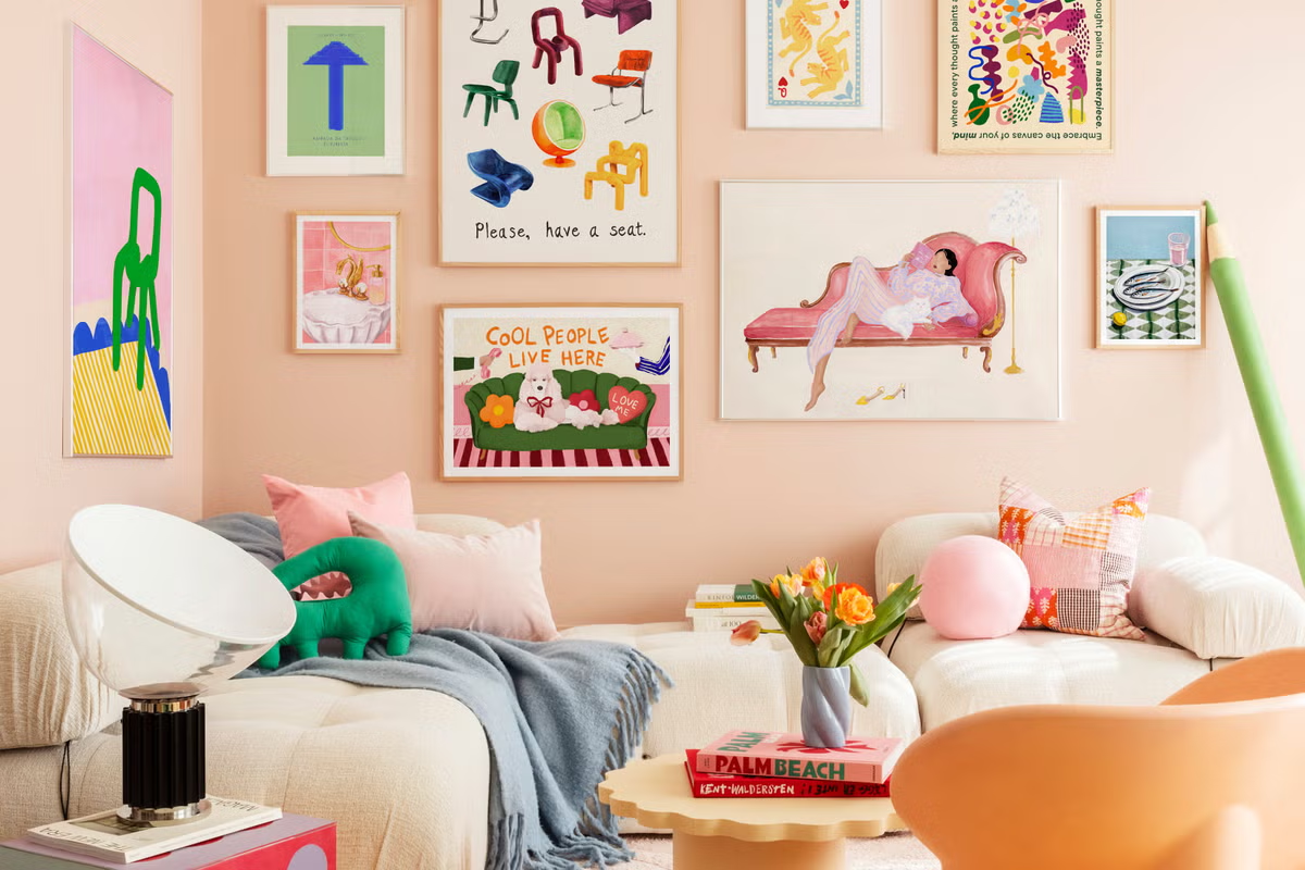
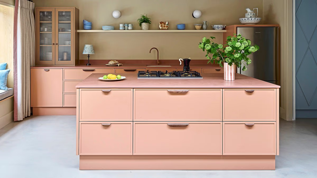
PEACH + SAND In this kitchen designed by Laura Stephens, the taupe walls prevent the peach shade from overwhelming the space. Try pluck.co.uk for a similar kitchen and mudaustralia.com for colourful ceramics.Daily Mail journalists select and curate the products that feature on our site. If you make a purchase via links on this page we will earn commission - learn more‘Peach has superpowers in the home because it activates warmth receptors and increases serotonin to instantly uplift your mood, but its gentle pink undertone keeps it from ever feeling aggressive or overstimulating,’ says Emma Bestley, creative director at Yes Colours. ‘It’s especially effective in the kitchen, where it creates a warm and welcoming atmosphere that encourages lingering. Grounding shades such as sand are perfect for softening the energetic fizz of peach to create a calm, almost sun-baked sanctuary.’CELESTIAL BLUE + CITRINE A juicy jolt of citrine stops this room from feeling too tonal. Cupboards and ceiling in Celestial Blue, window nook in Citrine, both £73 for 2.5 litres, littlegreene.com.‘This shade of blue is very calming, so it’s ideal for a bedroom,’ says Ruth Mottershead, creative director at Little Greene, ahead of the brand’s new gelato-inspired paint range launch. ‘Citrine is another standout shade this season, and window frames and doors are ideal for accent colours. Using citrine on a window frame highlights the architecture and allows the colour to respond to the changing light across the day. In sunlight it appears vibrant, and on grey days it helps the room feel more welcoming.’BUTTER YELLOW + BUBBLEGUM A considered colour palette can elevate even the most functional spaces. In this bathroom by Kerv Interiors, uplifting tones make a subtle statement in a compact space.‘This is a great pairing as the shades share warm undertones and offer a subtle contrast that is reminiscent of ice-cream counters from everyone’s childhood,’ says interior designer Emma Holmes. ‘Bathrooms are a great place to embrace colours like these as they pack a sensory punch – a far cry from the sterile, white aesthetic that has become commonplace in bathrooms over the past decade.’ Holmes adds that the pairing is also particularly well suited to a children’s bathroom.