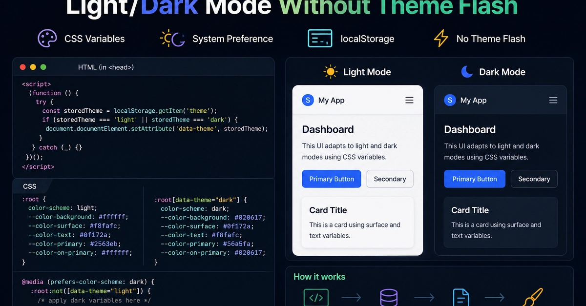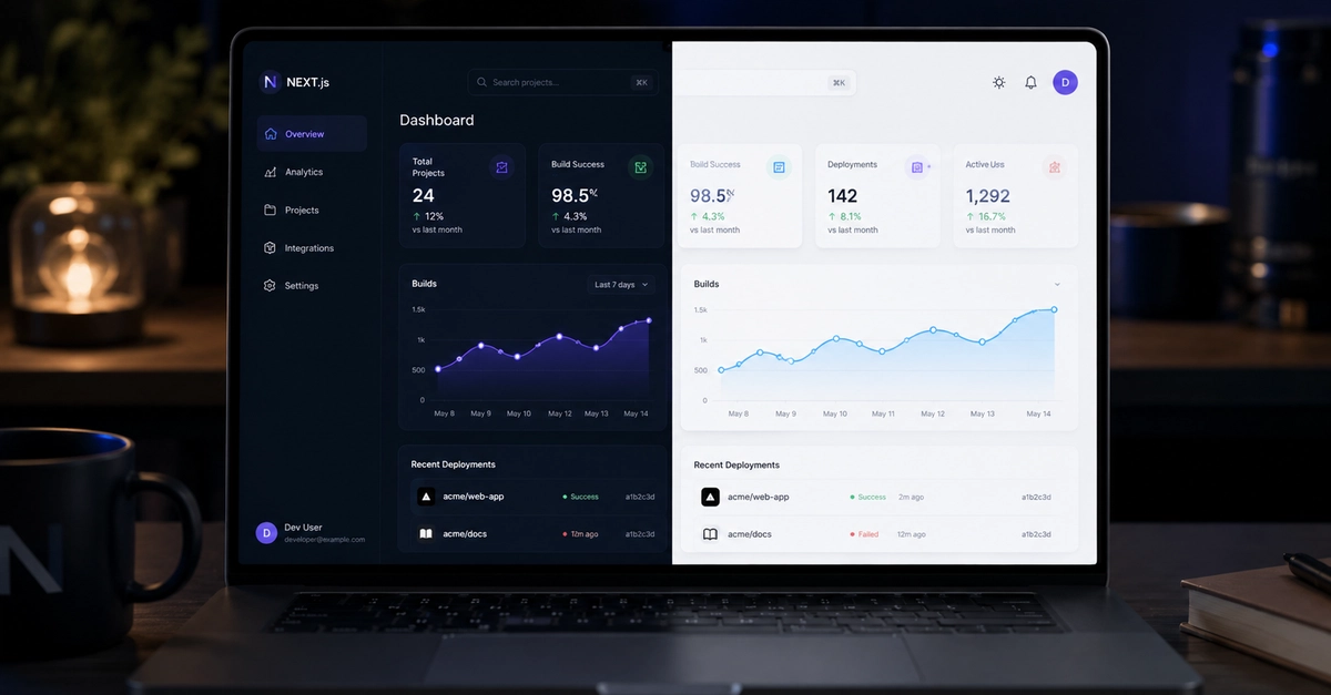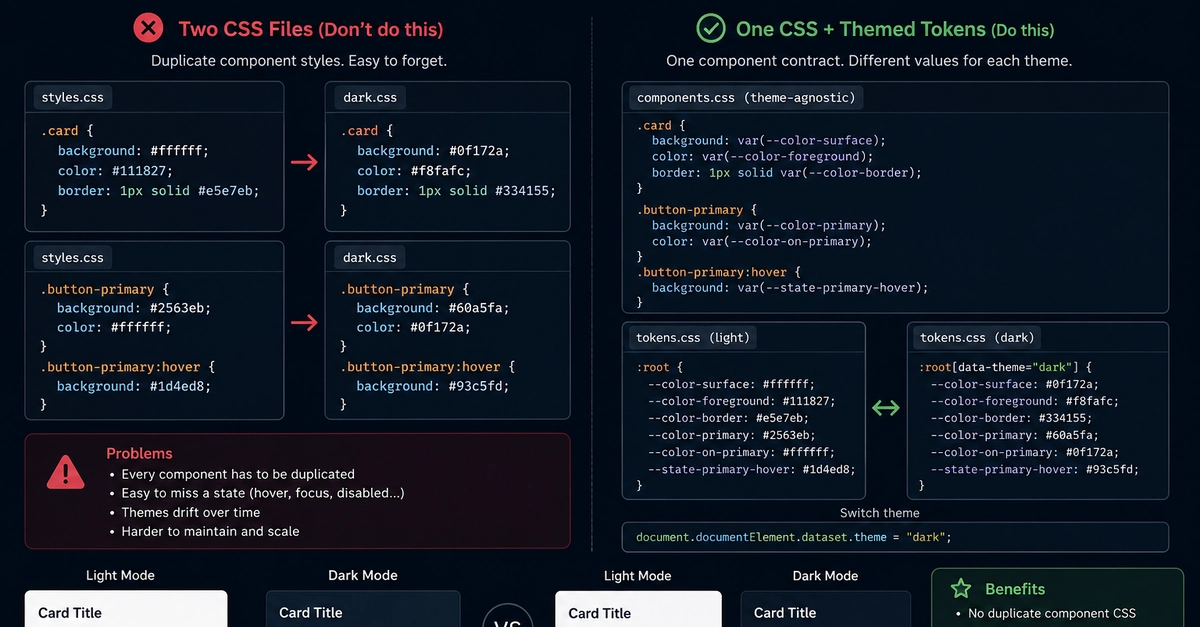
Your header has a sun icon, a moon icon, and a little monitor. Three buttons in a segmented control, or one that cycles Light → Dark → System with a click. Congratulations, you have shipped the data model as UI. Lea Verou's new post says the quiet part loud: that third button is doing work for the developer, not the user, and you can pull it.
The frame is disarmingly simple. Per the source, the user only reaches for a theme toggle when the current appearance is wrong for them right now. Verou states it flatly — "Users do not seek out solutions to problems they don't currently have." That single line is the whole verdict. If the page already looks the way the user wants, they will not open a menu to inform your storage layer of their long-term policy. The System option is you asking them to.
Where the tri-state actually comes from
Verou's diagnosis is that developers, having internalised the three-way model (light, dark, follow system), reflexively expose all three in the UI. The model has three states. The chooser must too. It is the same reflex that gives you a <select> full of every enum a backend can serialise, whether or not a human should ever need to pick one.
Per the source, the three-option pattern is out in the wild in Ant Design, Red Hat Design System, Web Awesome, Excalidraw, Taiga, Astro and Hero UI. Docusaurus is a special case — same three states, but rotated through one icon on click. The two-state approach shows up in Vitepress, Material Design, Adobe Spectrum, Radix and ShadCN. Two roughly equal-sized camps, no consensus, which is exactly the kind of split that gets a good essay written.