I am a Canadian realtor, not a career software engineer. That is probably why I had no emotional attachment to the normal way dashboards are supposed to look.
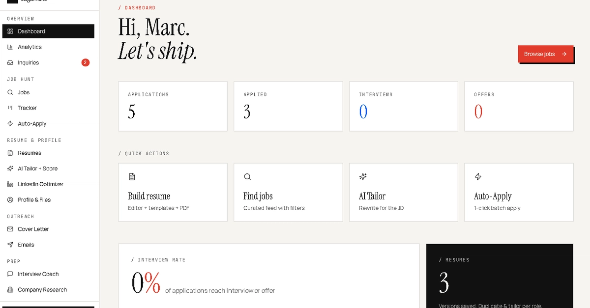
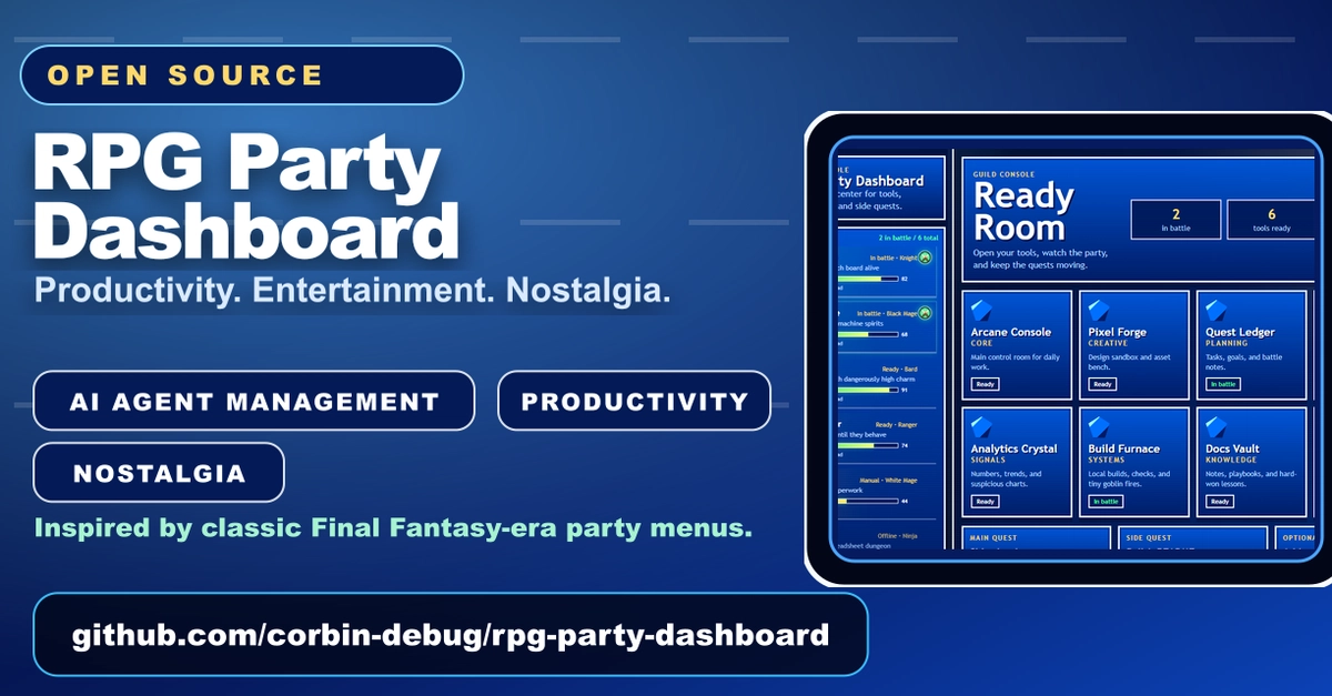
I had a practical problem. I was using different AI workers and tools for different jobs, but the screens used to monitor them all felt the same: grey tables, status labels, and a pile of information that technically existed but did not help me understand the team at a glance.
The best interface I could remember for understanding a team was not business software. It was a classic JRPG party menu.
The party-menu advantage
A good party screen answers useful questions immediately: