Support CleanTechnica's work through a Substack subscription, on Patreon, or on Stripe. Help us produce all of the high-quality, original content we publish week after week despite the challenges of content-scraping AI, antisocial media, inflation, and other hurdles.
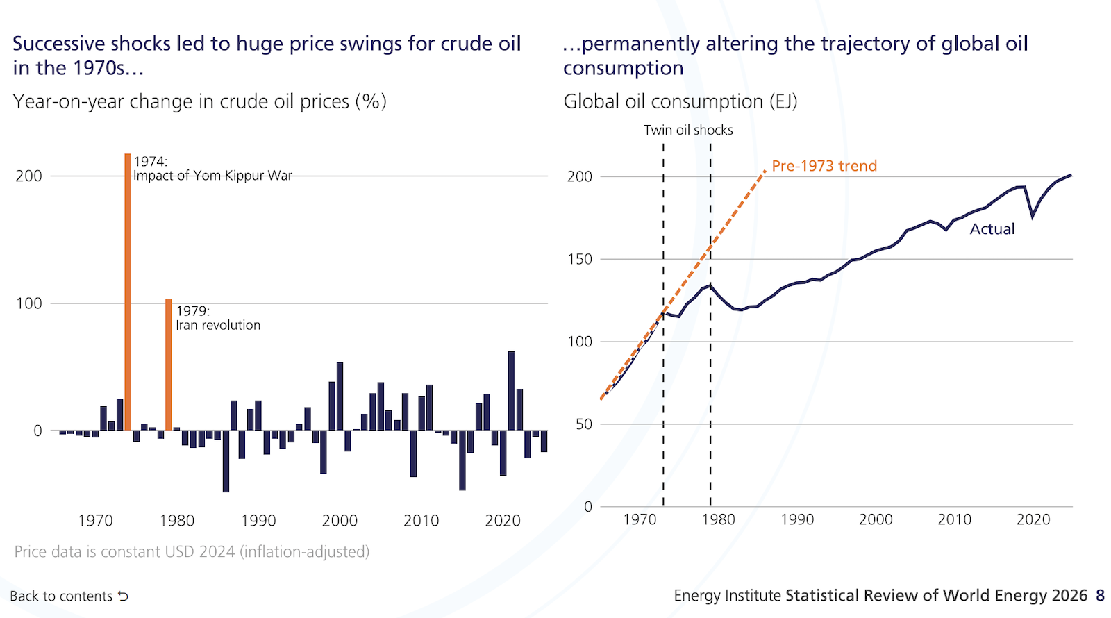
Continuing my series on 75th edition of the Statistical Review of World Energy from the Energy Institute, we’ve got another fascinating chart and graph today that I want to build on. Here are the paired graphics:
The graphics above show that there were two big oil shocks and price spikes in the 1970s, and they led to a significant, dramatic reduction in oil consumption for years to come.
What we’ve been going through now is very reminiscent of that. First, there was the shock of a few years ago when Russia invaded Ukraine. Now you’ve got the USA’s decision to bomb Iran, and Iran then closing the Strait of Hormuz. And even after an extended period of this, a “new war” has just begun by Trump (it’s the same war, of course, but technically it “ended” and now Trump started it again and has a 60-day window before Congress has to approve it).
So, the question is, how long does this second phase last, and what happens with oil prices and gas prices? Gasoline prices got up to an average of $4.56 per gallon on May 21, and then started dropping for a while. Right now, the average price of gas across the US is $3.943/gallon. But if this war heats up further, and the Strait of Hormuz is closed more again, and gas prices rise again, one has to think how that repeated experience would be a bit like the 1970s and really accelerate movement away from gasoline consumption. Right?