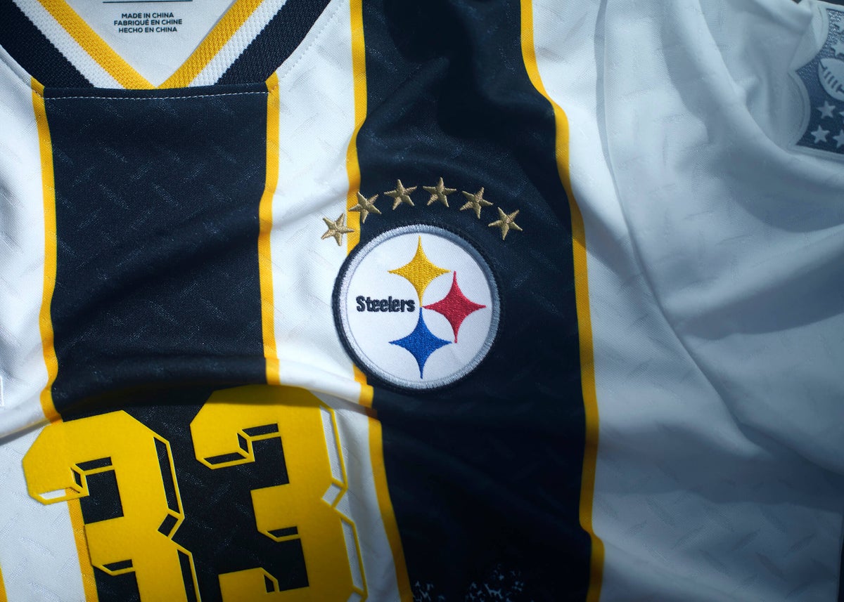
As the North America-hosted World Cup wraps up, another set of crossover jerseys have arrived and with it comes a raft of opinions.The designs, made by Fanatics, are intended to reimagine “NFL club identity through the lens of football culture and design heritage.” Basically, the intention seemed to be create a selection of shirts that could be worn at the Super Bowl or World Cup final without looking odd.These shirts will first go on sale at Fanatics Fest in New York City on July 16, then they’ll be available online the following day. Last year’s inaugural edition, inspired by football club kit designs from around the world, were priced at $100 each and quickly sold out.But which ones are the best among the new batch? I have no doubt that the jerseys I think are great, will be ranked in your bottom five, and vice versa. Let us know how we did in the comments. And check out our previous rankings for the last set of crossover jerseys here.(Note that the stars above some team logos on the jerseys represent Super Bowl wins in the way they represent World Cup wins on international soccer shirts.)32 – Cleveland Browns(Photo courtesy of Fanatics)The Browns jersey looks like the design of a carpet you’d find in a one-star hotel. Everything about this kit screams ‘maybe you shouldn’t have gone with the first half price offer you saw.’I don’t mind the shoulder area with the “Browns” wording, but this one finds itself on the bottom of the pile. It seems to take inspiration from the Netherlands’ popular 1998 shirt, but swapping vibrant orange for the Browns’ colours is a downgrade.31 – Tampa Bay Buccaneers(Photo courtesy of Fanatics)After you’ve read this article, give your grandma a call and pop ’round for a cup of tea. The chances of her having a tea towel in her draw with a similar design to this are very high.In its defence, the pirate designs on the black/grey strips are pretty cool. But those orange and red strips, inspired by Spain’s 1994 kits, aren’t doing a lot for me. (Ed. note: This one is easily top 10!)30 – Dallas Cowboys(Photo courtesy of Fanatics)I want to like this one, I really do. The design is bold, but I can’t help but think I would only ever wear this if I was taking out the garbage or signing for a parcel.There’s a bit too much going on here. I’m not sold on the star design or the shade of blue. This one clearly draws a direct link between the USA’s opinion-splitting 1994 “denim kit” and “American’s Team.”29 – Arizona Cardinals(Photo courtesy of Fanatics)What in the name of PlayStation One loading screen is going on here?That black and white background effect, which again seems inspired by Netherlands ’98, is quite similar to the loading screen you would see on the very first PlayStation model. Better than the Browns, but there’s still too much going on here, respectfully.28 – Seattle Seahawks(Photo courtesy of Fanatics)Fair enough. The Seahawks design is true to the team’s dark blue and slightly-off-putting neon green.Whilst we can’t fault them for heritage, we can fault them for style points. Looks like the 2006-era Adidas template.27 – Minnesota Vikings(Photo courtesy of Fanatics)This one has some Romania 1994 to it, but it looks like something you’d make at school as part of a design technology class. Having said that, there’s a part of me that also kind of likes it, but also, I don’t want to wear something I designed that only got me a C grade back when it was crunch time in exam season.Due to my indecision, I’ve put this one at No. 27.26 – Las Vegas Raiders(Photo courtesy of Fanatics)The younger crowd among us might say that the Las Vegas Referees Raiders are in their ‘officiating era’ after this seeing this kit.I’m not that interested in walking around looking like a human barcode, although, I do like the strip down the middle.25 – Atlanta Falcons(Photo courtesy of Fanatics)Have you ever printed something off but then halfway through, you run out of ink? That’s what this kit looks like. The striped effect ends too abruptly for me.
Football meets international football: Ranking every NFL soccer-style crossover jersey from 1-32
Which teams got the best results from Fanatics' second attempt at merging American football with global football shirts? Take a look.
2,150 words~10 min read