Illustration: Demetrius Robinson/The Athletic; Jared C. Tilton, Christian Kaspar-Bartke, Justin Setterfield/ Getty ImagesJune 8, 2026 12:11 am EDT Updated This article is part of our Style of Play series, an exploration of World Cup kit culture.The men’s World Cup will be many things: searing elite-level competition, a monument to hypercapitalism and, for better or worse, a fashion show.With an expanded 48-team tournament comes an expanded catalogue of football shirts for eyeballs to feast upon over the course of 37 days.There will be radical designs both evoking days of yore and shaping the zeitgeist with fresh, modern twists — and The Athletic’s Nick Miller is here to rank every home strip.(Julio Aguilar/Getty Images)Ah. Hmmm. No. You can understand the temptation to play around with an established design but playing around with the iconic Croatia checkerboard is an absolute high-wire act and regrettably, Nike have tumbled from the tightrope with this one. The squares are too small for a start and that’s before you get to the stupid white bit down the middle: it looks like someone has tried to edit this on their phone, got halfway through colouring it in white, and then became bored. No.Photo:(Julio Aguilar/Getty Images)(Julio Aguilar/Getty Images)(Jeff Vinnick/Getty Images)Here’s the most damning thing you could say about this to a Canadian: this looks like the sort of shirt an American would design. Take a national symbol, remove all semblance of subtlety and make it massive, then splatter it all over the body of the shirt. The maple leaf isn’t so much the design on this shirt — it is the shirt, and it simultaneously manages to look brash and boring. Some feat.Photo:(Jeff Vinnick/Getty Images)(Jeff Vinnick/Getty Images)(Vincent Carchietta/Getty Images)The Puma blurb for this shirt declares that it "honours the heroes of '96", which is fine… only this shirt looks absolutely nothing like the one the Czech Republic wore to reach the final of the 1996 European Championship. The shade of red is different, the shade of blue trim is different, the collar is different and the '96 shirt had a thick white and blue stripe down the sleeve. Other than that, it’s bang on. If you squint, it’s possible that this ‘honouring’ comes on the small pattern on the cuffs, which might be similar to the one on the '96 sleeves… but that’s a stretch. Shorn of that irritation, it’s just quite a dull shirt.Photo:(Vincent Carchietta/Getty Images)(Vincent Carchietta/Getty Images)(Ira L. Black/Getty Images)Not much to say about this, is there? It’s… just a yellow shirt. Which immediately lends it some kudos, given the relative rarity of the colour in football, but otherwise there’s not much going on here. There is some blue and red marbly business going on down the sides, which lends it some visual variety, but not much. What else… the collar is quite nice? It’s not bad, it’s just not terribly interesting.Photo:(Ira L. Black/Getty Images)(Ira L. Black/Getty Images)(Puma)Probably the funniest kit at this World Cup, broadly because, as I wrote in the AFCON rankings when discussing their previous shirt, it looks like in their attempts to incorporate some iconic imagery related to the nation in question, Puma just opened Egypt’s Wikipedia page and sagely noted that they have pyramids there. But they have also somehow managed it look like those Facebook memes about the Illuminati. All of which doesn’t necessarily make it a terrible kit… just quite a funny one. Which probably isn’t what they were going for.Photo:(Puma)(Puma)(Saeta)At first glance, you’re suspicious of a design where the manufacturer’s logo is more prominent than the team/country’s. And then at second glance, there’s an unusual design on the belly/hip area, which seems to be a group of men holding a flag on a mountain somewhere. Apparently It references the Battle of Vertieres in 1803, the final engagement of the Haitian Revolution against Napoleon's forces, but without wishing to insult a nation, from a purely aesthetic point of view… it looks a bit weird.Photo:(Saeta)(Saeta)(Roy Lazet/Soccrates/Getty Images)It’s a fine line between bold and garish when you have an orange kit, and it feels like this one has tipped into ‘hi-vis apron’ territory, rather than ‘iconic Oranje remembering the great sides and players of Dutch past.’ It looks like the sort of thing that someone who cycles to work buys after their partner nags them into wearing something less likely to get them hit by a van. I’m also in the camp that the Netherlands should always be clad in orange and white, rather than orange and black, but they haven’t had one of those kits since 2014, so that feels like a losing battle. The design itself is fine, if a little boring, it’s just the colours that make it an eyesore.Photo:(Roy Lazet/Soccrates/Getty Images)(Roy Lazet/Soccrates/Getty Images)(Bas Czerwinski/ANP via Getty Images)This is the same home jersey that Algeria wore at this year’s AFCON and the passage of time hasn’t made me any more keen on this one. The thick stripes down the sleeves and the green colour are both nice, but the three light-brown smears down the chest still make it look like they’ve been playing in a dirty puddle. In fact, they look like tire tracks, like some massive monster truck has driven over whoever is wearing the shirt. An omen for Algeria’s chances at the tournament? Well, no, but it still looks weird.
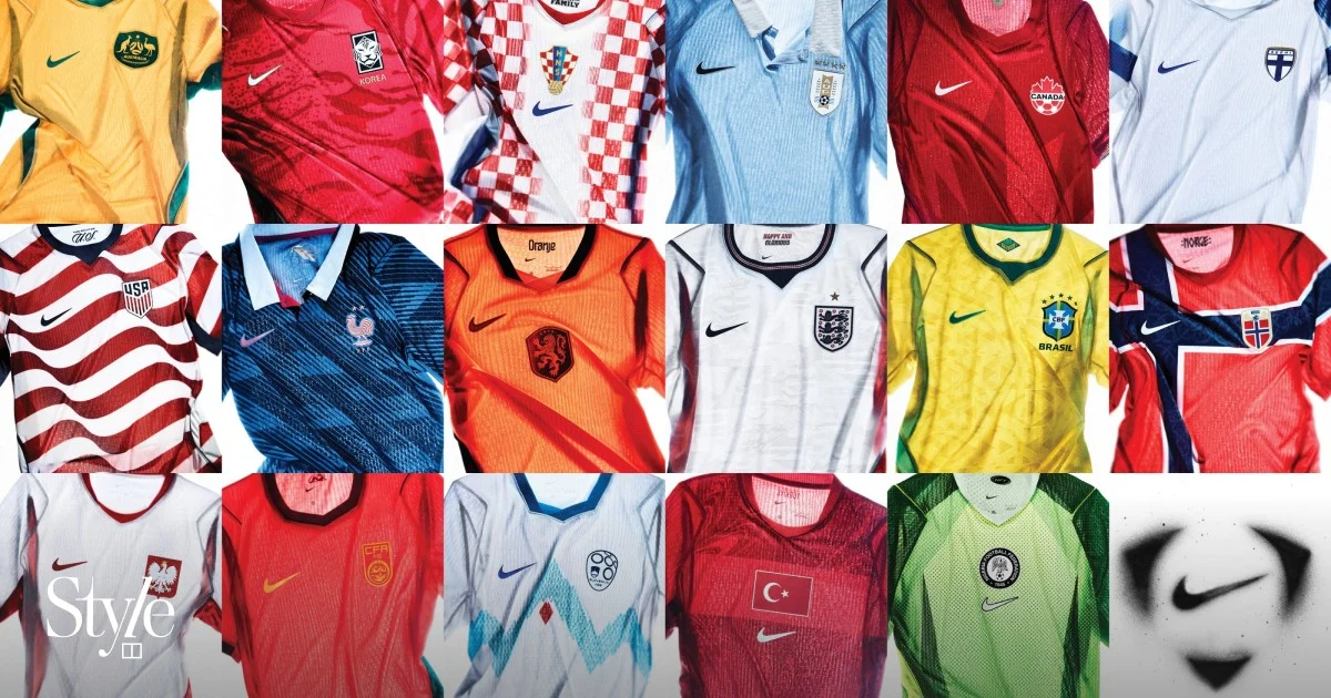
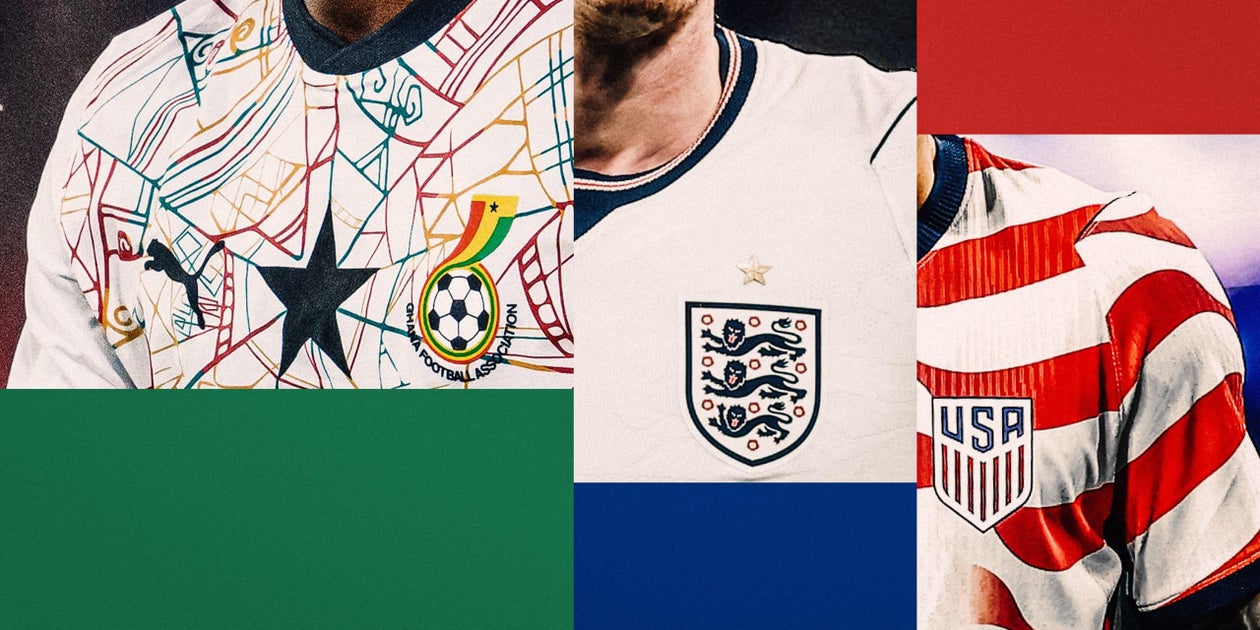
Ranking every home shirt at the 2026 World Cup: Passport print, Illuminati symbolism and a sublime spider web
Nick Miller ranks all 48 of the home shirts for the 2026 World Cup from best to worst
899 words~4 min read