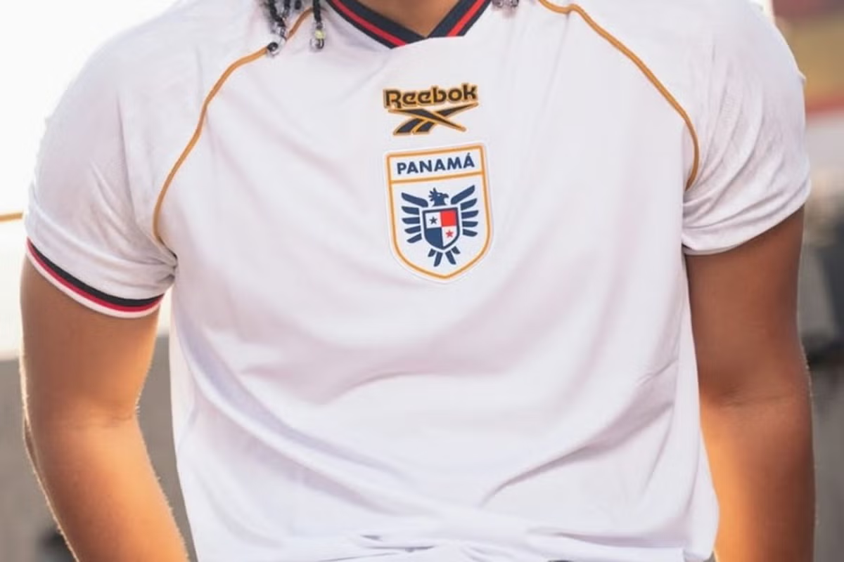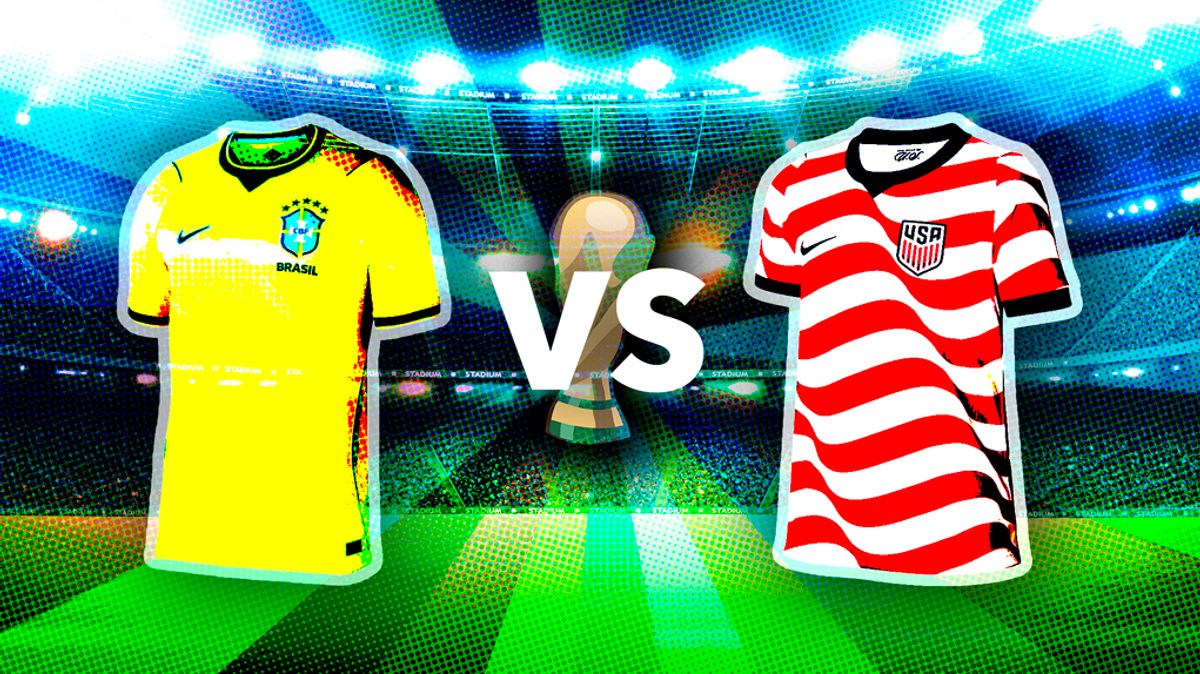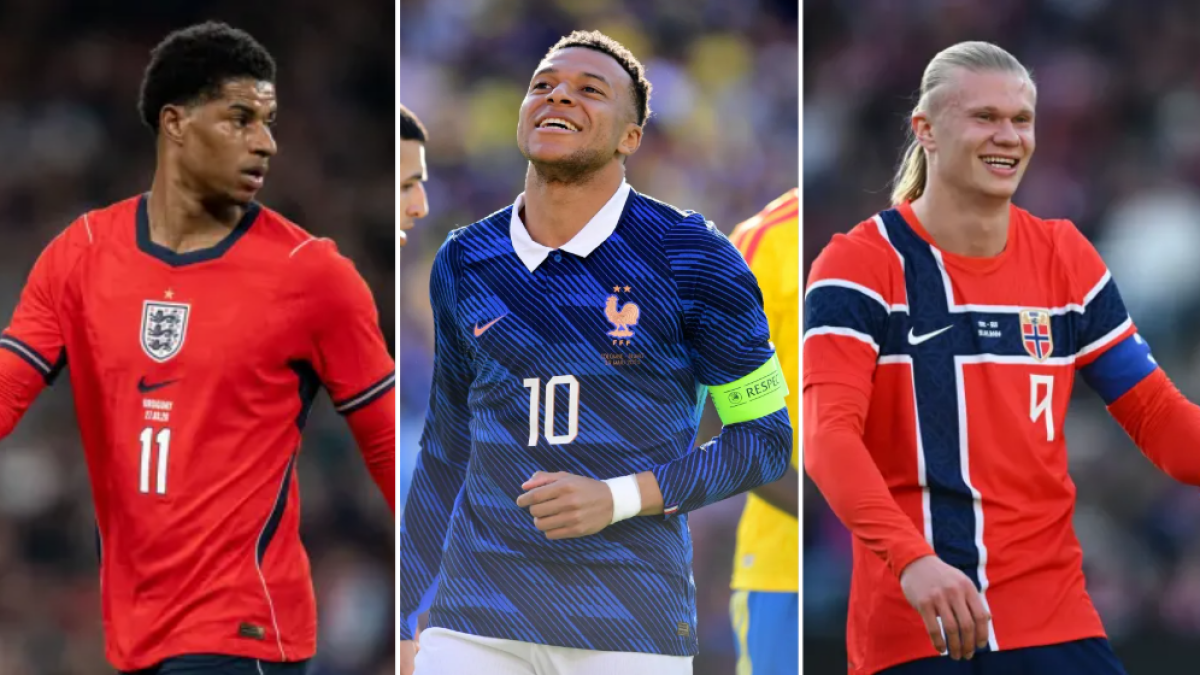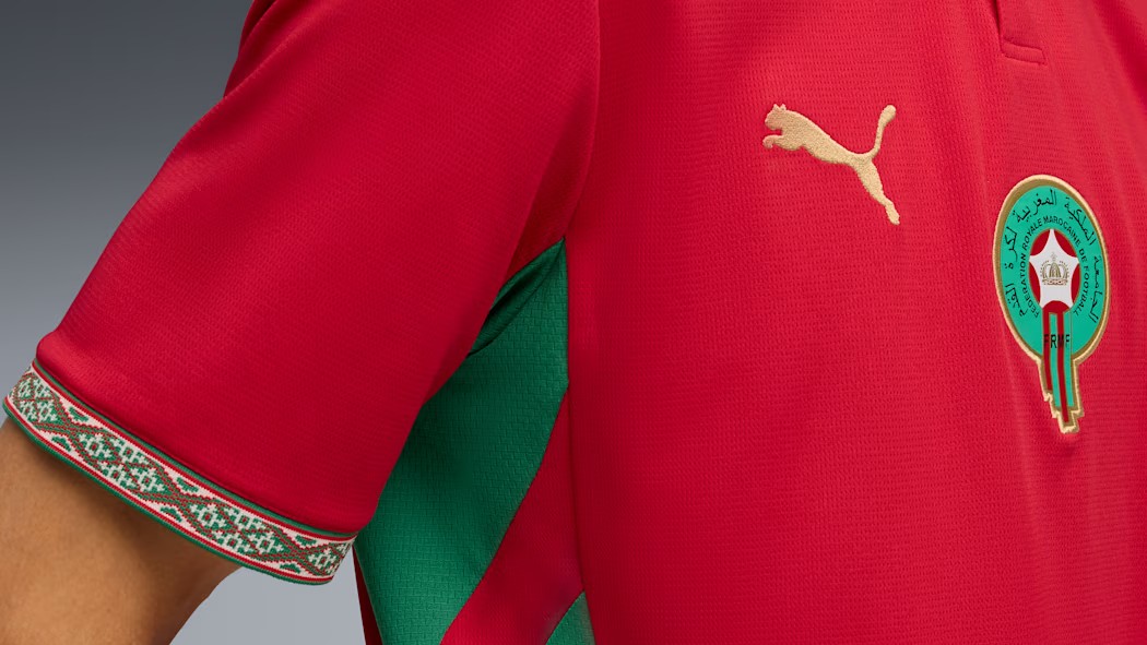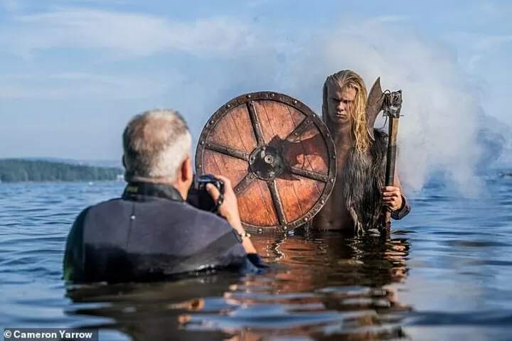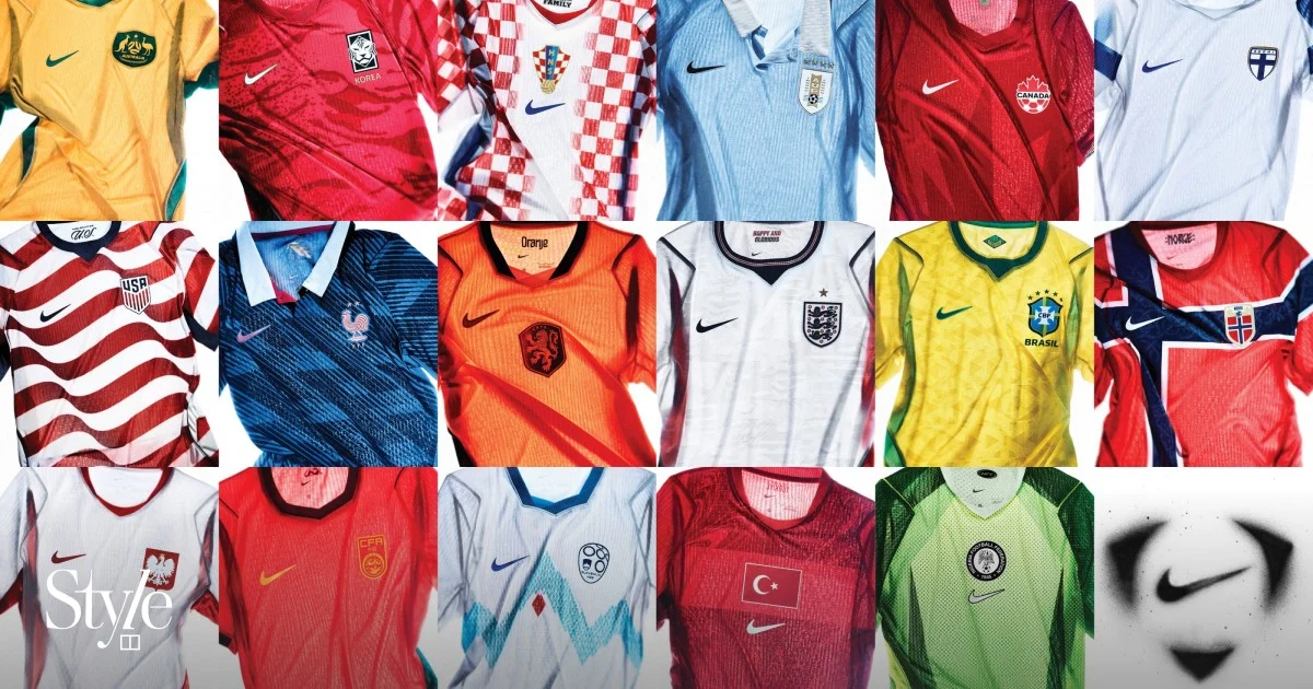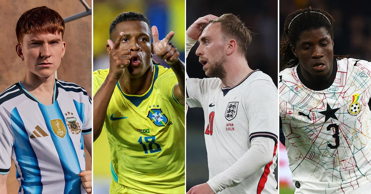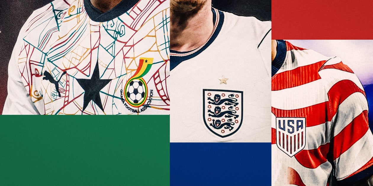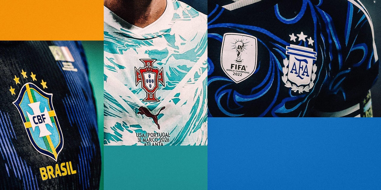
Illustration: Demetrius Robinson/The Athletic; Maddie Meyer, Marcelo Endelli, Kevin C. Cox/Getty ImagesJune 10, 2026 12:12 am EDT Updated This article is part of our Style of Play series, an exploration of World Cup kit culture.The World Cup is sometimes as much about how it looks as the results of the games themselves. Every tournament has a distinct aesthetic and plenty of that is governed by the kits.We’ve ranked all 48 home kits, so now attention turns to all 48 away ones: traditionally, this is where designers experiment and unleash some of their more ‘out there’ designs but in some cases this year, it’s a little bit different.So read on to hear about the strip that makes you check the colour balance on your screen, the one that looks like a Rorschach blot, the shirt from a tiny nation that is already sold out, and the beautiful kit that we might never see…(Puma)Oh good lord no. Both the home and away Swiss shirts are apparently inspired by the country’s passports, which is daft enough, but you have to ask if Swiss passports make you check the colour balance on your screen. This is a hideous colour, the sort that shouldn’t be seen anywhere other than on someone helping kids cross the road near a school. And even then, they’d be within their rights to ask for a different uniform.Photo:(Puma)(Puma)(Saeta)Ach, it’s not great, is it? Saeta is not a company I was too familiar with before: apparently it has its origins in Colombia but is now have a U.S. division, and it has been supplying Haiti’s kits since 2014. It’s nice to have someone a little different providing kits. It would be terribly dull if they were all just Nike and Adidas, but this waffle is just an attempt to tiptoe around this kit simply not being very good. Although the palm trees emblazoned all over the back are a pretty nice touch… so there’s that. Photo:(Saeta)(Saeta)(Dean Mouhtaropoulos/Getty Images)Wow. That is a black shirt. Absolutely black. Every inch of it: black. Not a colour to be found. It’s so black that I initially thought the picture of it on the Nike website was a placeholder image of a dummy, actual shirt to be released later. Thought there might be a little variety or a splash of something different on the shorts? Think again. Surely on the socks though, right? No! Apparently it was inspired "by Viking warriors, built to intimidate and channel Norways’s fearless spirit". Tremble, France, Senegal and Iraq, their group-stage opponents, before this extremely monochrome kit.Photo:(Dean Mouhtaropoulos/Getty Images)(Dean Mouhtaropoulos/Getty Images)(Robin Alam/ISI Photos/ISI Photos via Getty Images)This one is "inspired by the nation’s iconic players", according to Puma, which… well, no, come on, I’m not having that. It’s a nice line but how on earth does this design relate to great players from Portugal’s past? Is it a magic eye thing and if you stare at it for long enough you’ll see Eusebio? Does it spell out Luis Figo’s name in a long-forgotten, symbol-based language? As for the design itself… it’s not for me. It’s not that the swirling, ocean-themed pattern is necessarily bad, but just… why only do the top half of the shirt in it? And why cut out a triangle shape? It looks like quite an elaborate bib. No, too weird. Photo:(Robin Alam/ISI Photos/ISI Photos via Getty Images)(Robin Alam/ISI Photos/ISI Photos via Getty Images)(Luiza Moraes/Getty Images)I wrote in the home kit rankings that it felt like Qatar’s qualification for the World Cup took Adidas by surprise, so it didn’t quite have time to come up with an especially original design for their kit. This backs that half-baked theory up, because… well, there’s barely a design here at all. It’s just a white shirt with a v-neck and maroon stripes down the sleeves. That’s it. Which is not to say it necessarily looks bad because a plain white shirt with a nice contrast colour can look reasonably smart… but if I’m the Qatari FA, I’m wondering how long Adidas actually spent on conjuring up this one.Photo:(Luiza Moraes/Getty Images)(Luiza Moraes/Getty Images)(Minas Panagiotakis/Getty Images)We had some work done on our house recently. It involved a lot of sanding and painting, and let me tell you, the dust gets everywhere. Everywhere. Including the washing machine, meaning that the first wash we did after the work started resulted in a load of white dust and marks being left on the dark T-shirts. By the looks of things, that’s what the inspiration for this Canada away shirt was. It’s a no from me. Photo:(Minas Panagiotakis/Getty Images)(Minas Panagiotakis/Getty Images)(Pixsell/MB Media/Getty Images)This is the same design as the terrible Croatia home shirt, just in two shades of blue — but, for some reason, it feels better. Maybe not actively good, but better. Perhaps that’s because, in blue, it just feels like a moderately bad design and less like a desecration of a storied classic as messing with the classic Croatian red and white checkerboard does. It’s fine. Not actively good but not as bad as the home kit.Photo:(Pixsell/MB Media/Getty Images)(Pixsell/MB Media/Getty Images)(ANP via Getty Images)Just quite boring, alas. It sort of looks like a Scotland shirt but with all the personality taken out of it. The deep blue colour is quite nice and the gold-y colour trim as a point of contrast also works pretty well, but it just feels a bit half-hearted. It’s like this is a good start but you want more. Perhaps it’s low-key by design, a fuss-free effort to appeal to a relatively conservative audience, but it’s a bit of a shame as it could be a decent jersey with a bit more imagination. Photo:(ANP via Getty Images)(ANP via Getty Images)(Christian Bruna/Getty Images)It’s a nice idea and you don’t get enough football jerseys based on a floral motif, but this just looks a little bit too much like a semi-ironic T-shirt that someone who works in one of those artisan sandwich shops in east London might wear. Maybe that’s the demographic they’re aiming for, although that would be pretty niche. It’s also the purple: it's very tricky to make a purple football shirt work and when it does, it generally has to be a Fiorentina-esque shade, rather than this pale colour. A spirited effort but doesn’t quite hit the mark. Photo:(Christian Bruna/Getty Images)(Christian Bruna/Getty Images)(Kelme)This is a similar design to the blue home shirt but it actually works better due to the stronger contrast: you’ve got a white torso with dark blue sleeves, then the blue and yellow pinstripes that stand out much more against the white. The flip side is that the collar doesn’t pop quite as much but here’s an example of how the colours can make a design, not necessarily the design itself.Photo:(Kelme)(Kelme)(Jamie Squire/Getty Images)Does this just look like a training top to anyone else? I can’t quite place my finger on what it is but it doesn’t feel like a first-team shirt for some reason. Some credit must be given for the relationship between this away shirt and the home, which featured the stripes from the American flag, whereas this one depicts the stars. "An elegant and undeniably American design," says the Nike website, that statement carrying the implication that it had to be "undeniably American", otherwise nobody would buy it.Photo:(Jamie Squire/Getty Images)(Jamie Squire/Getty Images)(Ryan Hiscott/Getty Images)Bold as brass. You could quite easily file this under "a bit much", what with the strikingly strong goldy-yellowy colour and the ostentatious background design — inspired by the bustling Makola market in Accra, since you ask — making this one of the more in-your-face shirts of the World Cup. But you know what, fair play to them. Being "a bit much" is better than being "a bit boring", and that’s an accusation you most certainly cannot level at this shirt.Photo:(Ryan Hiscott/Getty Images)(Ryan Hiscott/Getty Images)(Shaun Clark/Getty Images)Hmmm. Let’s start with the fact that the background pattern looks like a Rorschach inkblot, so tell us in the comments whether you see an elaborate trophy, a depiction of the Hindu god Ganesha, your mother, or something else. Apparently it actually takes its inspiration from the poison dart frog, a toxic creature found in the rainforests of South America. O... K. The other interesting thing is that this features the Jordan brand logo, rather than the traditional Nike swoosh: you’d have to tie yourself in knots to get too upset about this but let’s just say Brazil win the whole thing wearing this shirt, it will look a bit… weird?Photo:(Shaun Clark/Getty Images)(Shaun Clark/Getty Images)(Capelli Sport)This is the same design as the home shirt but for some reason, it just doesn’t work quite as well in the white as it does in the blue. The trim is pretty good, with a nice bold shade of red popping quite well against the blue, but the background design — inspired by the flight paths between the 10 islands that make up Cape Verde — just isn’t as clear. It just serves to give it that slight "dirty white shirt" look. Against the pale blue of Uruguay, when the two teams meet in Group H, they'll actually be wearing their red third shirt, which does actually look a bit nicer than this white one. But we are sticklers for protocol, so the white is the one getting judged here.Photo:(Capelli Sport)(Capelli Sport)(Pavel Lebeda/Soccrates/Getty Images)Puma have taken the idea that you play it relatively safe with the home kit but experiment with the away, and have really run with it here. The background design is inspired by "crystals", it says on the brand's website, although it does look a bit more like the frosted glass on the front door of any suburban English semi-detached house. The trim colour is allegedly gold but it looks quite brown to me. It’s fine, just ultimately quite forgettable. Photo:(Pavel Lebeda/Soccrates/Getty Images)(Pavel Lebeda/Soccrates/Getty Images)(Puma)Much like the home shirt, someone at Puma has shrewdly noted that Egypt is known for pyramids, so onto the background design they go. Weirdly, these images aren’t quite as annoying on this white shirt, perhaps because if you weren’t looking that hard, they could plausibly just be fairly random patterns, not cliched iconography. And they actually bring a bit of variety to what is otherwise just a plain white shirt. Fine if you like that sort of thing.Photo:(Puma)(Puma)(Umbro)The curved line that goes around the edge of the torso on this shirt looks like a conscious tribute to the Nike kits of the early 2000s, which is strange considering this one is made by Umbro. It actually works quite nicely as a complement to the home shirt: on that, the pattern starts at the top of the shirt and fades as it gets lower, but this starts at the bottom and fades as it gets higher. It’s like they would tesselate if you combined the two shirts. Whether that’s deliberate, I’m not sure, and I’m also not sure if it’s that useful: does a design really work if you also have to know what that team’s other shirt looks like to get it?Photo:(Umbro)(Umbro)(Puma)Get out your dream catchers, light up that incense, and join me in reading the blurb for New Zealand’s away shirt. According to the Puma website, the shirt "is guided by the hau — the breath of life. A flowing pattern sweeps across the jersey, symbolising the four winds that bring the country together". While the spirit of the hau might have provided some design inspiration, let’s forget that and just enjoy some nice swirly patterns.Photo:(Puma)(Puma)(Majid Sportswear)The same design as the home shirt, with the Asiatic cheetah peering around the hip of the shirt like it’s just seen a particularly juicy impala it’s going to chase down for its lunch (brief tangent: did you know there have been no recorded instances of cheetahs killing humans? Apparently they’re just big, very fast house cats, so if one of them shows up in your neighbourhood, don’t worry too much), only in red as opposed to white. It feels like this version works slightly better, if only because the cheetah spots pattern on the sleeves is easier to see, but it remains a fairly plain shirt with a slightly incongruous cheetah on the side.Photo:(Majid Sportswear)(Majid Sportswear)(Jako)This absolutely looks like a Mexico shirt from the late 1980s or early '90s, but that’s OK: Mexico shirts were really good back then! It’s got the same background design as the home shirt but the colours work much better on this away number: the green more vibrant, offset neatly if not ostentatiously by the white, red and black trim. I do reckon they might have been better off just picking one of the four different patterns and sticking with that, but it looks fine.Photo:(Jako)(Jako)(Federico Peretti/NurPhoto via Getty Images)Swirly! This looks a bit like someone has set about a lava lamp with a hammer and allowed the contents to spill onto a black shirt. The pattern is "inspired by popular artistic expressions" from Argentina, which is slightly vague, but we’ll trust Adidas that it actually is drawn from Argentine culture rather than something they’ve just come up with. Photo:(Federico Peretti/NurPhoto via Getty Images)(Federico Peretti/NurPhoto via Getty Images)(Kelme Jordan)Did you know that the Jordan national team’s nickname is "Al Nashama", which means "The Chivalrous Ones"? Nice, isn’t it? That probably hasn’t got a lot to do with the shirt design, which, despite being a mirror image of the home shirt — red with white patterns on the sleeves, as opposed to white with red patterns on the sleeves — somehow feels much more plain. But is it chivalrous? Would you lay this shirt on a puddle so a lady could walk across it without getting her shoes wet? Well, you could, but that does seem a bit much.Photo:(Kelme Jordan)(Kelme Jordan)(Adidas)I’ve been peering at this shirt for a good while trying to work out what the background pattern — supposedly a "tribute to Algeria's vibrant landscapes, from the rocky deserts to lush oases" — actually is, with no joy so far, which does rather suggest there’s not a lot of point to a pattern you can’t actually see. Still, if you ignore that, it’s a pretty good shirt: the little splashes of red popping nicely against the green, and that background pattern is fairly nice… as long as you don’t try to look at it too closely.Photo:(Adidas)(Adidas)(Rich Graessle/Icon Sportswire via Getty Images)Another pretty plain effort, but quite smart with it, the gold and the green working together nicely as a contrast to the brilliant white of the main body. Unusually, Adidas has gone with a more elaborate design for the home shirt and played things safe with the away: typically, it’s the other way around but it does work quite well in this instance. There is a similar background design to the home shirt but with this one being white, it’s more difficult to make out.Photo:(Rich Graessle/Icon Sportswire via Getty Images)(Rich Graessle/Icon Sportswire via Getty Images)(Valerio Pennicino/Getty Images)You know in the second half of Return of the Jedi, when Emperor Palpatine is sitting in his big throne room, trying to turn Luke Skywalker to the dark side of the force, and he’s looking out of a massive, fragmented circular window thing onto the Rebel fleet over the forest moon of Endor? Doesn’t the design on this shirt look like that to you? No? Just me? Hopefully, that was what they had in mind: not enough football shirts position themselves towards the sci-fi nerd market. Photo:(Valerio Pennicino/Getty Images)(Valerio Pennicino/Getty Images)(7Saber)Not bad. Not amazing, but they have neatly side-stepped the potential problem of choosing mostly plain white as your shirt but it being very boring to look at. The intricate background pattern actually stands out pretty well for a white-on-white design, while the blue, green and yellow trim is used judiciously, just enough for it to pop and break the shirt up a bit. A solid effort. Photo:(7Saber)(7Saber)(Nike)This would be impractical at best but it would be good if Nike could figure out a way of making this shirt change as the tournament goes on: the more points Australia get, the further the orangey-pinky colour moves down the shirt. As it is, we’ll probably have to satisfy ourselves with just the shoulders, but that’s fine: perhaps this isn’t actually the nicest shirt around but it’s unusual, so for that alone, it gets extra points. Photo:(Nike)(Nike)(Yagiz Gurtug/NurPhoto via Getty Images)Turkey have, for the most part, resolutely stuck with the ‘thick band across the chest’ design for their shirts since… well, since the 1920s, which is quite a period of time. Maintaining some variety within those parameters must be tricky but they have managed that to a point here with the swirling motif that takes up most of the home shirt confined to that chest band. It’s not the best shirt in the world but they earn kudos for making their two kits ‘of a piece’, which is to say they reference each other without it being just the same design in different colours.Photo:(Yagiz Gurtug/NurPhoto via Getty Images)(Yagiz Gurtug/NurPhoto via Getty Images)(Severin Aichbauer/SEPA.Media /Getty Images)Apparently this design is inspired by Viennese coffee house culture, a reference to where plenty of the foundational theories of modern football were discussed and formulated. It’s a nice story and if you have been to some of those Viennese coffee houses, the patterns will be familiar, but as ever, the question is: does it look good? And the answer is: yes! Sort of! It’s a fairly original design, which earns points, and if you can get past that the blotches could look a bit like old encrusted sweat stains, it’s a fine shirt.Photo:(Severin Aichbauer/SEPA.Media /Getty Images)(Severin Aichbauer/SEPA.Media /Getty Images)(Kamil Krzaczynski/AFP via Getty Images)Kit designers will often look you square in the eye and try to convince you that something incredibly standard is in fact the height of innovation, and if you can’t see it then, well, that’s your problem. This sort of applies here, with Adidas informing us that this shirt’s "minimalist design blends with a striking graphic inspired by Mexico’s rich cultural heritage". Come on, guys: what are we doing here? It’s just a white shirt with some bold trim colours that effectively fit with the country’s aesthetic. It’s a good shirt! Nice and simple, just the right side of boring, and it will look great on the players… but let’s not over-intellectualise it, yeah?Photo:(Kamil Krzaczynski/AFP via Getty Images)(Kamil Krzaczynski/AFP via Getty Images)(Franco Arland/Getty Images)An interesting one. The shirt itself is pretty nice and the "kaleidoscopic graphic" down the front works rather well but if you removed the badge from this shirt and asked someone to guess which country it belonged to, I bet most would say Cameroon. Is that a problem? Is it weird that Senegal are wearing what looks like a shirt belonging to a West African rival? Is it a subtle taunt to Cameroon, who have of course failed to qualify for this tournament? The answer to those questions are: I don’t know, maybe?; and almost certainly not, but… it still feels notable. Photo:(Franco Arland/Getty Images)(Franco Arland/Getty Images)(Reebok Panama)Jay-Jay Okocha! Stelios Giannakopoulos! Henrik Pedersen! Ivan Campo! Kevin Nolan! Sometimes, the nostalgic names come to you in a massive rush, sparked by some sort of visual stimuli, and this Bolton Wanderers shir… sorry, this Panama shirt has done just that. It was perhaps inevitable that with Reebok back in the kit-designing game, it would fall back on some of its greatest hits, but, come on, this just is a Bolton shirt. Still, that team was quite good for a while, so maybe it’s a smart move. Photo:(Reebok Panama)(Reebok Panama)(Rich Storry/Getty Images)The home shirt is an absolute peach and while this does feature many of the same elements and is a similar structure, it doesn’t work quite as well. It’s also slightly odd that they’ve gone for largely the same basic design as the home shirt but in this one, the badge and Nike logo are central, as opposed to on either breast. It’s as if the manufacturer panicked at the last minute that they were too similar and said: "We need something different… badge in the middle? Sure, why not?"Photo:(Rich Storry/Getty Images)(Rich Storry/Getty Images)(Adidas)Sweden have occasionally diverted from the classic formula of flipping their colours for their away shirt — blue with yellow trim, as opposed to yellow with blue — but they always tend to come home, knowing that this is what we all want. And in this instance, it works perfectly, with a pattern that is slightly difficult to define (Adidas simply describes it as being from “the 1970s”) but when it works like this one does, you don’t really need to know exactly where it’s from. A mild nitpick here is that the collar is too chunky but when that’s the biggest problem with a shirt, you know it’s probably a good ‘un.Photo:(Adidas)(Adidas)(Franco Arland/Getty Images)Wooosh, now that is… different. It might look like the practice canvas of an abstract graffiti artist but apparently the graphics on this shirt are "drawn from the country’s natural terrain", which does feel like a classic example of someone designing the shirt they wanted to, then coming up with a nice-sounding theme that connects in some way to a country’s history and culture, looking you in the eye and saying the two things are connected. But as ever, it just boils down to whether the thing looks good and while this probably isn’t everyone’s cup of tea, it certainly is… different.Photo:(Franco Arland/Getty Images)(Franco Arland/Getty Images)(Mike Nowak/Getty Images)This isn’t the best of Adidas’ superb crop of away shirts but that should tell you something about the overall standard because it’s still really good. The greens and blues, and the pattern on the torso are really striking, but the lime green trim on the collar and the three stripes do spoil it slightly: just feels slightly gaudy, for want of a word that doesn’t make me sound like someone’s prudish grandparent who has just seen Charli XCX on TV.Photo:(Mike Nowak/Getty Images)(Mike Nowak/Getty Images)(ANP via Getty Images)The problem with the Dutch home shirt is that it’s just a bit overpowering, the bright orange colour resembling something a steward at a music festival might wear. This is much more subtle, while also making use of the striking orange but limiting it to a thick band across the chest and the trim around the collar and cuffs. It does look a bit like a repurposed Turkey shirt but in insolation, the shirt works nicely.Photo:(ANP via Getty Images)(ANP via Getty Images)(Adidas)Extremely strong. This is how you add subtle bits of detail to an otherwise fairly clean, basic shirt, with the hatched pattern stripes contrasting with a sort of small checkerboard design. That’s capped off with the gold trim colour and white shorts, all of which combines to make a delightful kit. The issue here is: are they going to get the chance to wear it? Their three group games are against teams who wear green, red and red, so they're currently not scheduled to wear it. Hopefully they get through to the knockouts and there's a clash there...Photo:(Adidas)(Adidas)(Marc Atkins/Getty Images)Quite, quite mad. There’s a lot going on here, so let’s take it step by step: on the top third, you’ve got what look like alternating palm trees, mainly in green and arranged in neat lines, then there’s what looks like a set of interlocking shining suns in a sort of pale orange colour, then below that… a sort of mixture of the two, with some suns green and some trees orange. If you tried to make logical sense out of it, you’d be here for a while and you probably wouldn’t succeed, so instead, it’s probably best to just leave logic out of it and enjoy this fairly extraordinary design.Photo:(Marc Atkins/Getty Images)(Marc Atkins/Getty Images)(Andrew Milligan/PA Images via Getty Images)Excellent. It’s interesting that manufacturers very rarely make explicit reference to retro designs being retro designs… even when they very clearly are. This one, for example, is an obvious tribute to Scotland’s away kit from the early 1990s… which was itself a tribute to one of their away kits from the early 1980s, but that’s not mentioned in Adidas’ blurb. Maybe it just wanted to give the impression that this is an original idea they’ve thought of entirely themselves. Anyway, it’s a smart move to reference that kit as it’s one that has been very popular on the retro reproduction market.Photo:(Andrew Milligan/PA Images via Getty Images)(Andrew Milligan/PA Images via Getty Images)(Jean Catuffe/Getty Images)Lovely. Pastel colours aren’t hugely common on football shirts: perhaps because of a strange interpretation of masculinity which decrees that a real man should only sport bold colours, perhaps because they’re just not as easy to market. But it really works here, the pale turquoise-y colour offset subtly but really well by the red, white and blue trim. For kits of the big teams, you think "in years to come, would it look silly if they won the whole thing wearing this shirt?". In this case, they really wouldn’t.Photo:(Jean Catuffe/Getty Images)(Jean Catuffe/Getty Images)(Kappa)This is great. Both Tunisia’s home and away kits have a sleeve design inspired by the Eagle of Carthage, the animal that gives the Tunisia team its nickname and appears on its crest. On the white home kit, the design was tricky to make out given it was in a light grey, but they’ve absolutely nailed it for the red away shirt, the far more striking white providing a clear contrast, and allowing you to actually see the feathers and wings of the eagle. Really, really great. Photo:(Kappa)(Kappa)(Gongora/NurPhoto via Getty Images)Lovely. There isn’t quite so much going on with this one as there is the home kit, and the background design on the main body — "manuscript graphics" which symbolise "the cultural depth of the Spanish language", it says here — are a little tough to make out unless you’re staring from pretty close, but the trim colours set that off nicely. Interestingly — and yes, perhaps "interestingly" is doing quite a bit of heavy lifting here — those trim colours are sort of red and sort of yellow, but different to the classic Spanish shades of both. Yes, I am a laugh.Photo:(Gongora/NurPhoto via Getty Images)(Gongora/NurPhoto via Getty Images)(Kevin C. Cox/Getty Images)Belgium have a fine history of absolutely nailing their away kits, from the fantastic pale blue Euro 2016 design to the music festival-inspired number from 2022, and they have continued that history here. It’s apparently inspired by surrealist art, those pink semi-circular patterns intended to evoke the country’s "rich artistic heritage" but you don’t need to know that to admire how beautiful it looks. A minor point but the other thing they have nailed here is keeping the shorts as plain as possible: when you have a shirt with a lot going on, the shorts should be very basic so things don’t get too busy. Well done, Adidas.Photo:(Kevin C. Cox/Getty Images)(Kevin C. Cox/Getty Images)(Christian Kaspar-Bartke/Getty Images)Absolutely gorgeous. This is one that works from a distance and close up: zoom in and you can enjoy the subtle chevrons on the background design and the three mini diamonds dotted around in turquoise like raindrops, zoom out and you can just appreciate a pleasant deep blue colour with a strong contrast. The collar is great, the sleeve detail is excellent, it’s just a great piece of work all round. If you were to really quibble, you’d maybe want dark socks to provide the dark-light-dark contrast, but that’s the nittiest of nit picks. Brilliant. Photo:(Christian Kaspar-Bartke/Getty Images)(Christian Kaspar-Bartke/Getty Images)(Florencia Tan Jun/Getty Images)Yeah, this is really great. It features the same design as the home shirt but there it was confined to some tasteful sections on the collar and cuffs whereas here, it’s right down the centre of the shirt, bold and much more in your face. In some ways, it’s the perfect away kit: it’s a distinctive, original design, but at the same time, it’s identifiably a Morocco kit, something signalled by the classic deep red and green trim. The home shirt was brilliant but this is even better.Photo:(Florencia Tan Jun/Getty Images)(Florencia Tan Jun/Getty Images)(Ed Sykes/Sportsphoto/Allstar via Getty Images)One of the reasons these kit-ranking articles usually work is, for the most part, there are typically enough good ones to gush over, enough middling ones to shrug about, and enough bad ones to have some slightly snidey fun in giving them a kicking. When Adidas dropped their World Cup away kits back in November, we considered doing a separate piece about them but ultimately decided against it, partly because there just weren’t enough bad ones to have fun with. I mean, just look at this Japan top: a sight to behold, it's a fantastic piece of design that manages to incorporate a fairly established pattern but give it enough variety to make it interesting. Who’s going to win the World Cup, I don’t know… but I hope they’re wearing an Adidas away kit while they do it.Photo:(Ed Sykes/Sportsphoto/Allstar via Getty Images)(Ed Sykes/Sportsphoto/Allstar via Getty Images)(Rob Casey/SNS Group via Getty Images)Just beautiful. The Curacao home kit is quite dull and is a slightly weird colour, but this is almost perfect. The pale yellow is offset wonderfully by the two shades of blue and red trim, and having the three shoulder stripes in different colours works here when it sometimes doesn’t, and the collar is excellent too. The fact that this, the away kit for the smallest nation to ever play at the World Cup, is currently sold out on the Adidas website says it all. Here's the thing though: they're not currently scheduled to wear it in any of their three group games and given it would be quite a surprise if they made it into the knockouts, that means we might not actually get to see it. Forget the ticket prices and the political interventions and the visa problems — this is the real tragedy of this World Cup.Photo:(Rob Casey/SNS Group via Getty Images)(Rob Casey/SNS Group via Getty Images)The Style of Play series is sponsored by the Active Cash Visa® Credit Card from Wells Fargo.The Athletic maintains full editorial independence. Partners have no control over or input into the reporting or editing process and do not review stories before publication.Jun 10, 2026Connections: Sports EditionSpot the pattern. Connect the termsFind the hidden link between sports terms
Ranking every away shirt at the 2026 World Cup: Star Wars vibes, inkblot insanity and the beauty we might not see
Nick Miller turns his critical eye to all 48 of the away shirts for the 2026 World Cup, ranking them from worst to best
5,048 words~23 min read