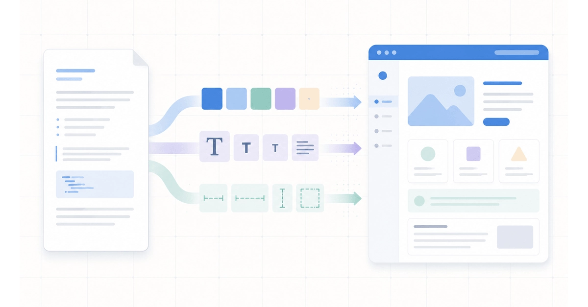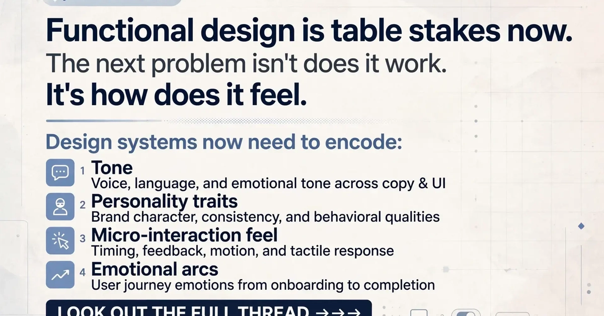
Most of us treat design systems as a functional problem: consistent colors, consistent spacing, consistent components. That part's solved for most teams now.
The part nobody writes down is tone. How should this loading state feel? Should this error feel scary or manageable? Is this confirmation message robotic or human?
Here's what I've learned paying attention to that layer.
Four moments that carry the emotional weight
In any app, four states do most of the emotional work: