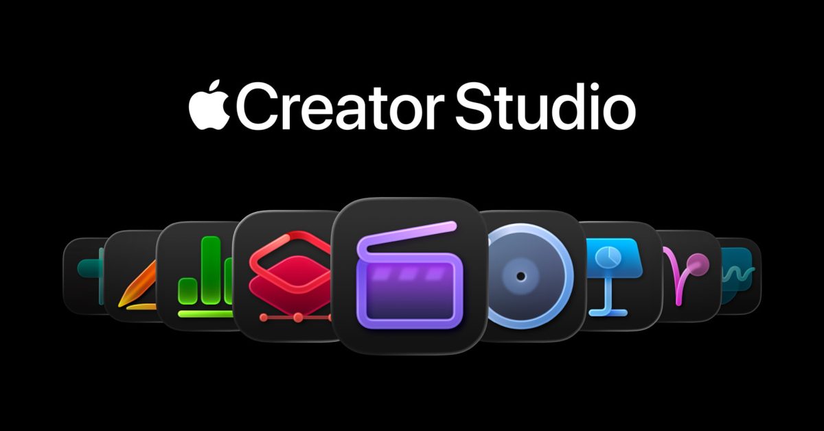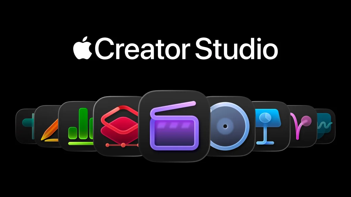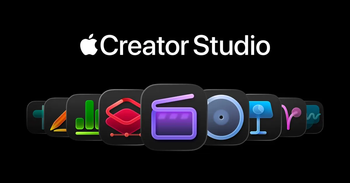
Let’s Just Get It Out of the Way and Talk About the New Icons First, but Let’s Also Use the Icons as a Proxy for Talking About the Broader Software Design Problems at Apple
There’s a lot of hate for the new app icons of the entire Creator Studio suite, but while I think the icons are tragically simplistic, I think the hate is misplaced.
The problem isn’t with these icons in and of themselves. The problem is with the rules Apple has imposed for Liquid Glass app icons, along with their own style guidelines for how to comply with those rules. Given Apple’s own self-imposed constraints for how icons must look (with the mandatory squircle) and how Apple has decided its own app icons should look (a look which can best be described as crude), I actually think the icons in the Creator Studio are pretty good, relatively speaking. But that’s like saying one group of kids has pretty good haircuts, relatively speaking, at a summer camp where the rule is that the kids all cut each others’ hair using only fingernail clippers.
The best take on these icons is this zinger from Héliographe:
If you put the Apple icons in reverse it looks like the portfolio