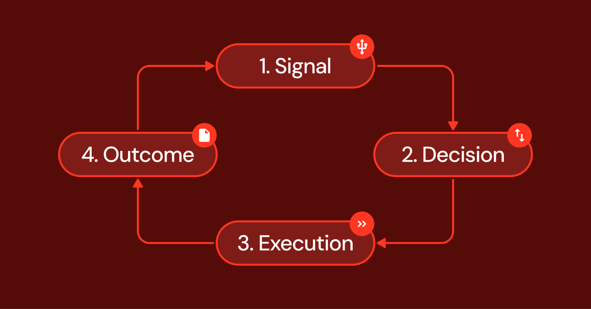
Despite the rise of Python, R, notebooks, cloud warehouses, and custom analytics platforms, Power BI remains one of the most important tools in my data workflow. I do not see it as a replacement for code, and I would not use it to train a model or manage heavy data engineering logic. But I have learned that Power BI is where analysis becomes visible, repeatable, and usable for the people who actually need to make decisions from it.
I did not appreciate that at first. Early in my data journey, I was more excited by Python scripts, SQL queries, machine learning models, and clean notebooks. Dashboards felt like the final decoration after the “real” work was done. I thought the serious part of data lived in the code, while Power BI was just the place where charts went. That view changed when I started working with teams that needed more than answers. They needed a shared place to keep returning to those answers.
One project made that clear. I was working on a fraud-detection analysis for a payments team, and the model output looked solid in Python. We had suspicious transactions, merchant risk scores, flagged patterns, and supporting features. But every review meeting became a long explanation of screenshots, exported tables, and notebook cells. The business team wanted to slice the results by country, merchant category, payment channel, and time period. I could answer those questions manually, but it was slow and frustrating.