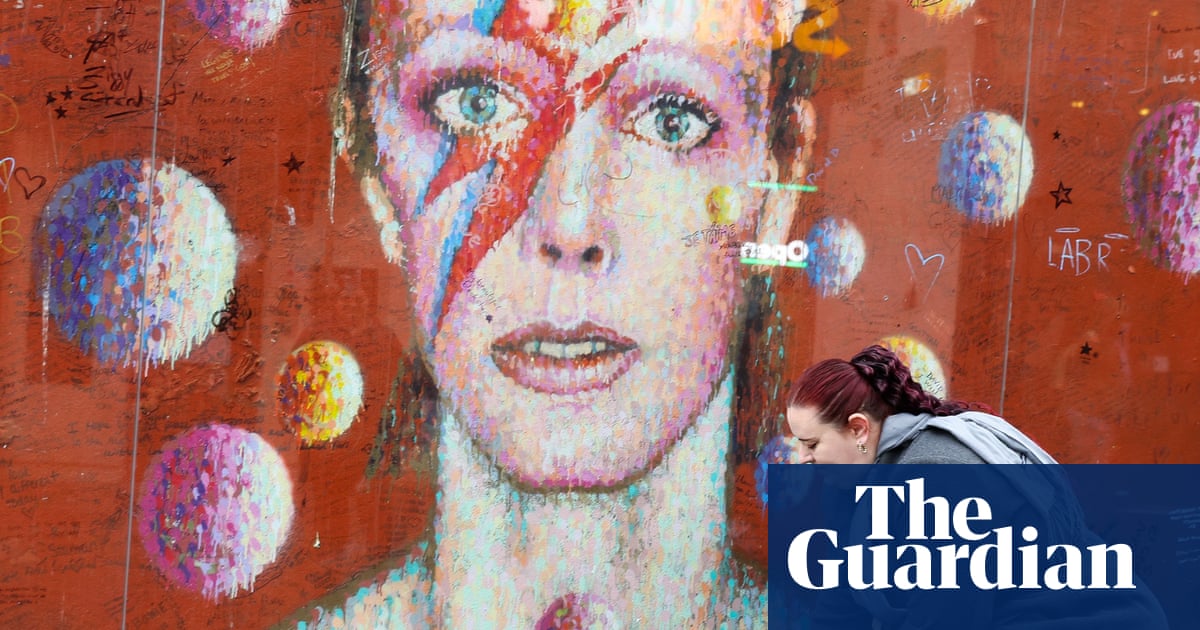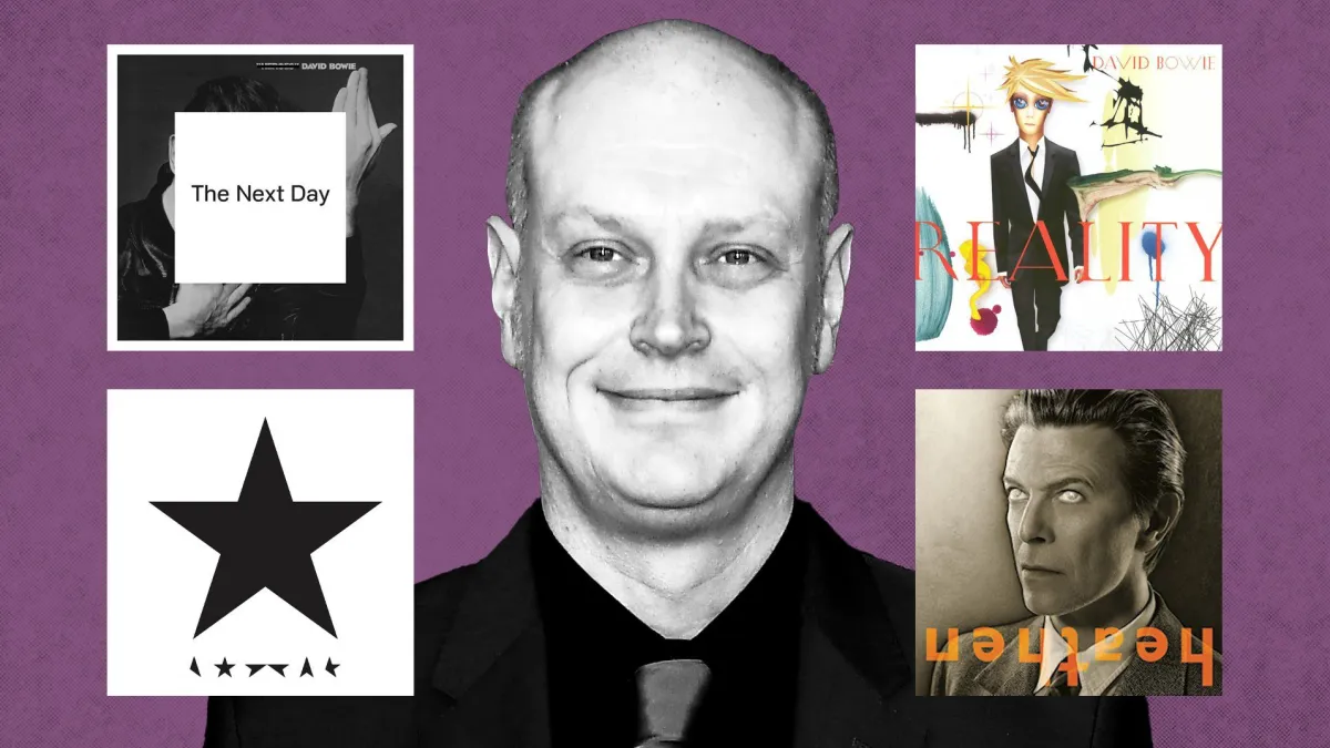
Jonathan Barnbrook was one of the only people who knew that David Bowie was about to make a shock comeback. It was January 2013, and the graphic designer had created the now famous and – it turned out – divisive artwork for Bowie’s 25th album The Next Day: the iconic cover shot from Bowie’s classic 1977 album Heroes with a white square superimposed on top, with the album title in black font.
“The night before it went live, I said to David, ‘Are you sure about this?’” recalls Barnbrook, speaking from his studio in Holloway, north London. “Even though I came up with the idea, I was having some second thoughts. He said, ‘Yes, don’t worry, it’s fine.’”
Barnbrook was right to be worried. “Some people quite liked it,” he says. “But a lot of people really hated it.” Many fans thought it was sacrilege; even the album’s producer Tony Visconti apparently thought it was a joke. “There was a lot of criticism of it. I felt two things: one, I was quite glad that it was different, but also I was mortified that people were quite misunderstanding, saying it took five minutes to do.”
Barnbrook had been inspired by Bowie sending him old 70s photos of himself. “It made me think about how we subvert this expectation of the image. I really wanted to interject that into what people think is a simple relationship. They see a picture of the artist, they listen to the music, and it confirms something in them. I didn’t want to give them that.”