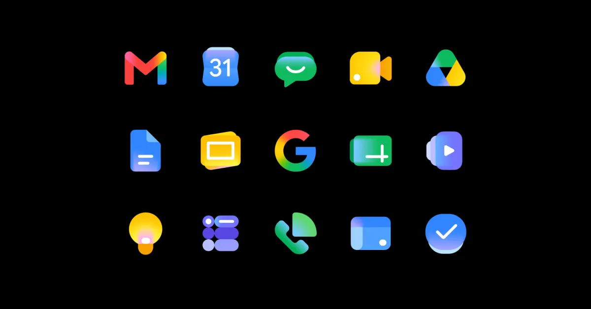
With the new Workspace icons fully rolled out, Google is now tweaking how Chat appears in the Android status bar to look less like Messages.
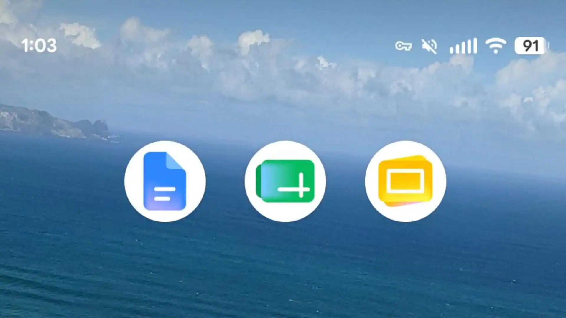
The homescreen icons are pretty distinguished in terms of color (green vs. blue), but the design has more than a few similarities. Both consist of two layered chat bubbles with tails that are on the left side, though they face opposite directions.
Old
The similarities become most apparent in the status bar. Chat’s first design was a straightforward adaptation and shrink in white, with a tiny smile serving as the primary differentiator from Messages. At small sizes, the two icons are easily confused.
If your company uses Google Chat as its primary messaging platform (like Google does internally), this would be particularly annoying for personal vs. work communication. (For comparison, Google Chat has over 50 million downloads on the Play Store, while Messages sits at 10+ billion.)