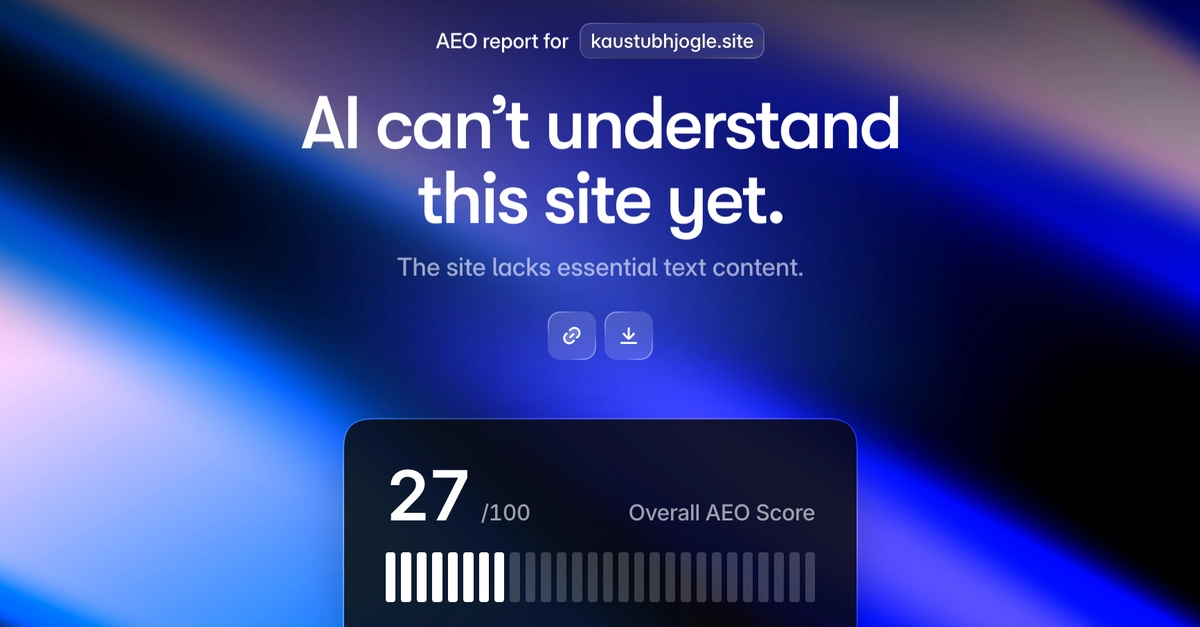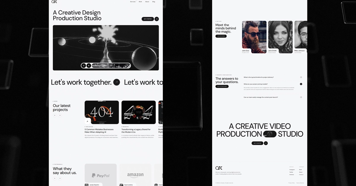
Every site my AI website builder produced looked great on a phone and weak on a desktop. The hero stretched edge-to-edge in a single anemic column. Features grids stayed at one column on a 27" monitor. Section padding that felt generous on mobile felt empty at desktop widths.
I spent two weeks trying to fix this from the prompt side. None of it worked the way I wanted. Then I gave up on the approach entirely and switched the generation to Tailwind via CDN. The desktop problem disappeared.
This is the writeup of why the original approach was wrong, what I tried first, and the specific change that mattered.
The symptom
The system prompt told the model to write mobile-first CSS: