Fixed-height cards often feel like a safe choice. A designer hands you a mockup where every card aligns perfectly in a grid. The titles are short, the excerpts fit neatly, and the layout looks stable across the entire page. So you implement the design exactly as specified and ship it.
Everything works until the content changes. An editor updates the copy, a translation adds longer words, and some users bump their default font size, especially those with low vision or digital eye strain, just to make things easier to read.
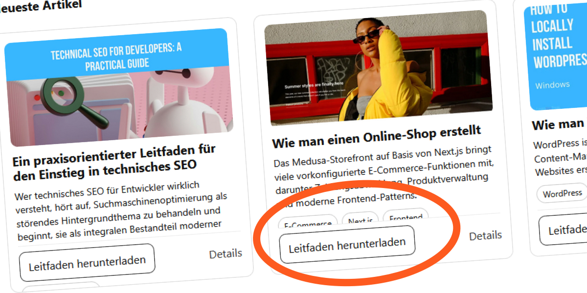
I ran into this while building a “Recent Articles” section for a blog. The design assumed relatively short English titles, so everything fit comfortably inside the fixed height.
The layout looked solid at first glance:
Initial design