Gboard for Android is slowly getting M3 Expressive, but the shortcuts page redesign comes at the expense of density.
Previously, the shortcuts page displayed everything as a grid. Each item was placed in a rectangular card that you could adjust to fit in one view without scrolling.
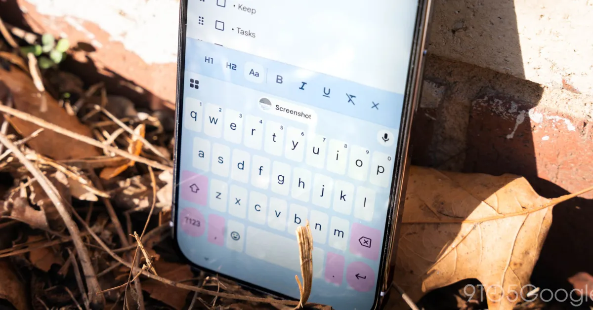
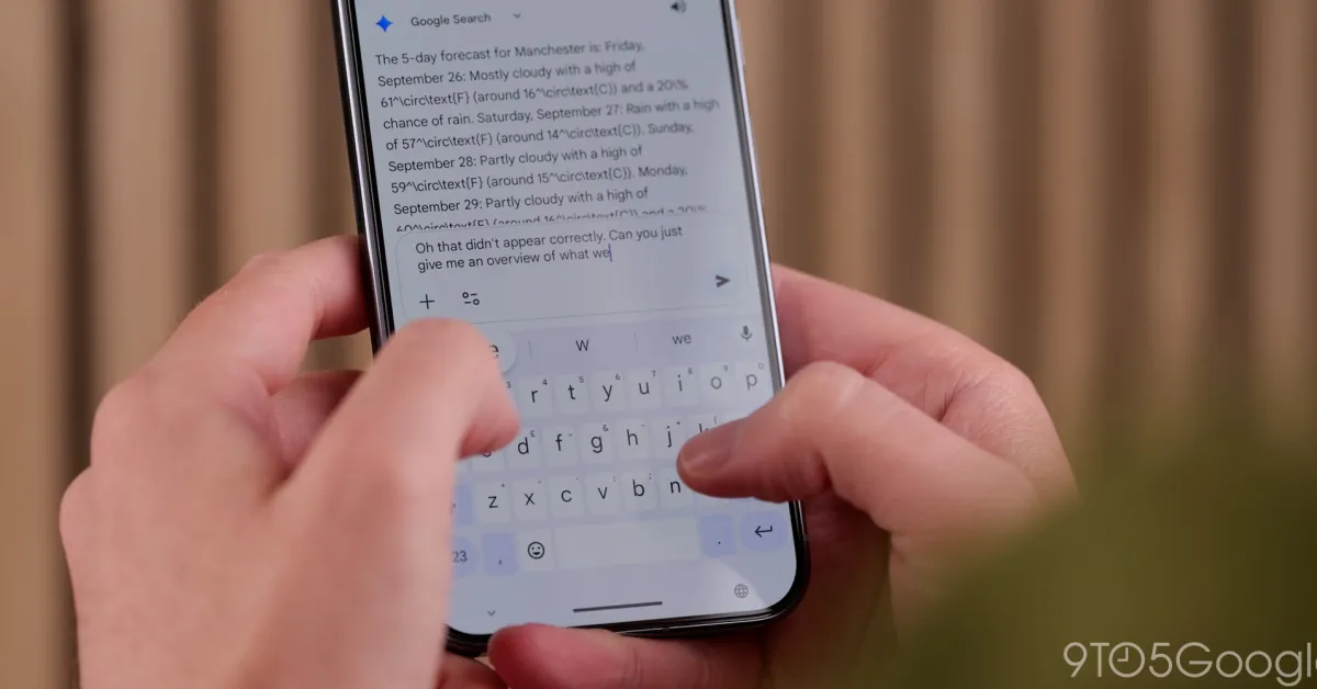
The Material 3 Expressive redesign places everything in a rounded pill, with two shortcuts per row. Instead of scrolling, you swipe left to see the next page of shortcuts. The icons are unchanged, with the text labels significantly larger. However, “Share Gboard” might scroll because it does not fit in the container.
Old vs. new
Shortcuts in the suggestions strip drop their container, while the back button is replaced by a close ‘x’ in the top-left corner.