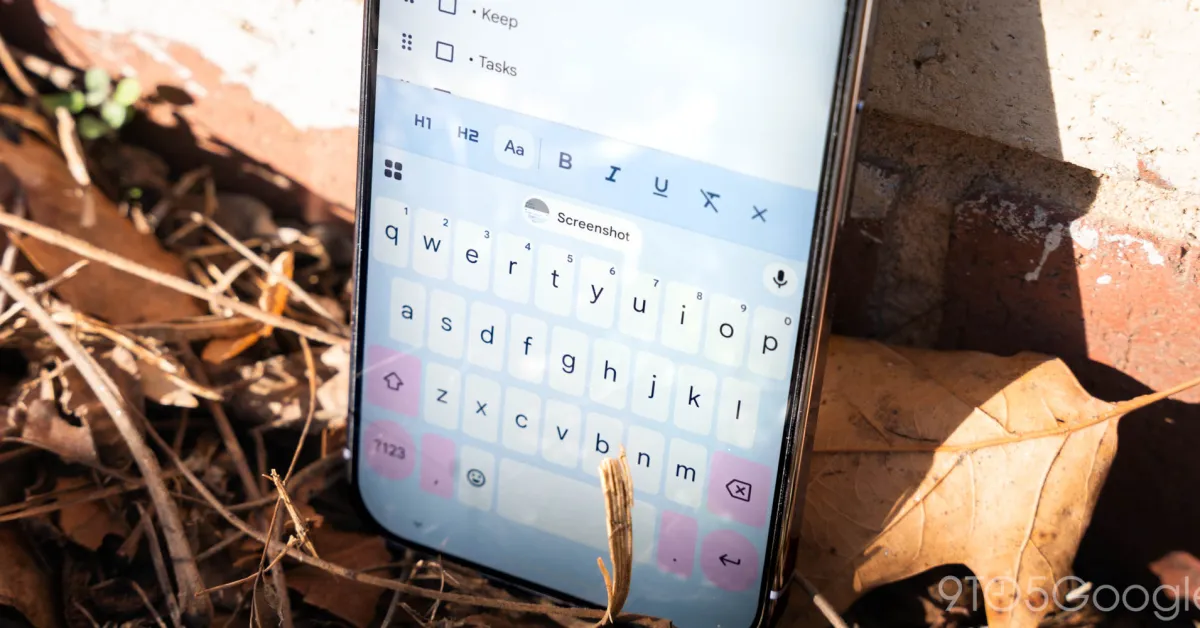
Gboard introduced a Material 3 Expressive redesign of shortcuts in January that is now seeing wider availability for beta users.
Gboard previously used a grid layout for the shortcuts page. Each item was placed in a small rectangular card, and you could adjust the keyboard (make it taller in Resize) to fit in one view without vertical scrolling.
The Material 3 Expressive redesign places everything in a rounded pill, with two shortcuts fitting into each row. You now swipe left to see the next page of tools.
Old vs. new
The actual icons are unchanged, with the text labels significantly larger at the right. Unfortunately, some shortcut labels will scroll because they do not fit the container.